Yeah we need better options for both relationship status and sexual orientation :p (And maybe a multi select). But do know that it’s on our to do list!
People will inevitably get confused when they want to add a widget and can’t find it, only to find out later that they looked in the wrong place for the widget? With little to no rhyme or reason
It’s baffling to me how weirdly complex iOS has become with Control Center widgets. See screenshot: both of these widgets are from the Todoist app. Both do the same thing: Add a task. Yet one is a “control center widget” and one is a “Lock Screen widget”. They’re not compatible with each other.
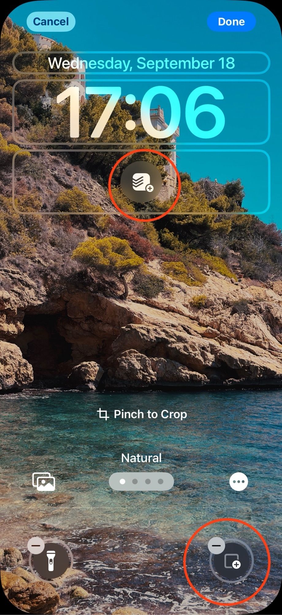
The UX itself is also broken imo. Why does control center need pages? Its use is quick access - pages just add needless complexity
I remember when installing the first iOS 18 beta thinking surely they will fix control center before launch. But no lol. It’s still completely broken.

Btw! If you want to see the labels I put on my profile, you can subscribe to: Pronouns: bsky.app/profile/pron...bsky.app/profile/sona... (And you can fill them in for yourself too if you want)
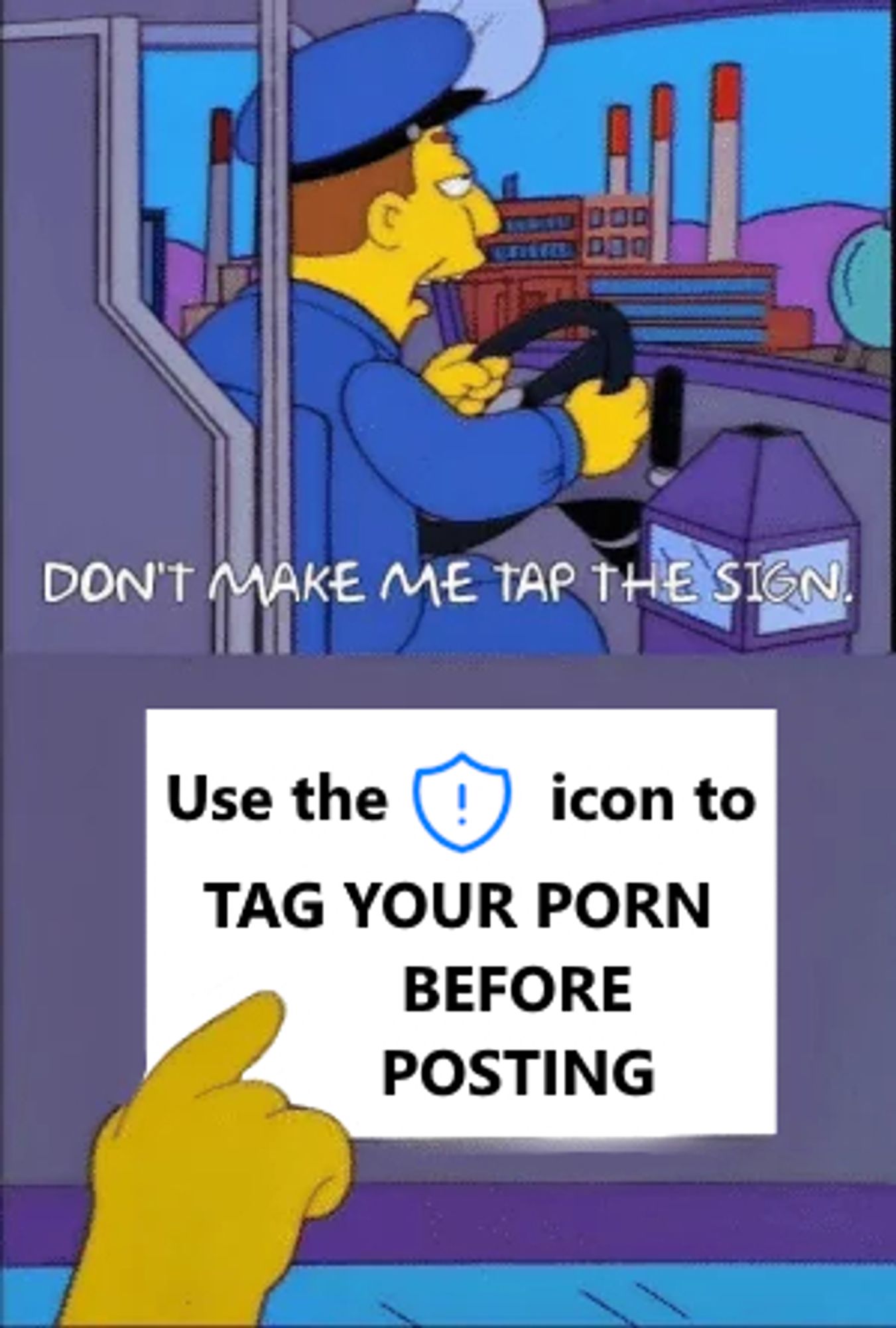
Agreed, but maybe it would help if bluesky team altered the icon- cause the shield with exclamation mark reads as “report” or “moderate” - not “put a content warning on it”
Someone registered number.wang and I’m very happy they did lol
This sometimes annoys me about the privacy community in general A good chunk of that community seems to be hard libertarian or conservative. It should be possible to be both progressive/left-leaning and caring for privacy :p