I always recommend using various shades for consistency, what if you have to touch up later? Unless it's a light difference, for example on the skin on this pic it's usually better to use 3-4 shades in the same family :)
Random thoughts of the day regarding both platform followers Artists supporting each other is awesome and very necessary but I often see non-artists not giving enough credit for themselves. You have no idea how important it is to us that our works are shared to wider audiences. 🧵
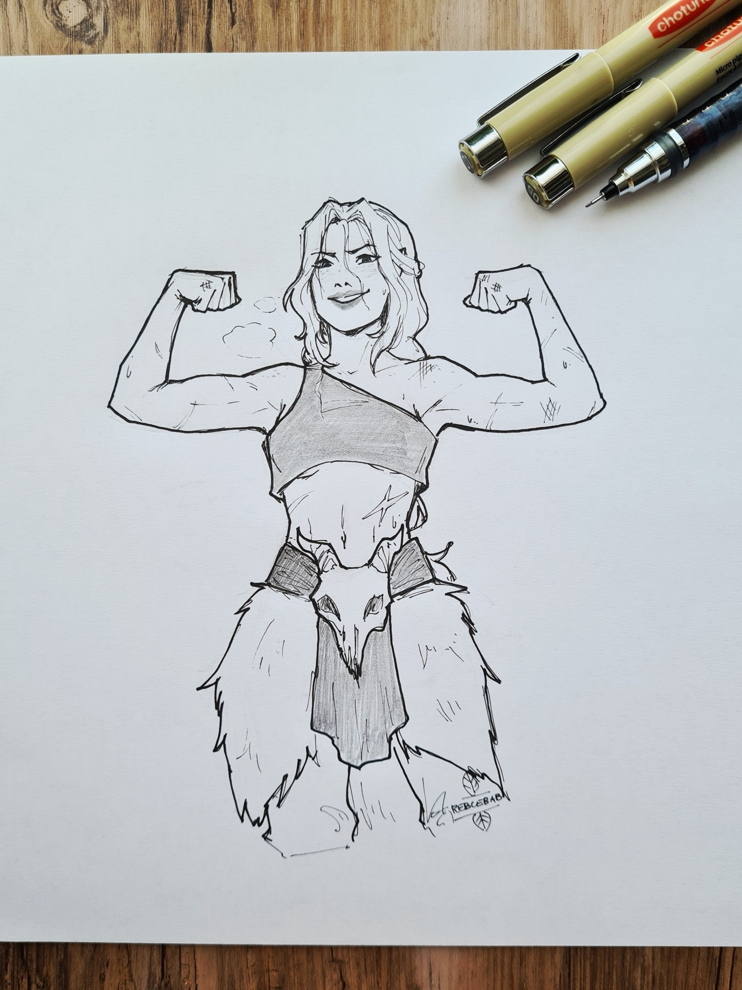
Nina's been hitting the gym or other people I let you decide 💪 Took a tablet break, I felt my art started slacking which is always a sign to practice traditional, it just moves my brain differently #Ninarok#warcraftart#warcraft#traditionalart
I tried many brands but copic is still superior for me for professional use (mostly because of the brush quality, colours can be duplicated easier), my fav thing about them is the coding system. Once I learnt what the numbers and letters mean, I can now imagine a colour just by seeing a code only :)
Love the dynamic pose!!!!!!!!!!!
Also consistency is highly dependent on application, some instances it's easier to create a gradient with a quick flick, but if you saturate the paper well it becomes one flat wash :)
Oh nooooo don't be fooled, I used like 10 different colours I just wanted some decoration for the picture :) I'm happy to share codes too :)
Ahhh this is the cutesssssst 🥹❤️❤️❤️