
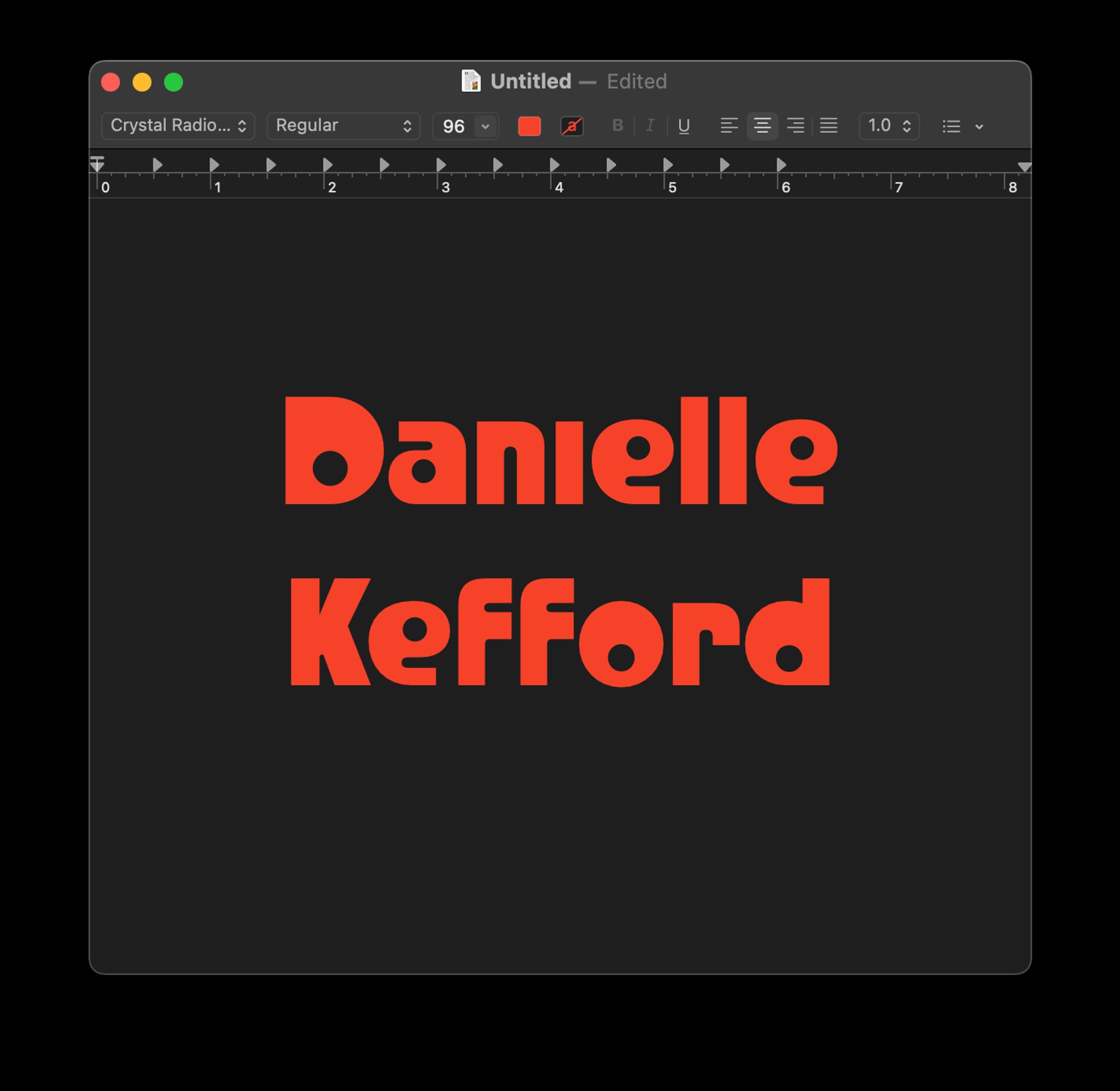
TIL someone made a font with glyphs reminiscent of the old Radio Shack logo, and since I worked there for like 7½ years, I just _had_ to get it...
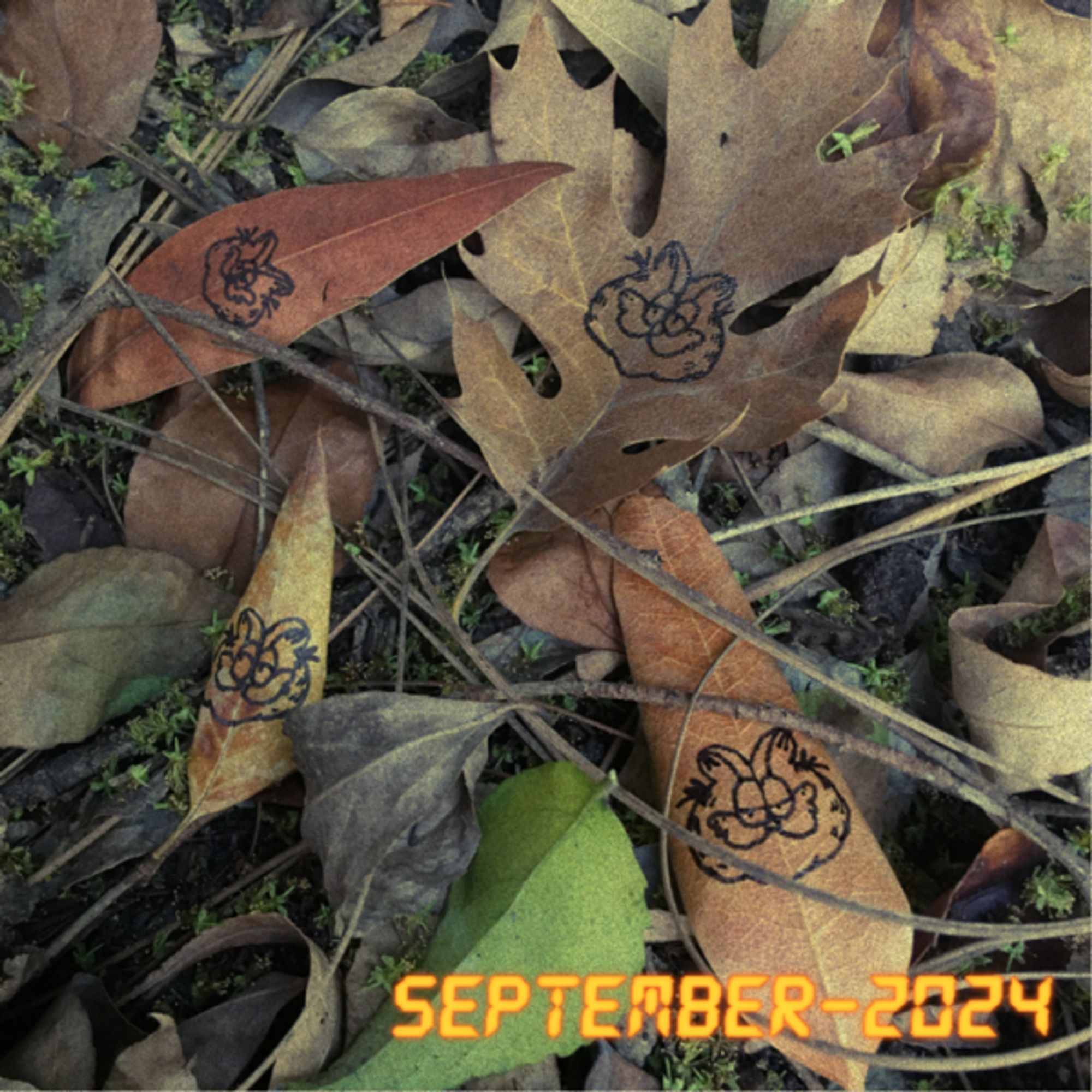
September playlist! It's early fall! It's late summer! It's supposed to hit 100f for us this week! Public posts up at the usual places: ✨Comradery: https://comradery.co/bzedan/posts/1266https://www.patreon.com/posts/113119764
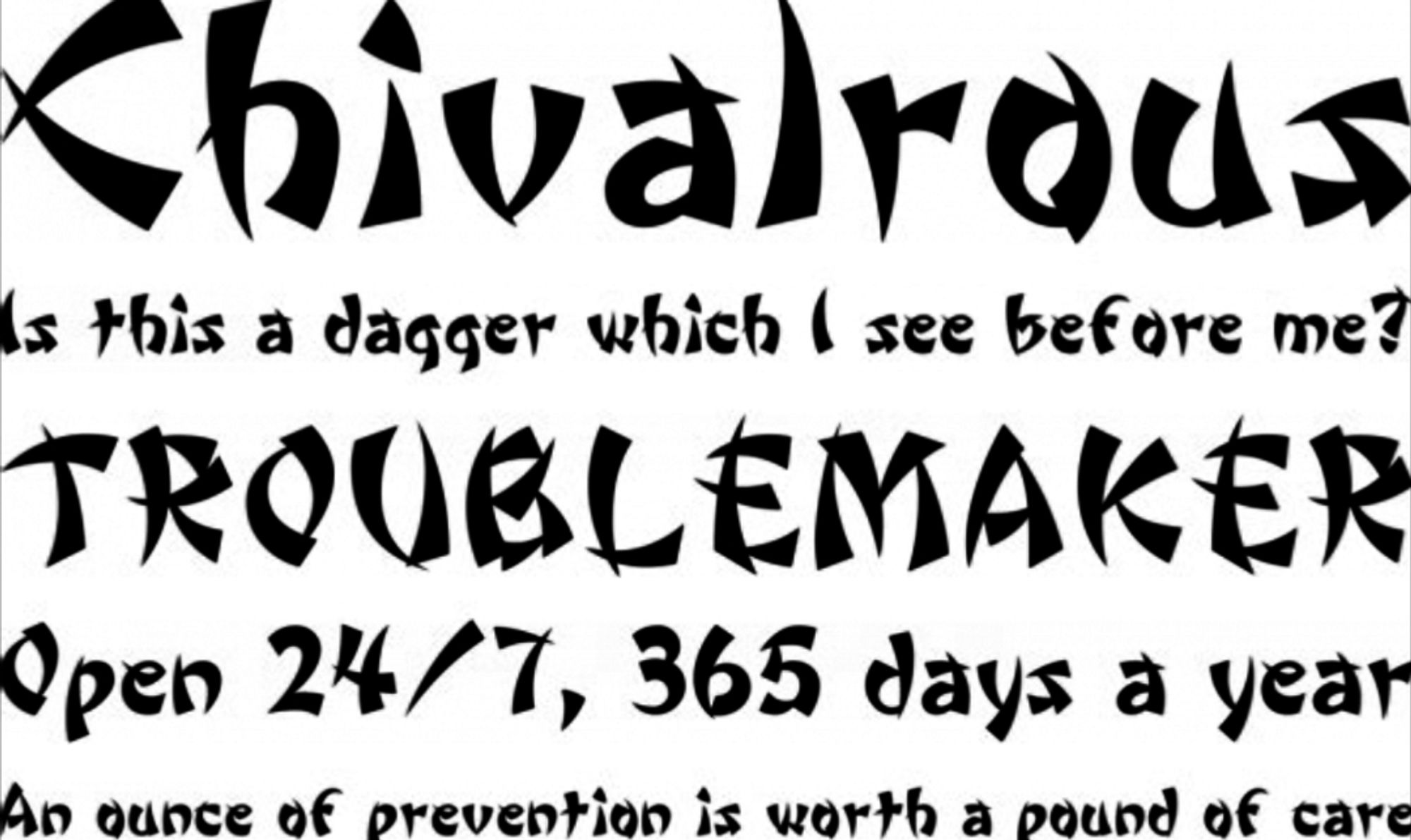
wonton font bros, we are so back
So, as artists, and as computer programmers, I find the true horror is that we can never rely upon a proportional font to give us consistent results. Our careful calculations will yield wildly different results if we ever want to change anything about our text... Why is this not a grid?!
Papyrus *is* a slutty font
Tu peux voir aussi avec l’hopital Saint Louis qui ont aussi cette spécialité Ainsi que l’Hopital Américain où là c’est sur qu’ils font des AG dentaires