AG
Andrea Gokus
@agokus.bsky.social
McDonnell PostDoc Fellow at WashU in Saint Louis, working on active galactic nuclei.
Enthusiastic about music 🎶 , space 🚀, dogs🐕 and saving planet Earth 🌎.
32 followers45 following27 posts
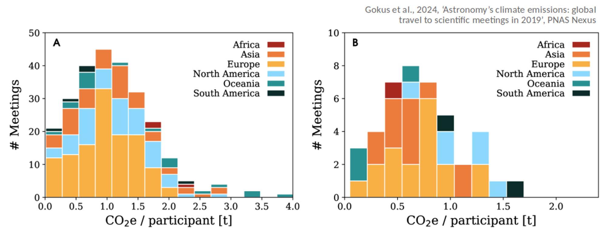
The distributions of the average CO2-equivalent emissions/person/meeting, here split for conferences and schools (since they pursue different goals for participation), show how widespread travel-related emissions are, depending on the meeting.
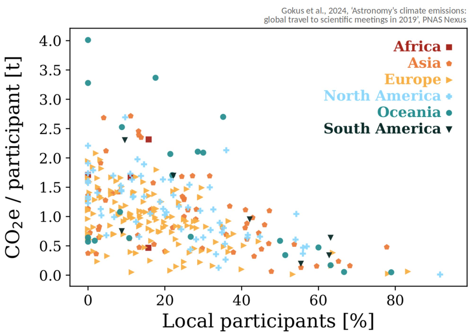
Not a big surprise, but the higher the amount of local (< 100 km from venue) participation, the smaller the average emissions. However, even meetings with few local attendees can have travel emissions below the average.
I didn't realize that there are far more conferences in Europe than in North America.
AG
Andrea Gokus
@agokus.bsky.social
McDonnell PostDoc Fellow at WashU in Saint Louis, working on active galactic nuclei.
Enthusiastic about music 🎶 , space 🚀, dogs🐕 and saving planet Earth 🌎.
32 followers45 following27 posts