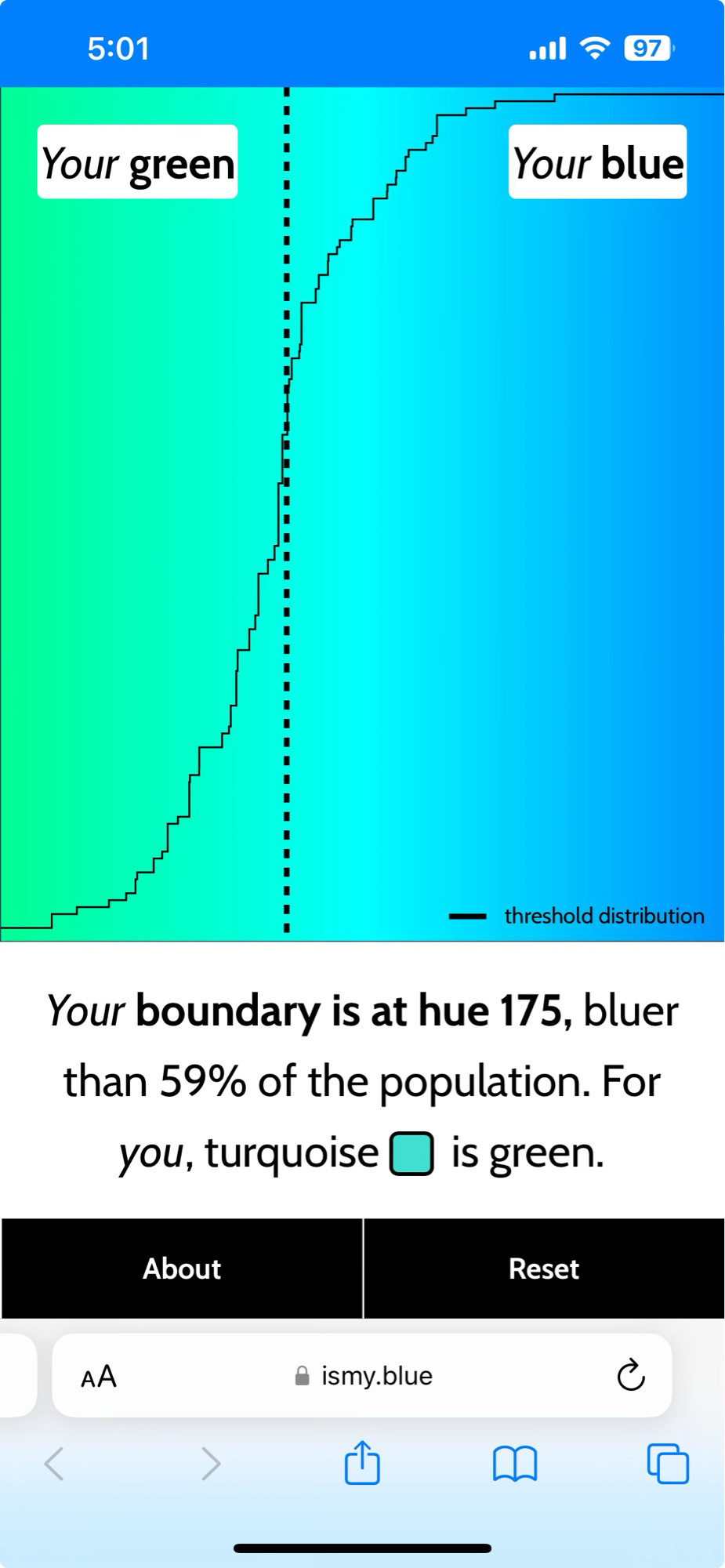
This is fascinating, and it makes me think once again that we need a basic color term (turquoise? teal? cyan?) between blue and green.
Bleen, clearly.
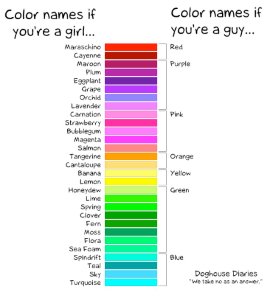
For me teal is greener than it's blue, while turquoise is bluer than it's green. I think the term that makes me imagine the true smack-in-the-middle colour is "aqua". ("Cyan" is a printer's word, and it would look odd if used to describe, say, the colour of some swimming-pool tiles.)
Oh boy! We're talking about cross-linguistic (in)consistency in basic color terms (as part of linguistic relativity) in my Language, Mind, & Society class in two weeks -- definitely gonna share this with my students! It's kinda weird that the light vs. dark blue distinction is the one English lacks
Looking at it, I see the line as between green and cyan and cyan and blue.
What 12 years of research on color terminology has taught me is English makes some really weird choices about the basic colors terms.

Don't the paint manufacturers have precise codes for specific pigments and shades? I think the people who sell colors have technical nomenclature and taxonomy, but such terms are not conducive to beautiful prose.
No it's Seafoam !