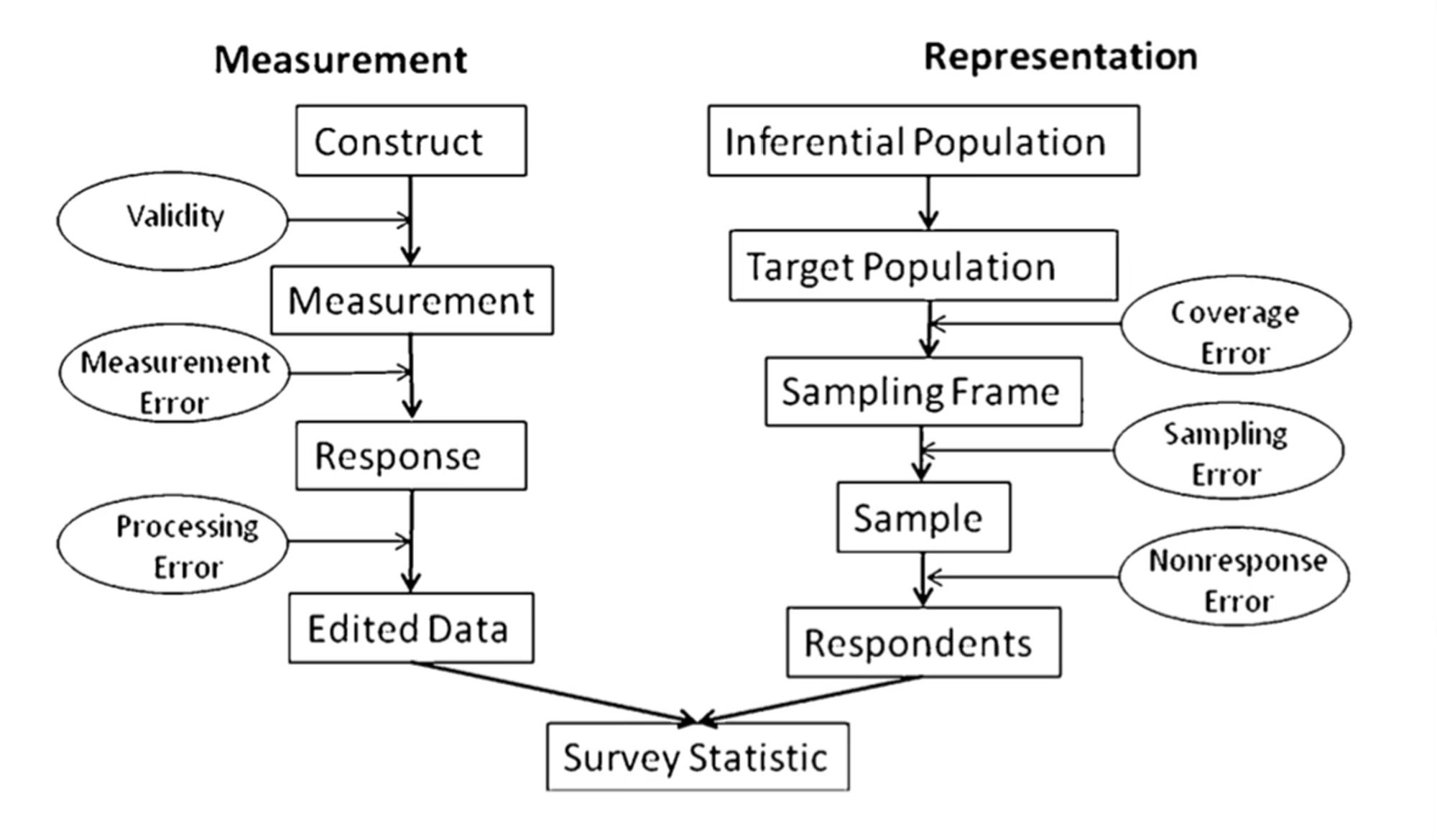
So in my field, we have this idea of “total survey error” where we enumerate all the many factors that can cause your estimate to deviate from the true population value. Most of them can’t be measured or quantified except in rare situations. But we tend to approach estimates with this in mind.
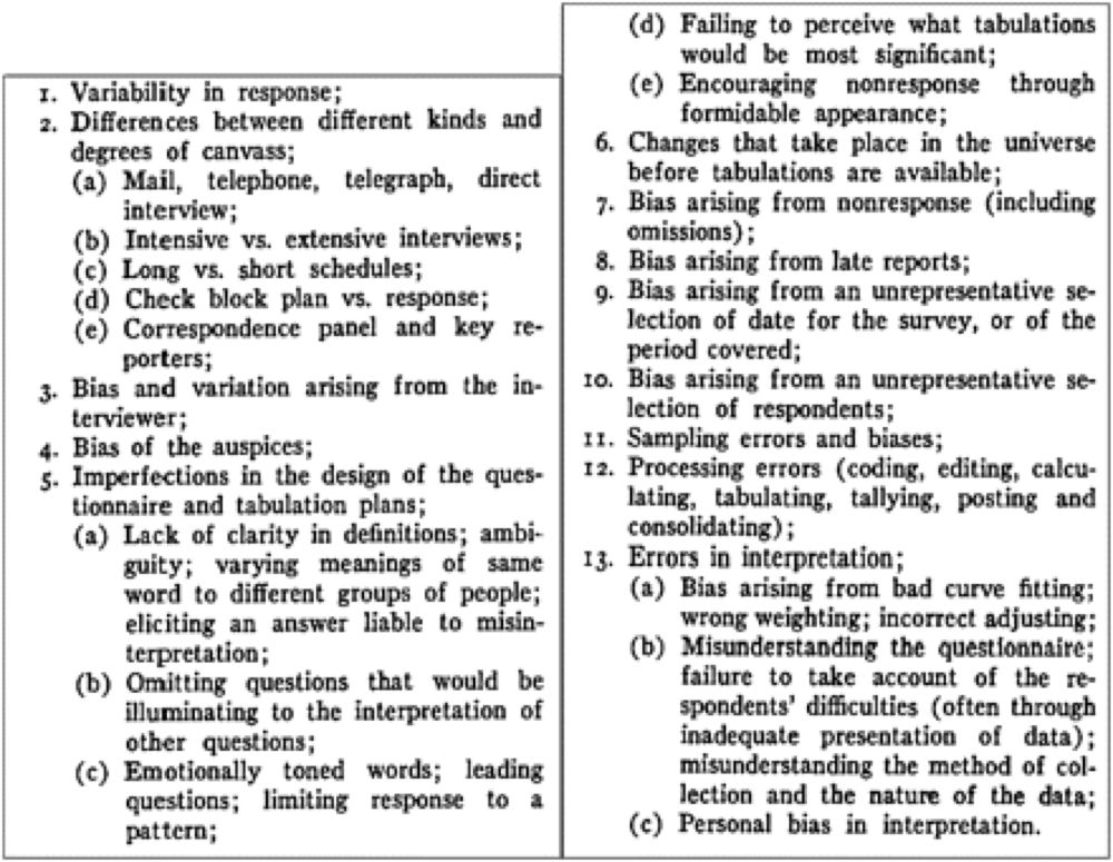
And when these sources of errors compound, really really weird things happen. We have simulation results showing 0% reproducibility of true results under measurement error and 100% reproducibility of false results for example. Gets worse with larger N too!
can I have a reference to this diagram if that’s ok?
I feel like this is a really helpful way to look at things. P-values or confidence intervals capture only a tiny part of all of this. They’re also the only part that’s easy to quantify. But this approach means we approach them with a degree of humility and don’t try to over interpret them.
Where's "there's a bug in the analysis code" fit into this chart? I'm asking for... uhh... a friend. Yeah, that's it. I'm asking for a friend!