BLUE
Profile banner
CS
Cédric Scherer
@cedricscherer.com
🧙‍♂️✨📊 Independent Data Visualization Designer, Consultant & Instructor ♢ PhD in Computational Ecology ♢ Interested in all things data & design ♢ #DataViz with #rstats, #ggplot2, #Figma and more ♢ he/him
1.3k followers473 following189 posts
CScedricscherer.com

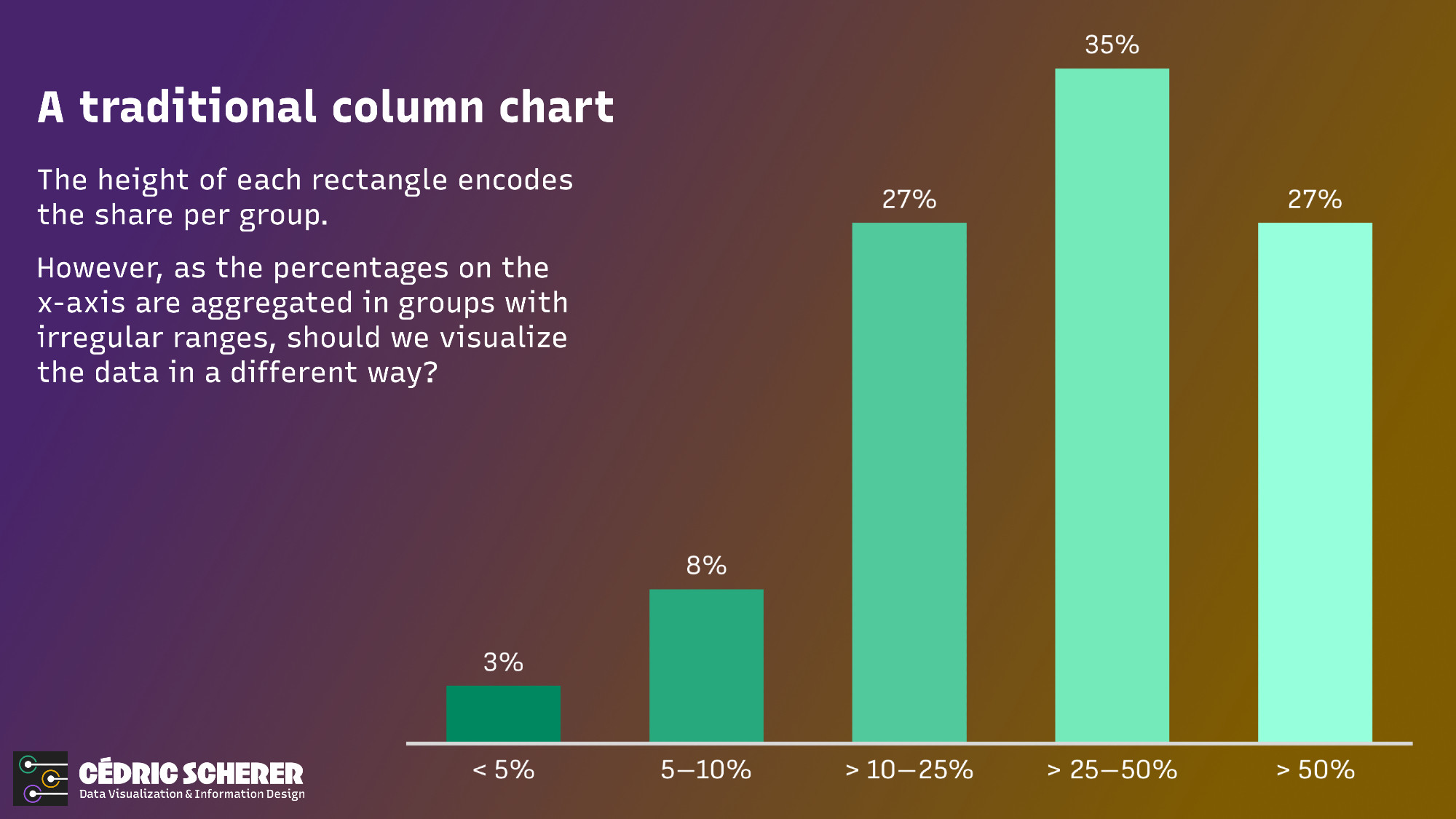
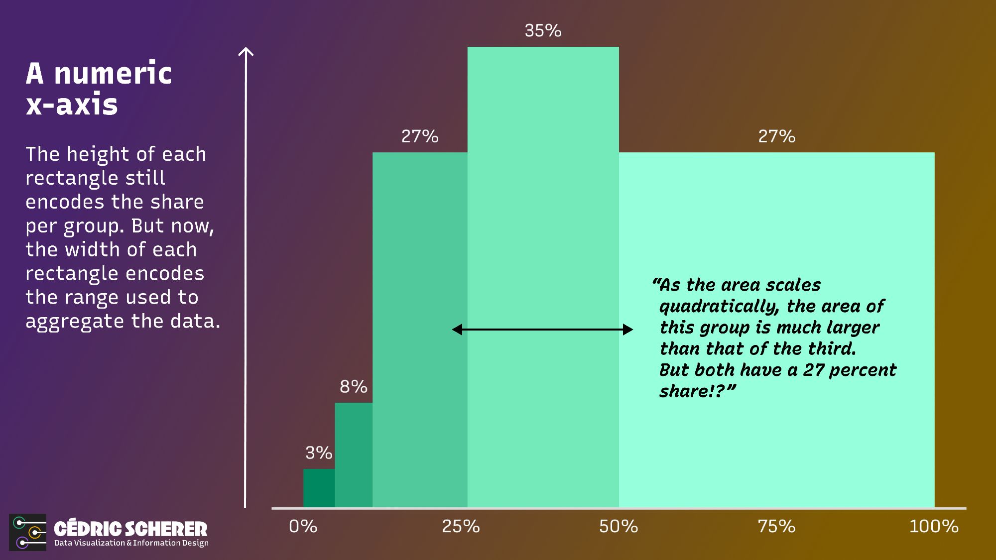
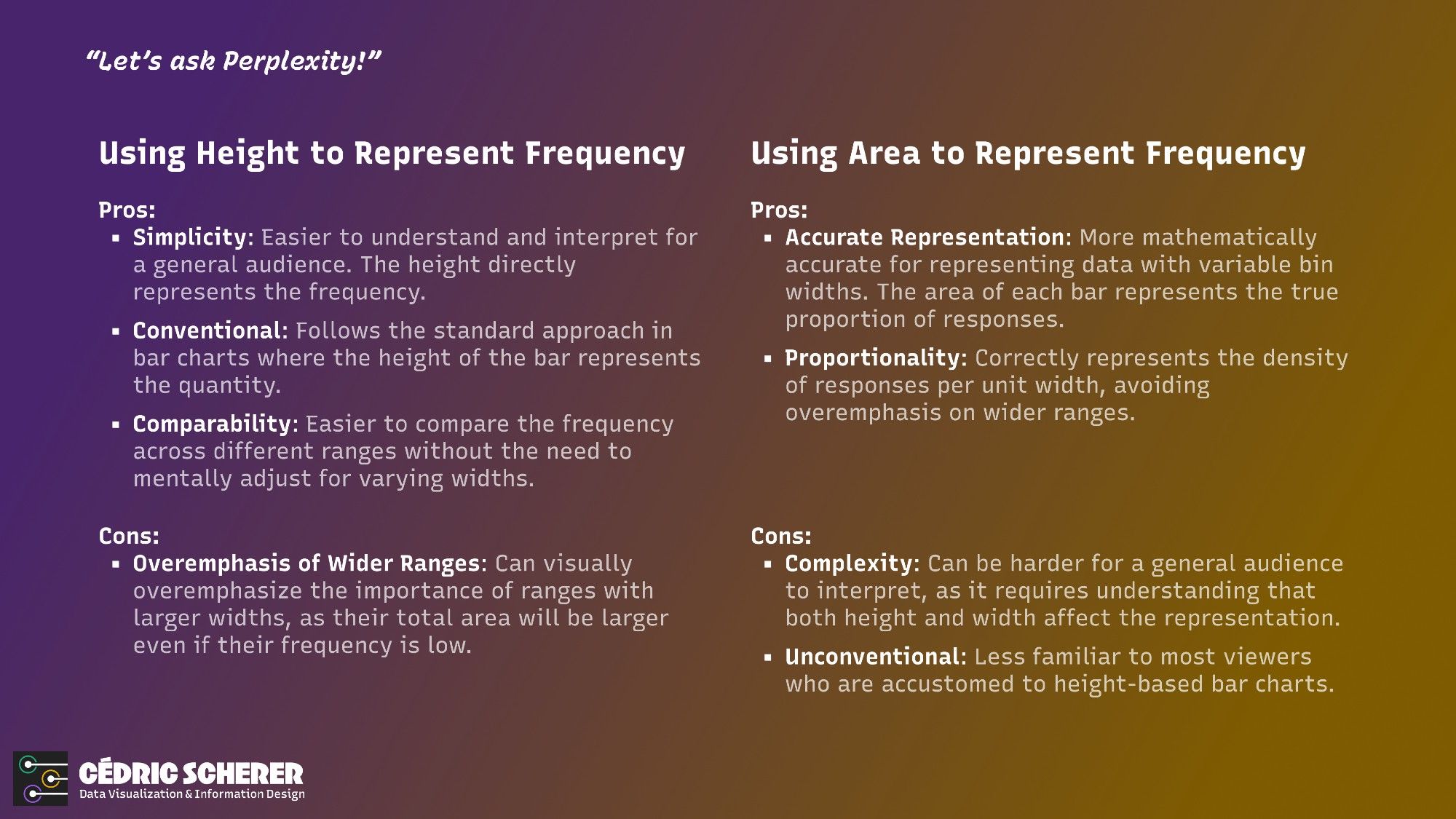
📊 Have you ever needed to create a bar chart when data is aggregated in groups of different ranges? While researching the pros and cons, I couldn't find a consensus on what the "best" approach is. As often, "It depends" is the best recommendation I could find. #dataviz#datavis#datavisualization

A traditional column chart. The height of each rectangle encodes the share per group. However, as the percentages on the x-axis are aggregated in groups with irregular ranges, should we visualize the data in a different way? 

In the made-up example shown, the groups on the x-axis are aggregated as <5%, 5-10%, >10-25%, >25-50%, and >50%. The groups >10-25% and >50% both have bars with a height indicating the same frequency of 27%.
A numeric x-axis. The height of each rectangle still encodes the share per group. But now, the width of each rectangle encodes the range used to aggregate the data.

As the area scales quadratically, the area of the last group is much larger than that of the third. But both have a 27 percent share.
Percentages encoded by area. To prevent rectangles with larger x-axis ranges from giving a false impression of greater importance than those with similar shares, we can map the share to the area instead of the height.

This might be correct, but how can we ensure that viewers understand and interpret it correctly?
A comparison of pros and cons when visualizing frequency by height (simplicity, conventional, comparability versus overemphasis of wider ranges) or area (accuracy, proportionality versus complexity, unconventional)
0

Profile banner
CS
Cédric Scherer
@cedricscherer.com
🧙‍♂️✨📊 Independent Data Visualization Designer, Consultant & Instructor ♢ PhD in Computational Ecology ♢ Interested in all things data & design ♢ #DataViz with #rstats, #ggplot2, #Figma and more ♢ he/him
1.3k followers473 following189 posts