
Hey, that's awesome progress! Thank you for sharing. The easiest way to learn colors is to always make your own color palette and also use good reference ;)
Its very simple^^ I did rotate the back card in Aseprite, which tilts the artwork but keeps it all on the pixel grid. I then fixed the skewed pixels so it doesn't look bad. It only works because most of the card is hidden by the one in front, because this is how they look without:
You got them all, and also respect for getting the reference to the rune language. I had to learn how it works to make that one, only to have nobody but a few people like you actually notice that detail. ;D
That's a pretty crazy compliment, because I have improved massively in the three years since then. I appreciate that. I was thinking of remaking this at some point to check if I can make it even better
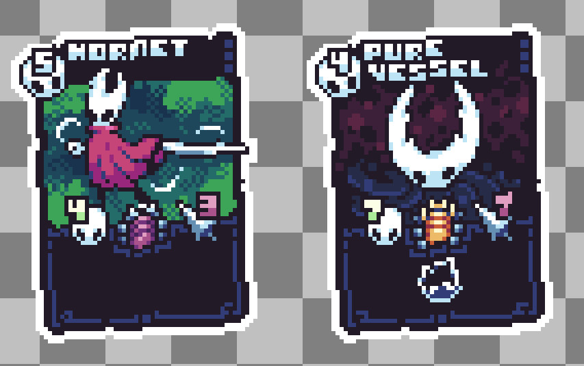
Yup, that's them. Some of my favs as well ;D
That's exactly it, yes!
Man, I just love your concept designs. Every time I see a new design from you, I am just always so surprised by your ideas and attention to detail. <3 I love all the poses, but if I had to choose, it would be B.
I just think it looks nice to make an object stand out more, gives it a nice magical feel. The contrast of dark outline followed directly by bright-colored outline just looks great to me. I honestly might have just stolen this detail from another artist called Pixeldoshi, they use it a lot too.
The original trilogy of M&L RPGs are soo good, I don't think the 3DS titles really hold up to them that well. I hope you have fun playing them again, I'm also super excited about the new one. I almost gave up hope they were ever making one again^^;
Honestly, I'm also not quite sure how to go about them still. I kinda used two different styles here. The clouds outside the door are more realistic, but I don't like them as much as the clouds inside the door, which are simpler. Might need to do another deep study myself ;)