EH
Eli Holder
@elibryan.bsky.social
How might we visualize people, fairly and equitably? Data / dataviz / design / psychology / research geek. He / him. Chaotic good. Follows Fizzlethorpe Bristlebane. Design + writing at 3iap.com.
712 followers1.5k following117 posts
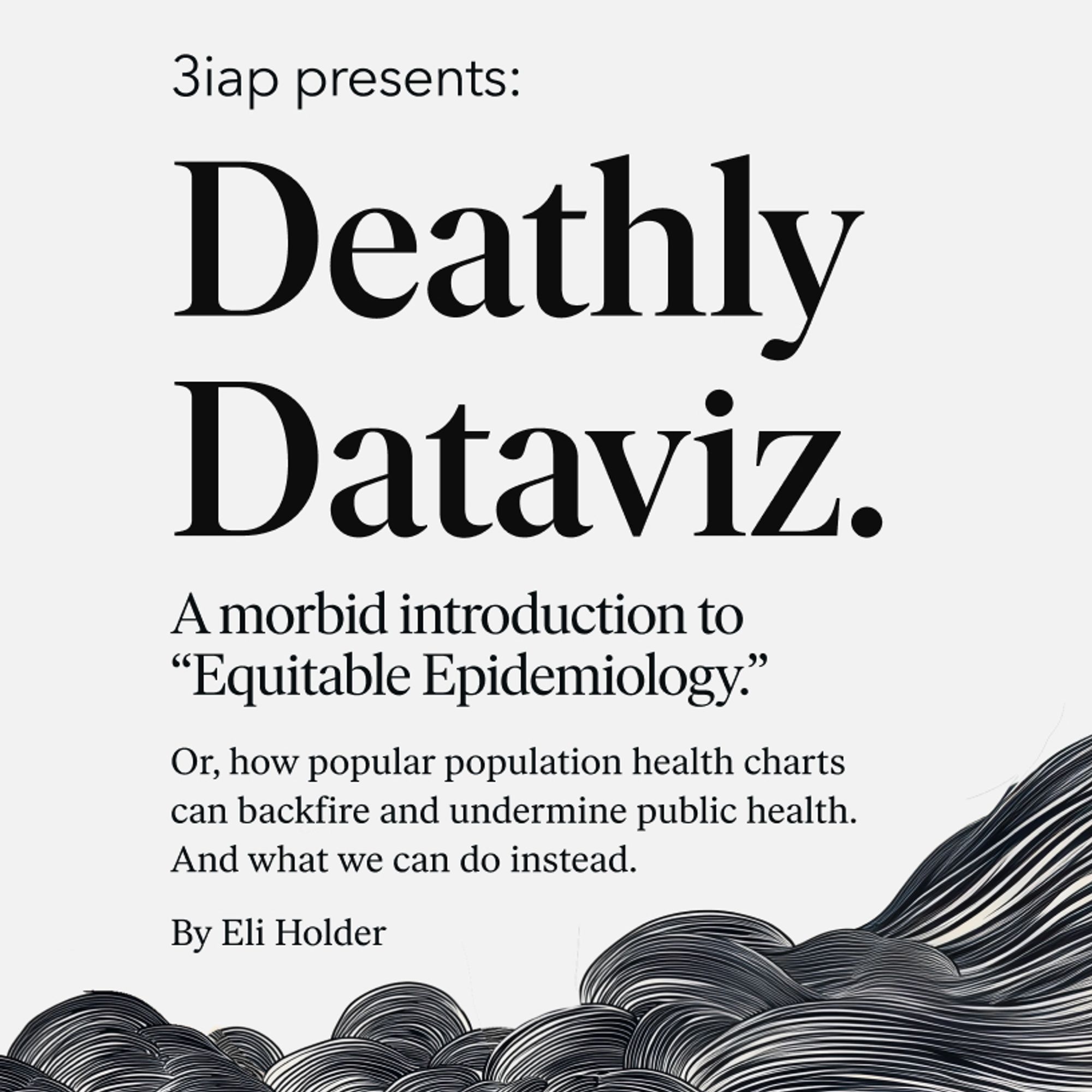
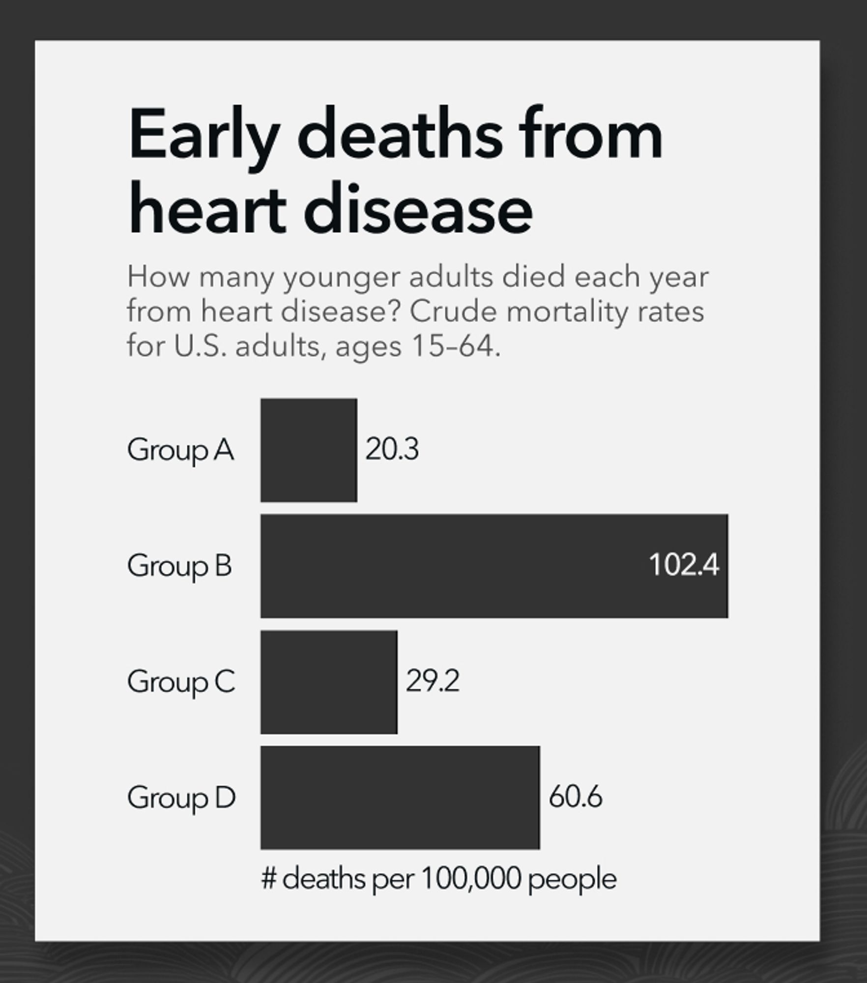
Presenting new 📊 work at tomorrow's UK Healthcare TUG, absurdly asking: Can some charts be deadly?! Could visualizing population mortality risk plausibly, conceivably, maybe, actually increase population mortality risk? And... could we solve this with design? usergroups.tableau.com/events/detai...
EH
Eli Holder
@elibryan.bsky.social
How might we visualize people, fairly and equitably? Data / dataviz / design / psychology / research geek. He / him. Chaotic good. Follows Fizzlethorpe Bristlebane. Design + writing at 3iap.com.
712 followers1.5k following117 posts