Why? This seems like a major invasion of privacy.
At this point, anything is better than whatever Twitter turned into.
Yeah, it's that gorgeous, savory smell from whatever Czech printer Swordfish Islands uses. Tome of Black Sand has that same "nostalgic musk" smell. Lol
The Zweihander team did sponsor two upcoming videos of mine, but they were cool enough to do so with my free reign to absolutely tear things apart. So far, I've got nothing but positive feelings about the Reforged project, and you can follow it here: www.kickstarter.com/projects/zwe...
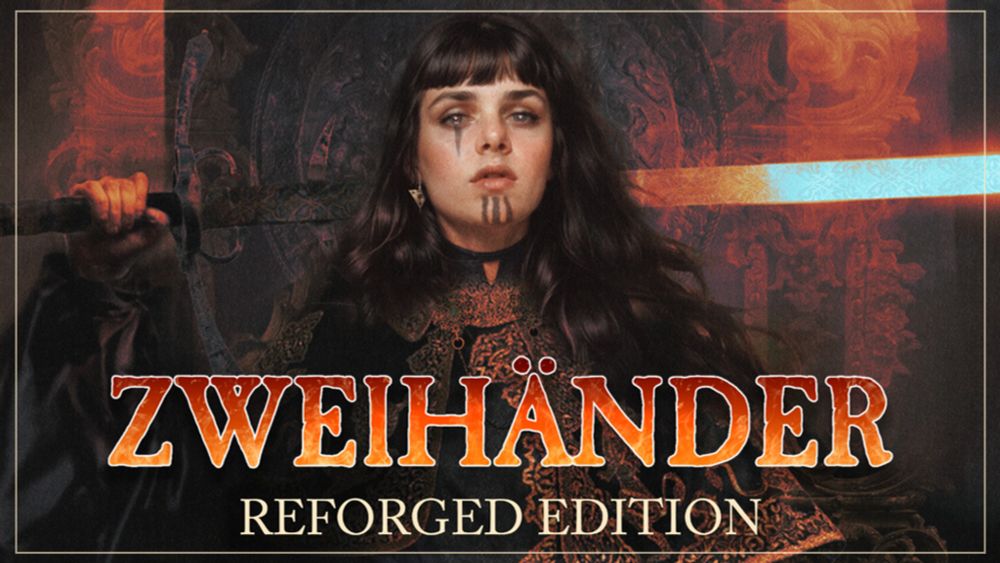
The next evolution of the ENNIE award-winning dark fantasy tabletop RPG is here!
I'm going to go into it in my video even further, but hearing the Zweihander Reforged project cut the total page count by ~260 pages gives me a lot of hope that this will be the thing to get this system core played at more tables.
Taking a look at "Flames of Freedom" (a Zweihander game), it appears to also have gotten the updated layout, with headers broken up by more apparent colors and sizes. It is undeniably a bigger book, but bigger for "content", not core. These reductions are fantastic
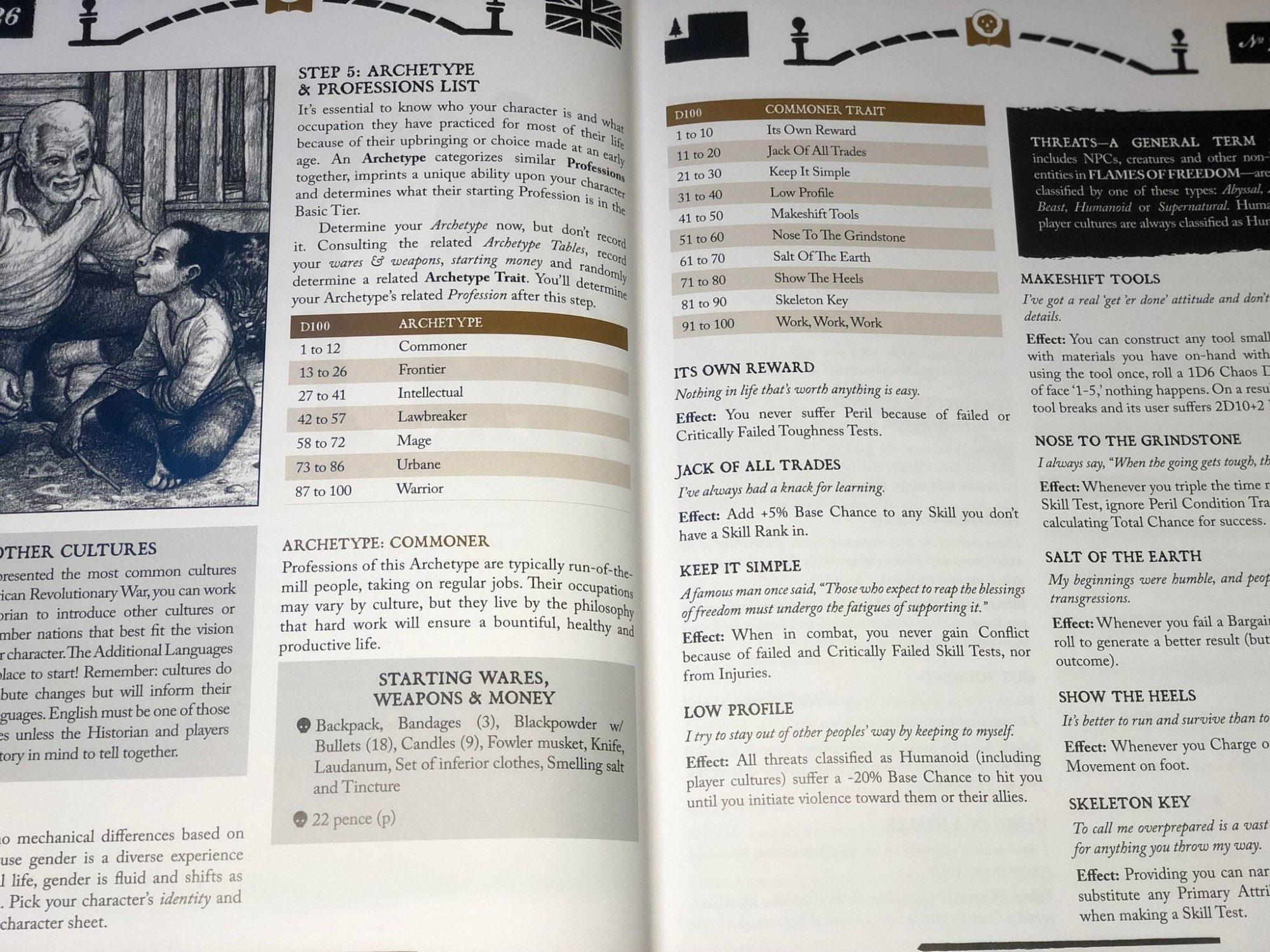
It's also quite a lot of "Black Text on White Background" that even the designers have acknowledged needed a more thorough editing pass to help reduce word bloat. Here's that same section in the Starter Kit, which I've been told is very close to Reforged's look and layout:
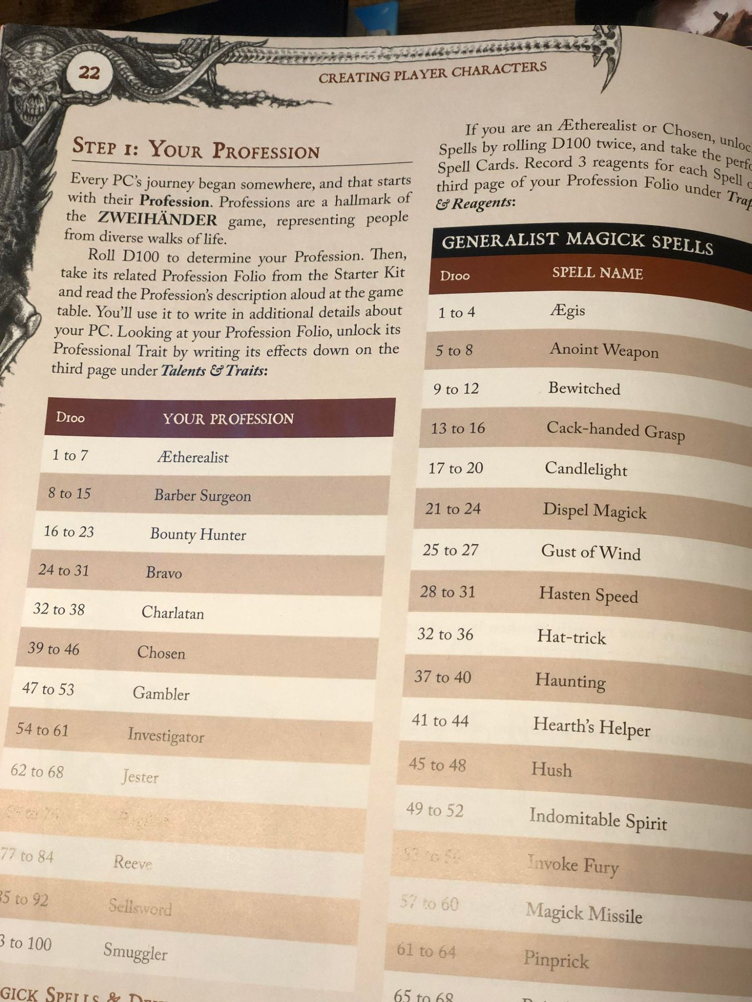
I'll give an example here; "Professions" is the Chapter Header, "Buying Character Advances" is a H1, "What is a Tier?" is a H2. They're all the same color and similar size, and the Center Alignment of H1 can sometimes appear as a Left Alignment when the text is longer.
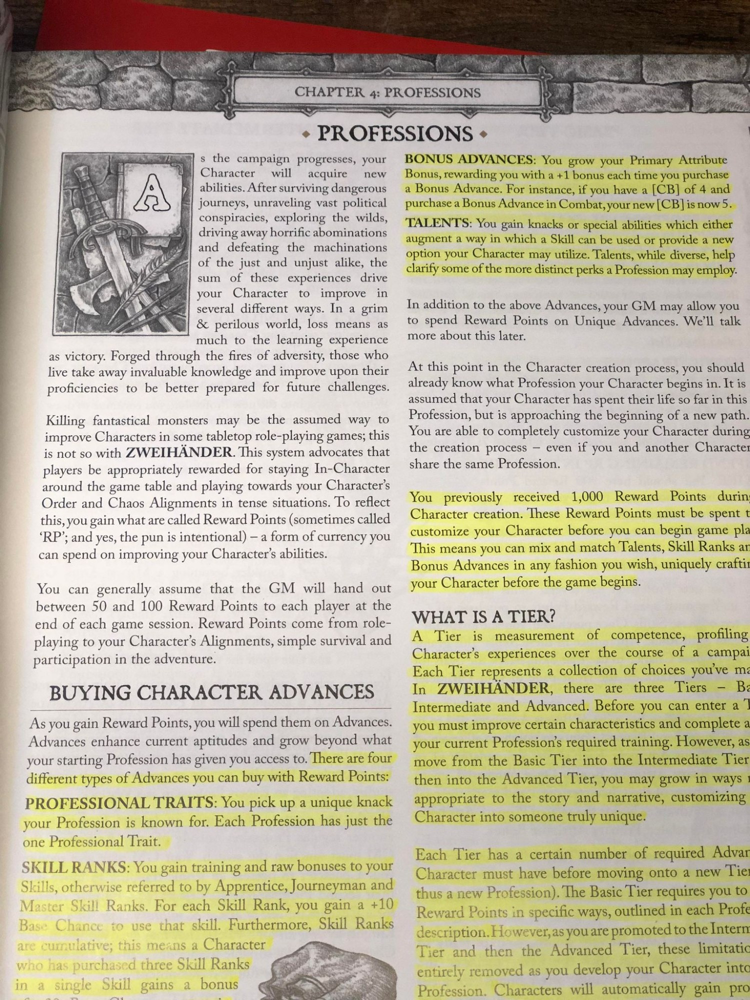
This core has a ton of potential, but WFRP takes the crunch to an extreme that pushes it out of my personal preference. Zweihander does a terrific job of abstracting the subsystems of WFRP, but the header hierarchy of the Revised book isn't clear on sight read.
Which is why reviewers tend to have different rates based on platform size.