
SD
School Data Updates
@jpembroke.bsky.social
Helping schools make sense of their data. Work with insighttracking.com because they make cool stuff. Co-author of Dataproof Your School. sigplus.co.uk/blog/
1k followers184 following330 posts
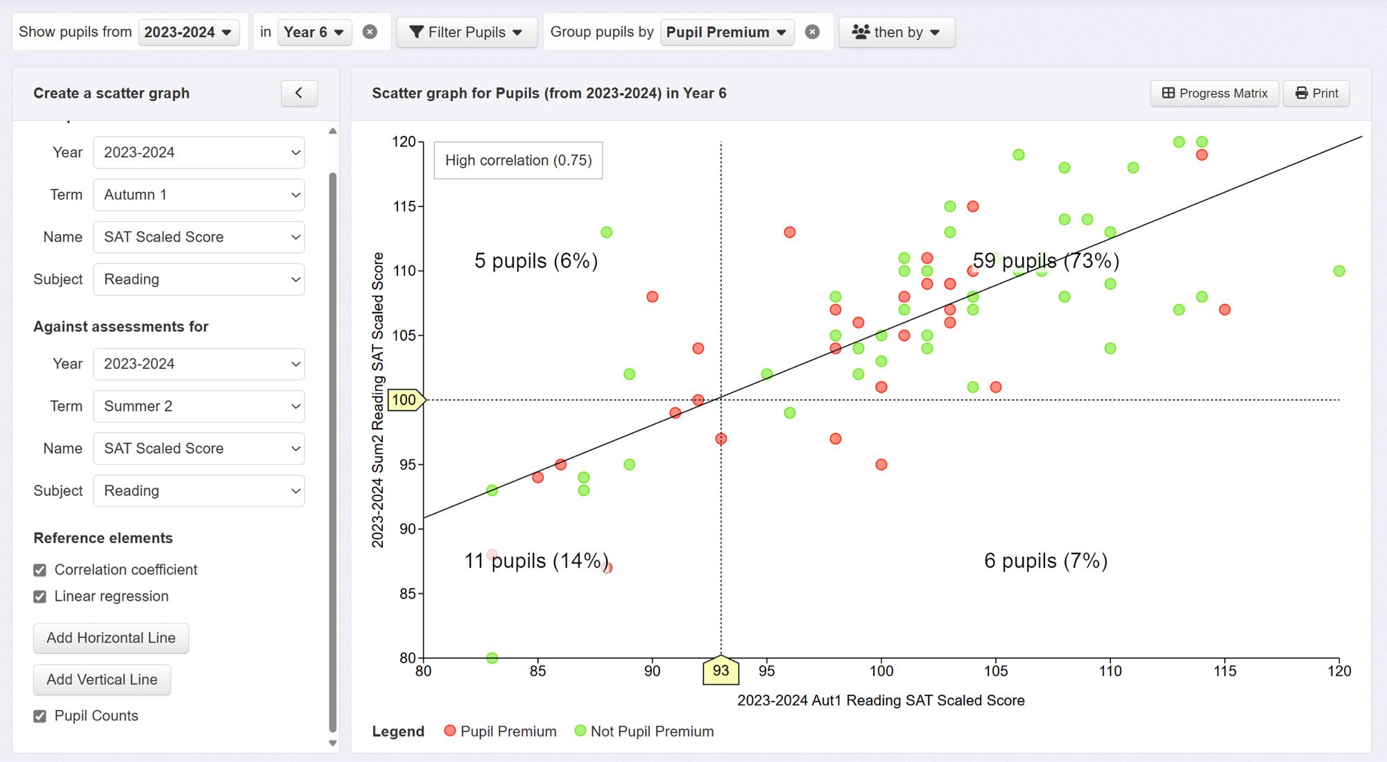
Using Insight scatter plot to compare results of mock KS2 tests in autumn against final results to find reasonable predictor of expected standards. Here, 59/65 pupils scoring 93+ in autumn achieved EXS at end of year (73% of all pupils).
Looking at your graph (and the one for my Trust), if children are on a line which quadrant are they counted in?
Thanks @jpembroke.bsky.social That’s fascinating. Is a scaled score of 93 a better predictor in early Autumn than 94?
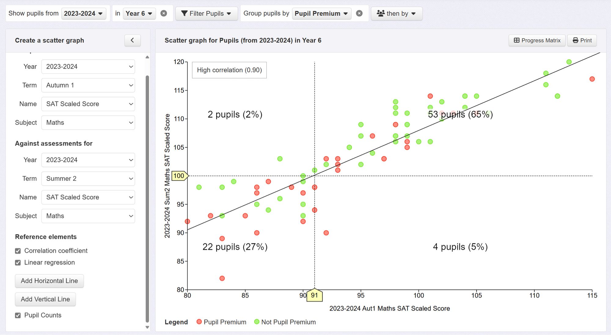
Also great for schools who use standardised tests to compare scores to final scaled scores and see how useful a predictor they are
Looks really interesting. Makes me want to play with my school's data. Though not quite tempting enough to move me off the sofa on a Friday evening!
SD
School Data Updates
@jpembroke.bsky.social
Helping schools make sense of their data. Work with insighttracking.com because they make cool stuff. Co-author of Dataproof Your School. sigplus.co.uk/blog/
1k followers184 following330 posts