Paper by @lucystats.bsky.socialjournals.sagepub.com/doi/abs/10.1...
Missing data is a common challenge when analyzing epidemiological data, and imputation is often used to address this issue. Here, we investigate the scenario wh...
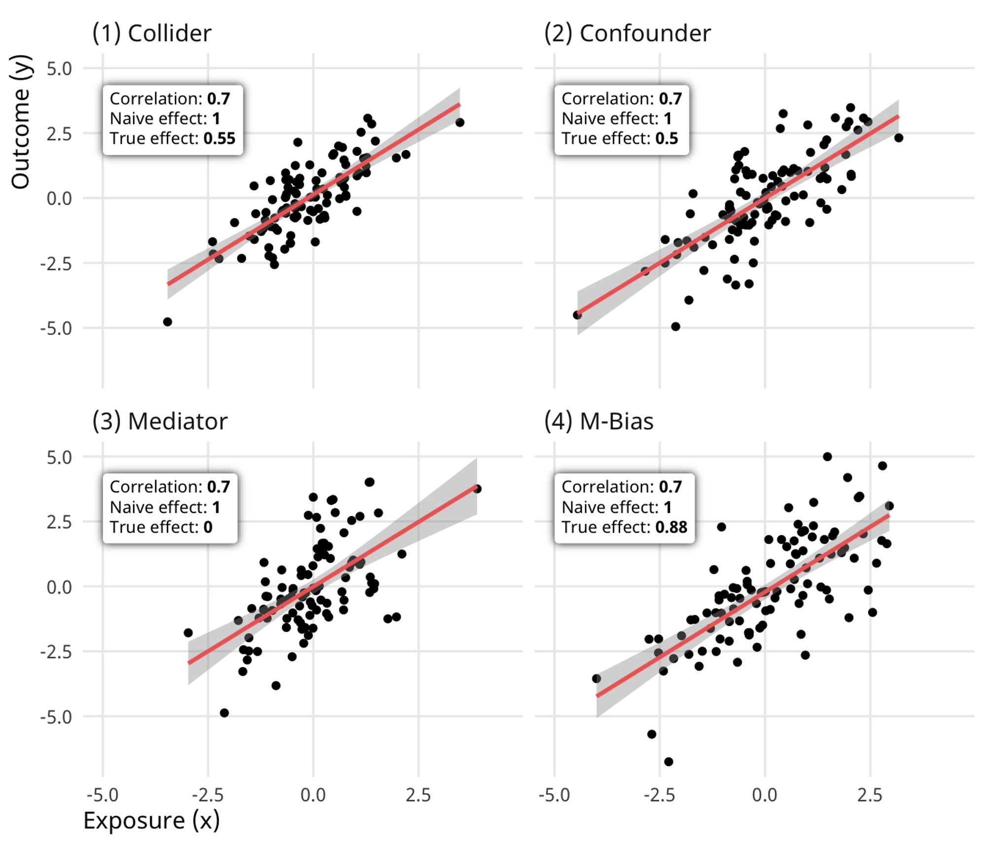
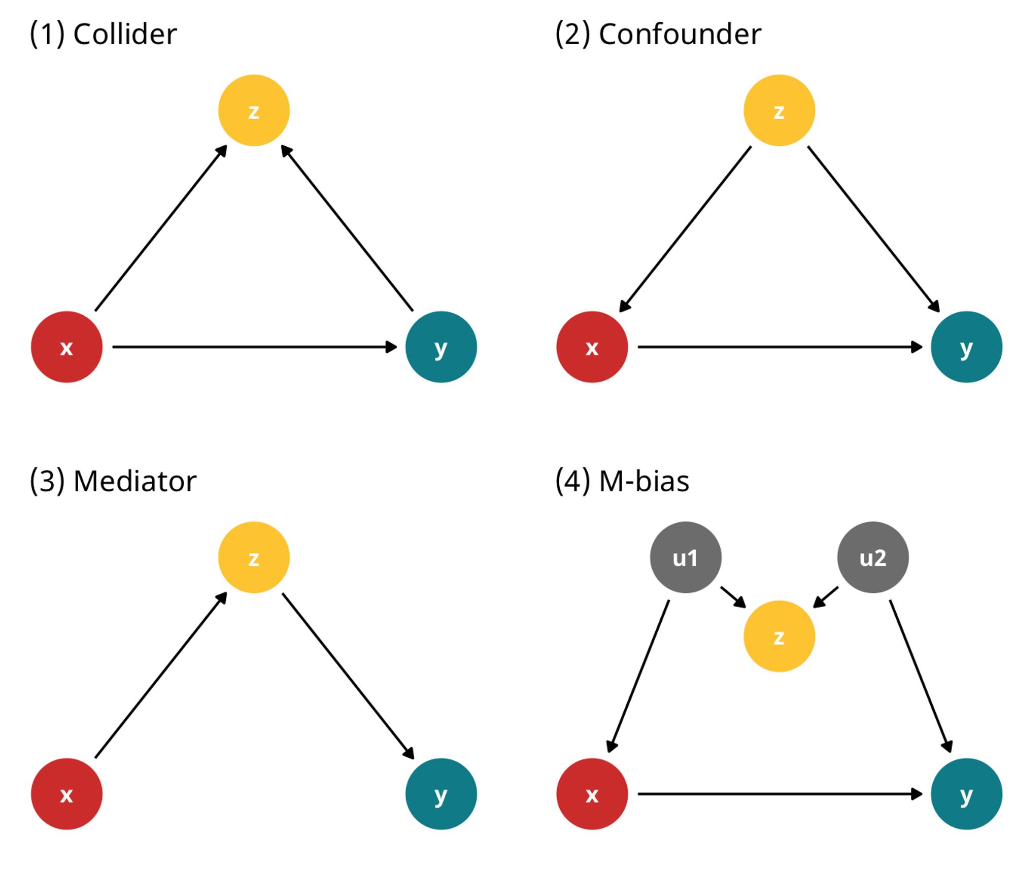
Just discovered the Causal Quartet by @lucystats.bsky.social@travisgerke.bsky.social@malcolmbarrett.malco.io#rstats
I hope in a good way 🫣🫣🫣 I’m always trying to find clearer ways to explain tipping point sensitivity analysis
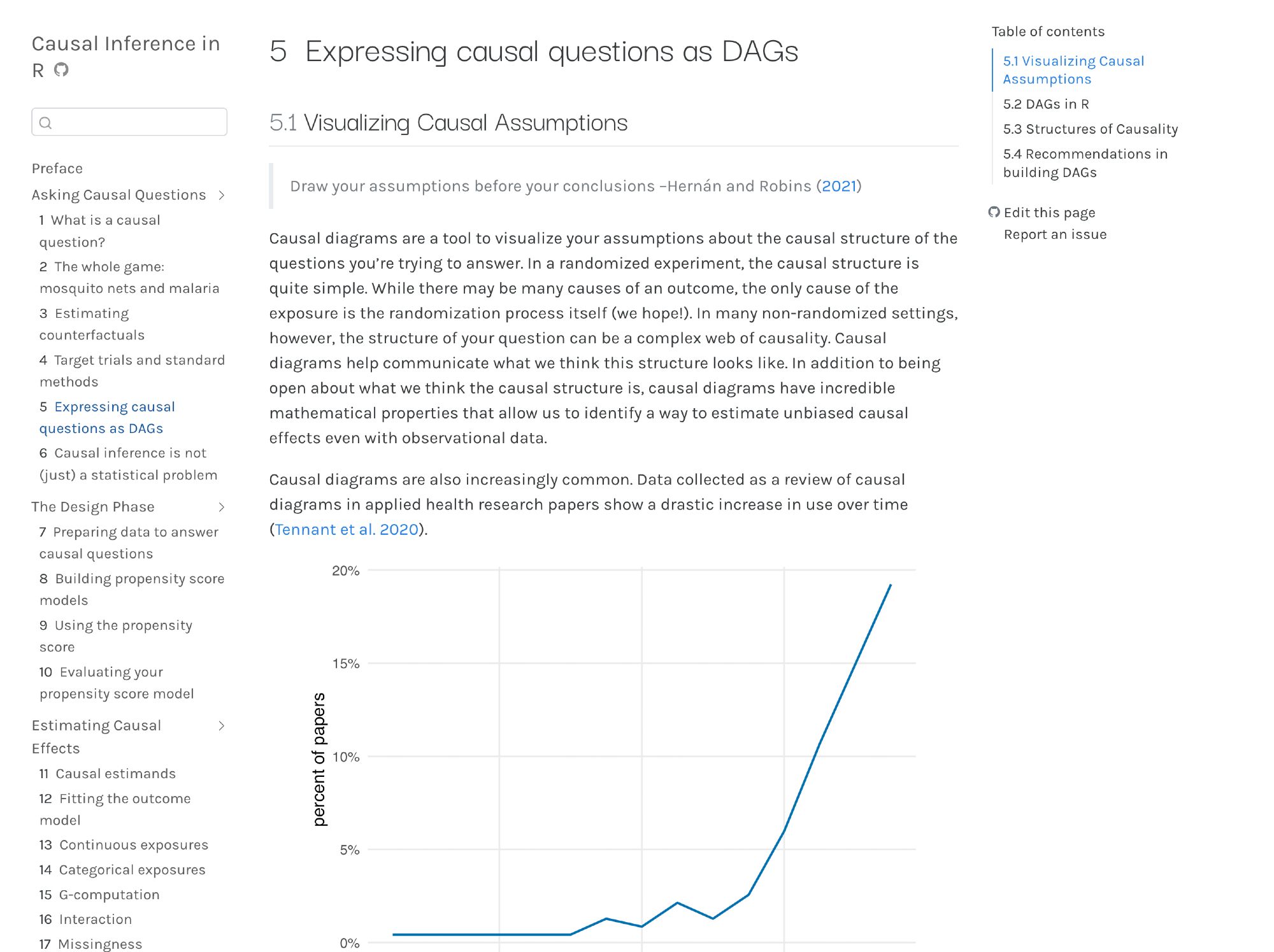
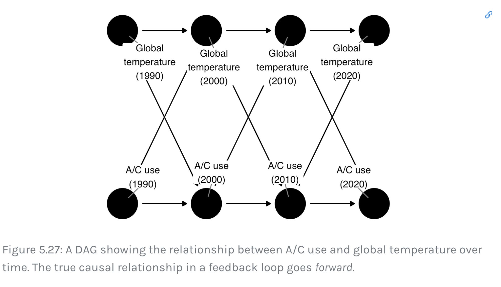
We've made a major update to the causal diagrams chapter of Causal Inference in R! Check it out to learn about DAGs! I think there's a lot in this chapter that is undercovered in other sources. #rstats#causalinference@lucystats.bsky.social@travisgerke.bsky.socialwww.r-causal.org/chapters/05-...
Cheers! Love to hear it! 🍷
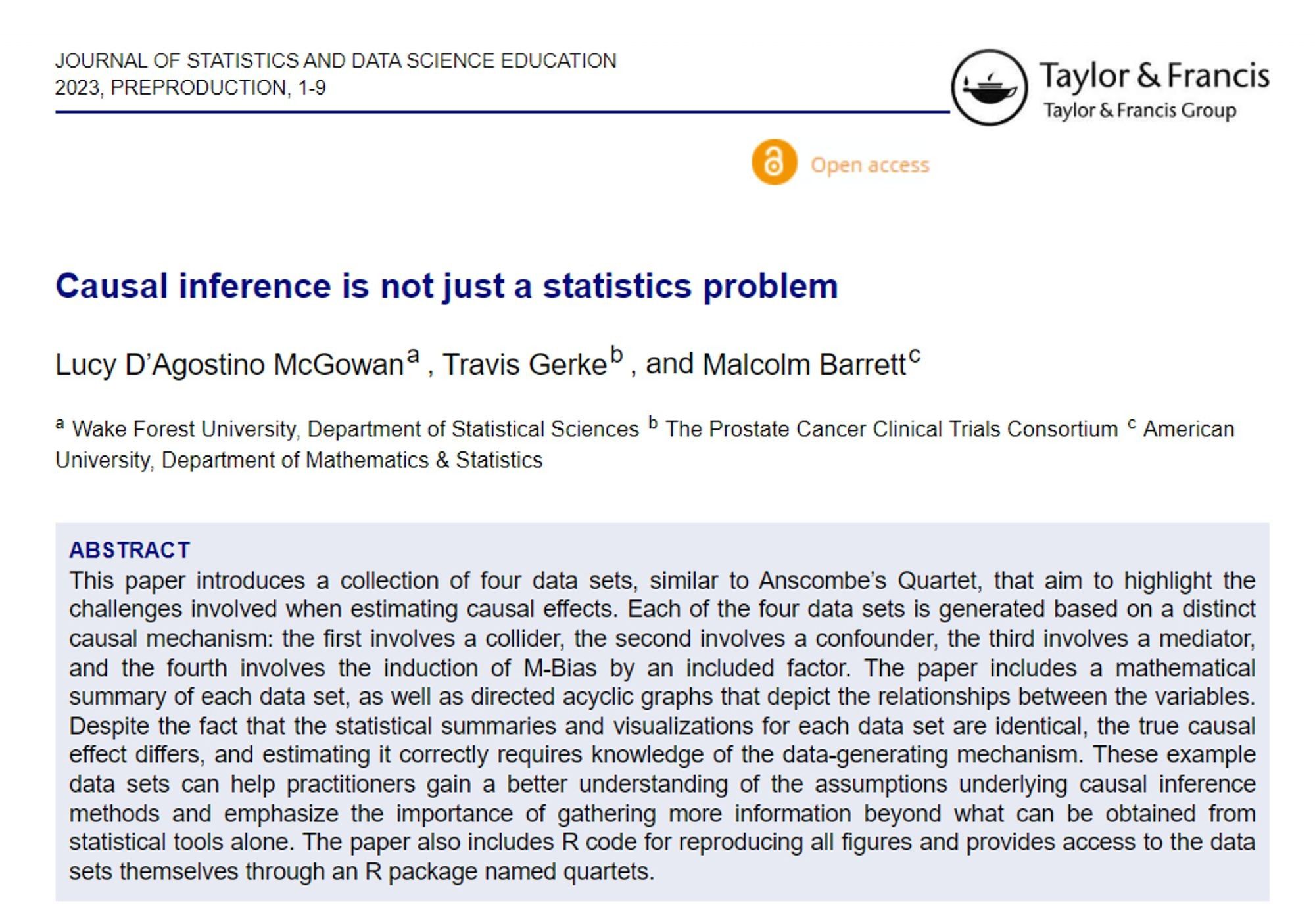
“Causal inference is not just a statistics problem” New article by @lucystats.bsky.social@travisgerke.bsky.social@malcolmbarrett.malco.iodoi.org/10.1080/2693...#Stats#DataScience 🧪
The best part of this job is working with great people!
This week was more fun than words can express! 🌟
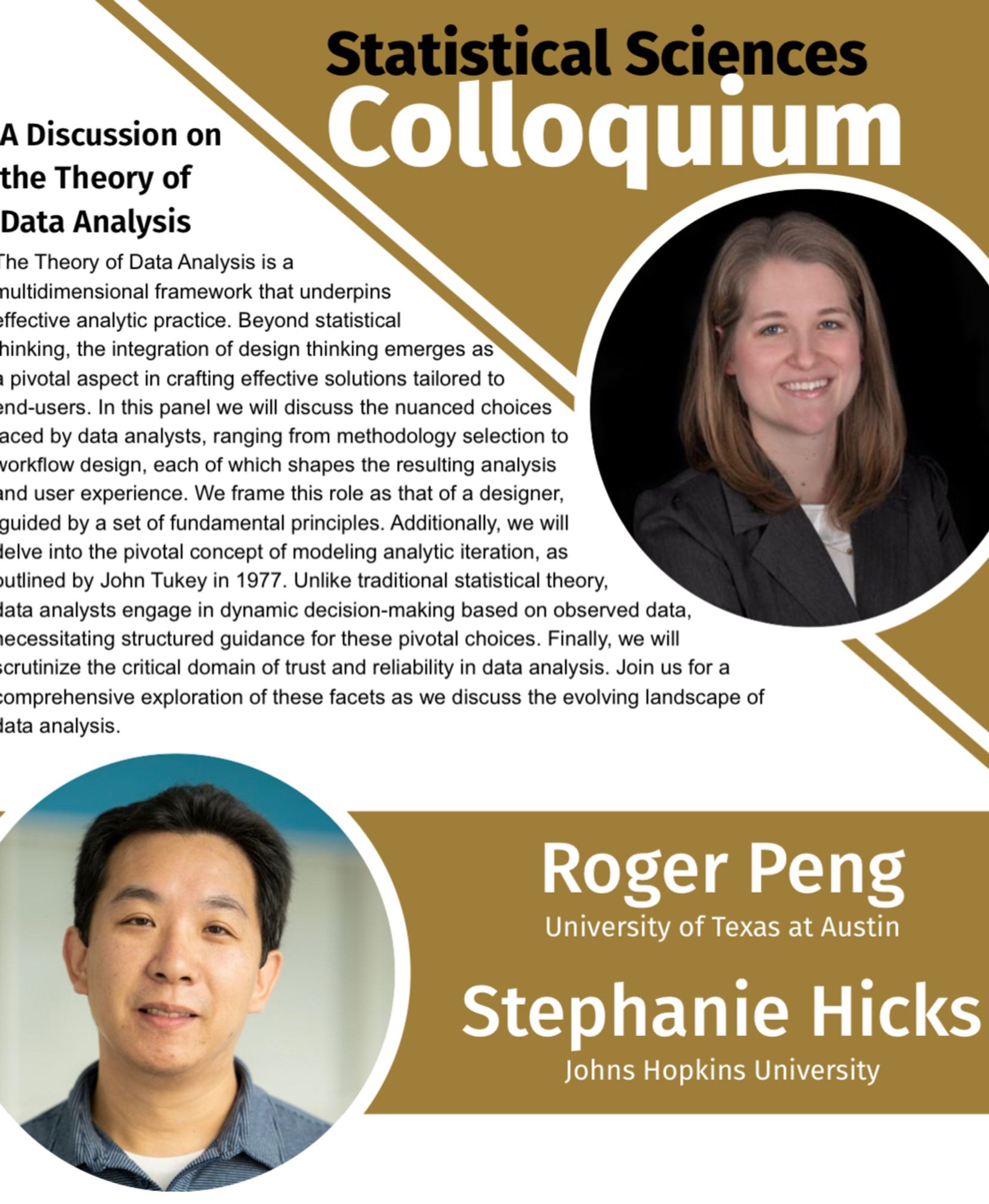
What a delightful week working with @rdpeng.org@stephaniehicks.bsky.social on Analytic Design Theory — stay tuned, exciting things happening here!
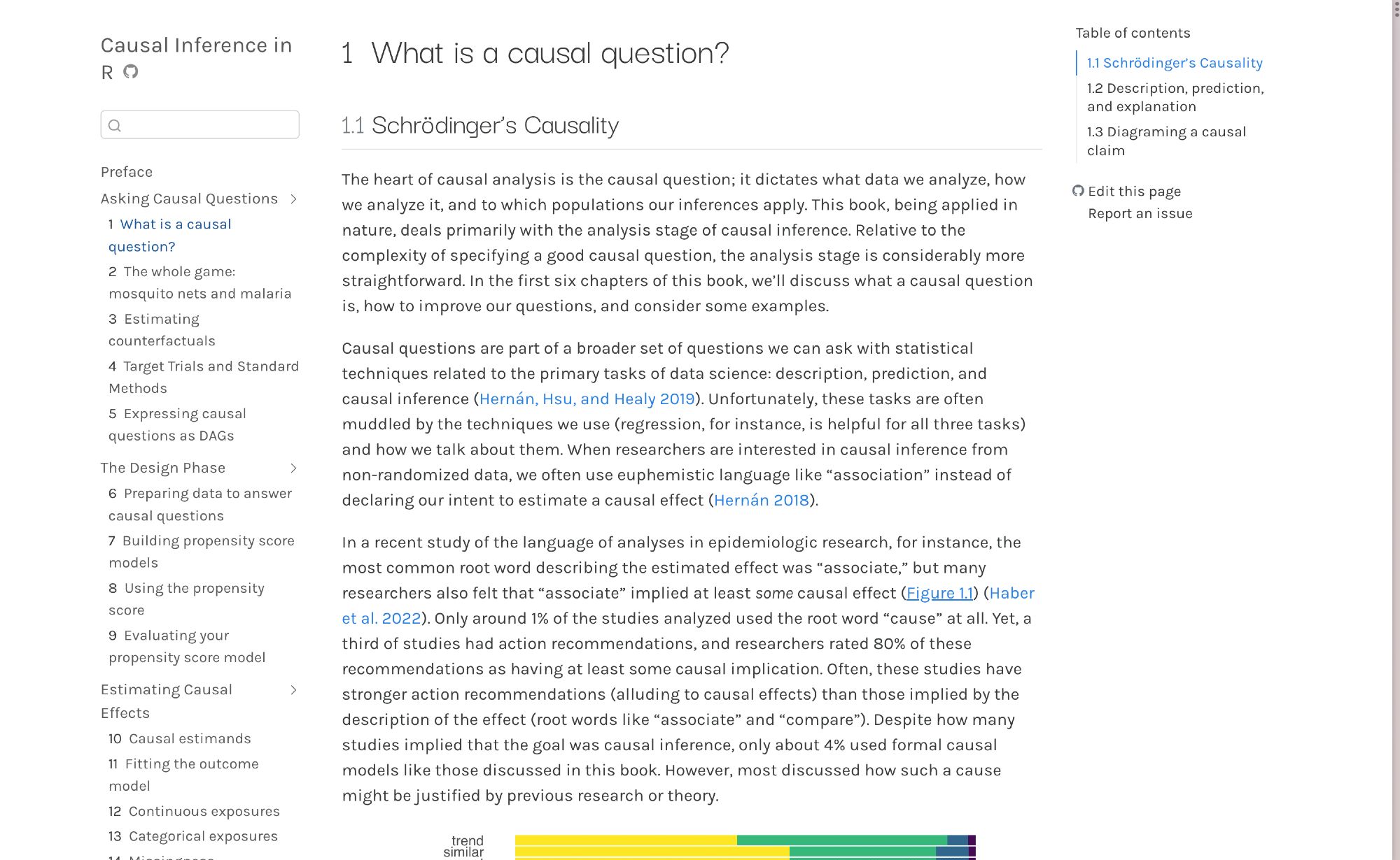
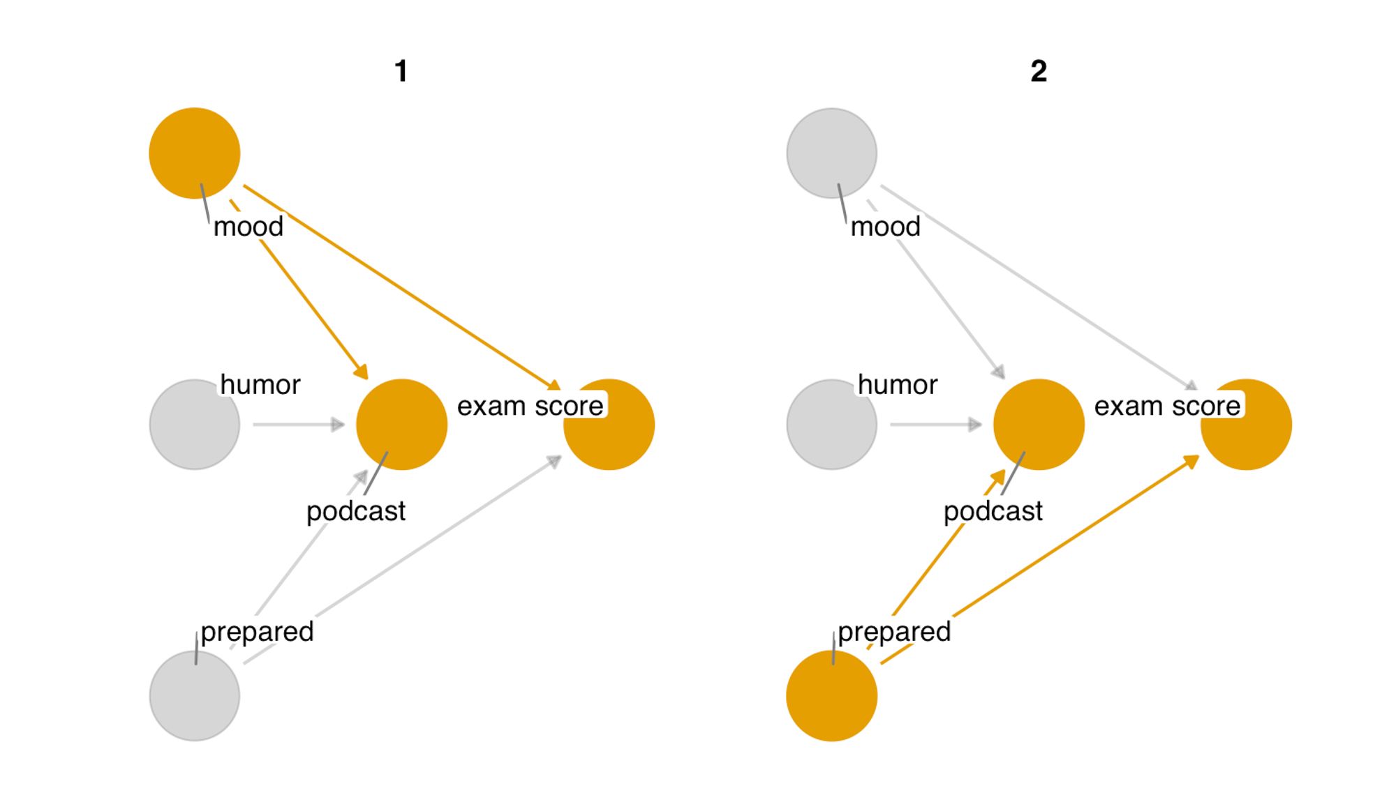
We just overhauled the first chapter of our book, Causal Inference in R! Learn about causal questions, their structure, and the relationship between description, prediction, and causal inference. www.r-causal.org/chapters/cha...@lucystats.bsky.social@travisgerke.bsky.social #rstats