BLUE
Profile banner
S
ShapedNoise
@shapednoisae.bsky.social
Composer-Producer-Sound+Instrument Designer-Educator-Drunkard-Pervert-Flanneur www.shapednoise.com
22 followers23 following78 posts
Sshapednoisae.bsky.social

WOW: thats… terrifying. meanwhile…

1

Cchelecajeleca.bsky.social

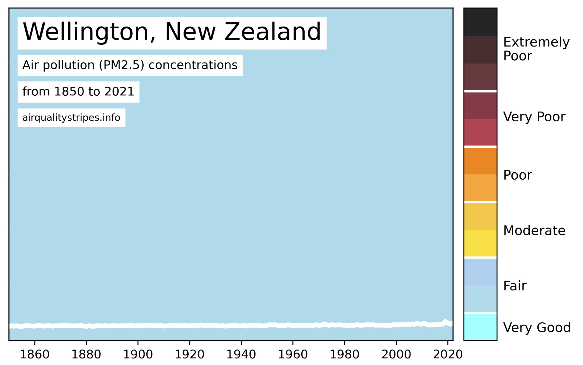
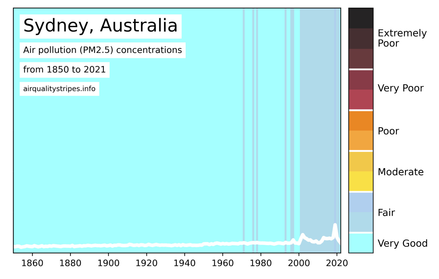
I’m a bit surprised by Sydney compared to Wellington. I assume the 2020 blip is the Australian bushfire smoke that did a world tour.

A graph of air pollution (PM2.5) concentrations for Sydney, Australia, from 1850 to 2021, from the website AirQualityStripes.info. 
The graphic shows a white line graph, as well as vertical colour bar graph showing.  The majority of measurements are in the “very good range”, but with recent years (especially from 2020) in “fair”. There’s a notable spike close to the 2020 mark - I assume this is the result of the 2019-2020 bushfires.
1
Profile banner
S
ShapedNoise
@shapednoisae.bsky.social
Composer-Producer-Sound+Instrument Designer-Educator-Drunkard-Pervert-Flanneur www.shapednoise.com
22 followers23 following78 posts