TM
the murderHobos! (the band)
@the-murderhobos.bsky.social
Nerd Rock.
website: the-murderhobos.com
favorite local band: open.spotify.com/artist/4e2QS0OUVn8CEgy1MvPa8N?si=DwAUtR5CQ3enn8PbfH4VTQ
stickers & cases: www.redbubble.com/people/cafeTechne
1.7k followers13.5k following2.8k posts
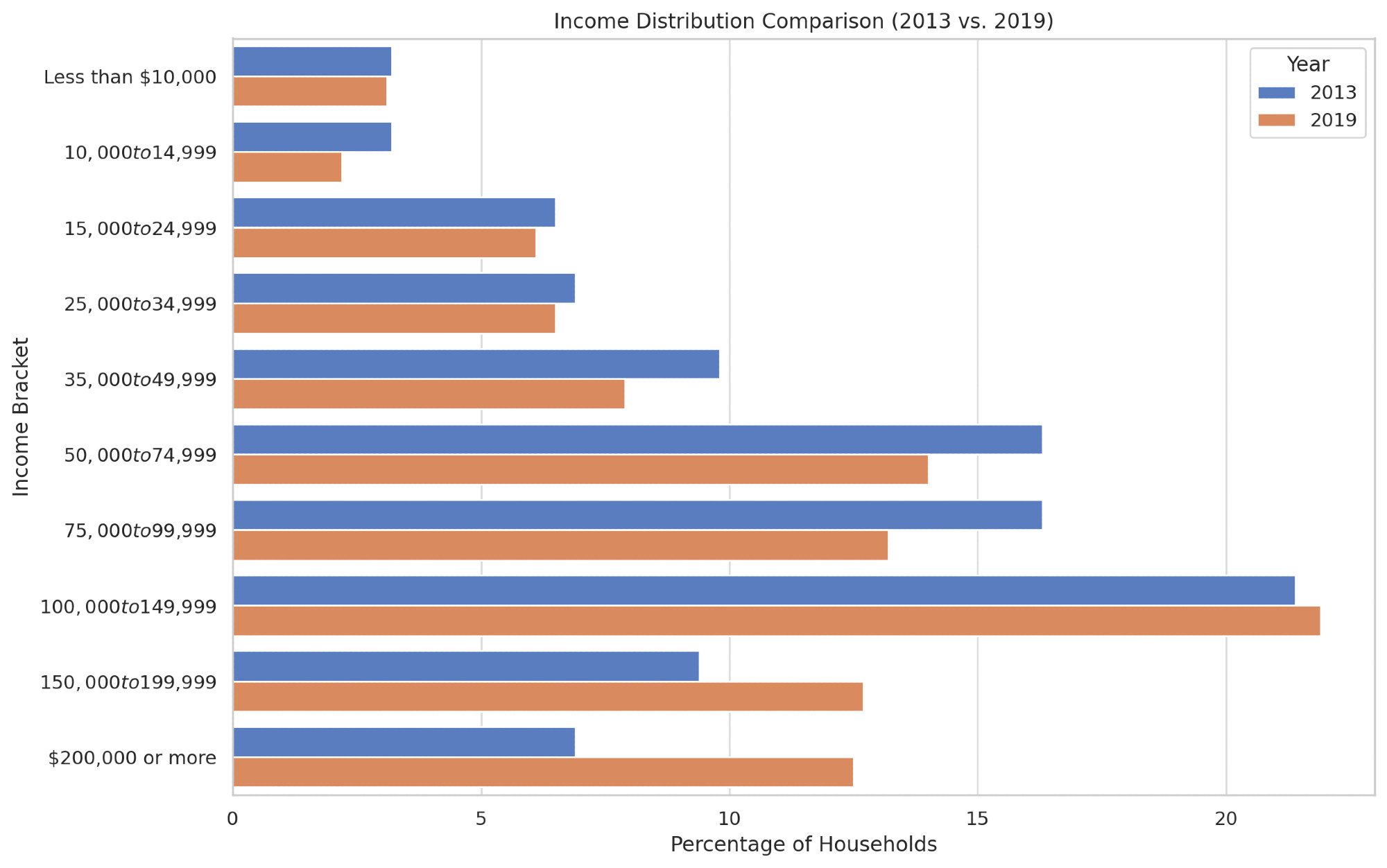
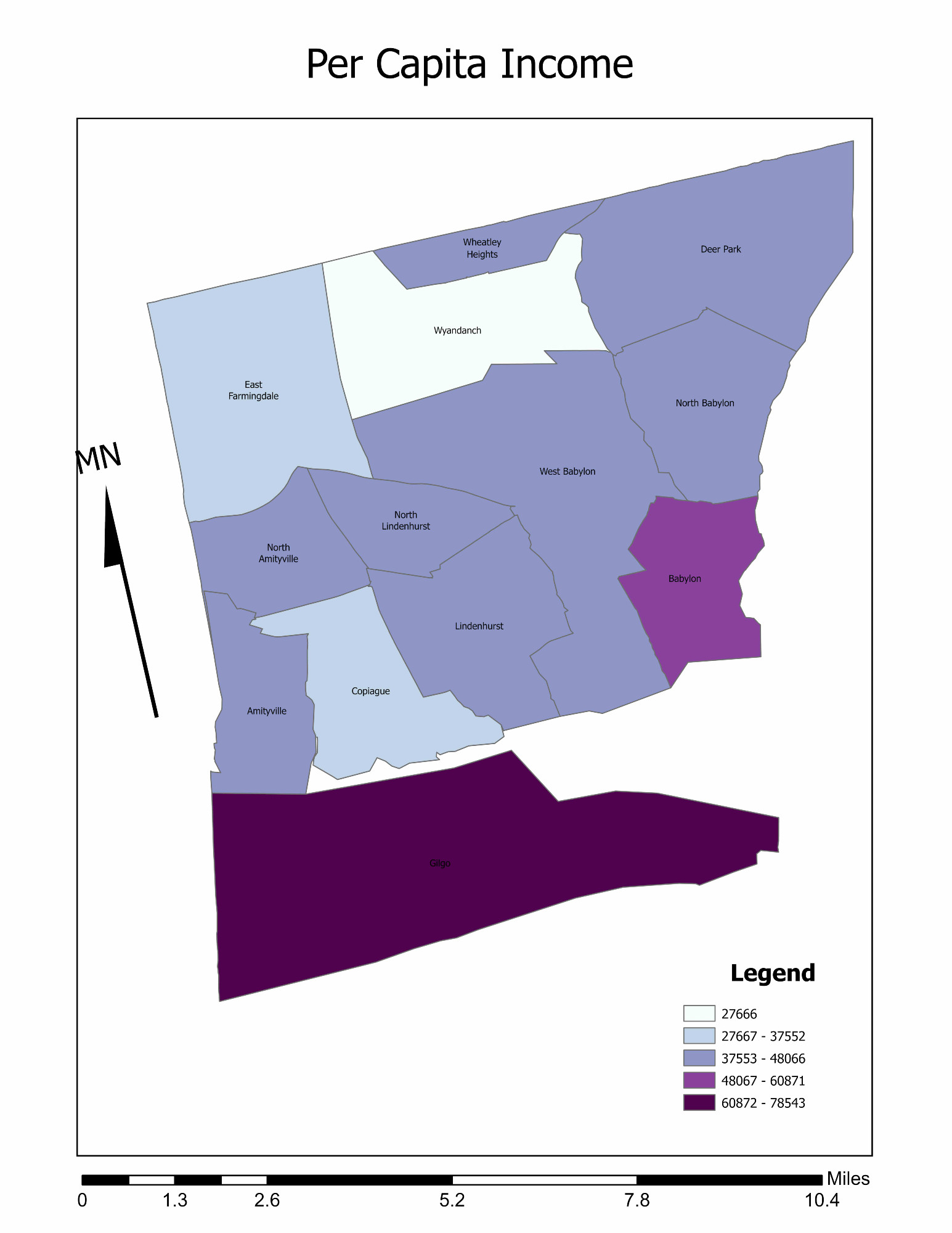
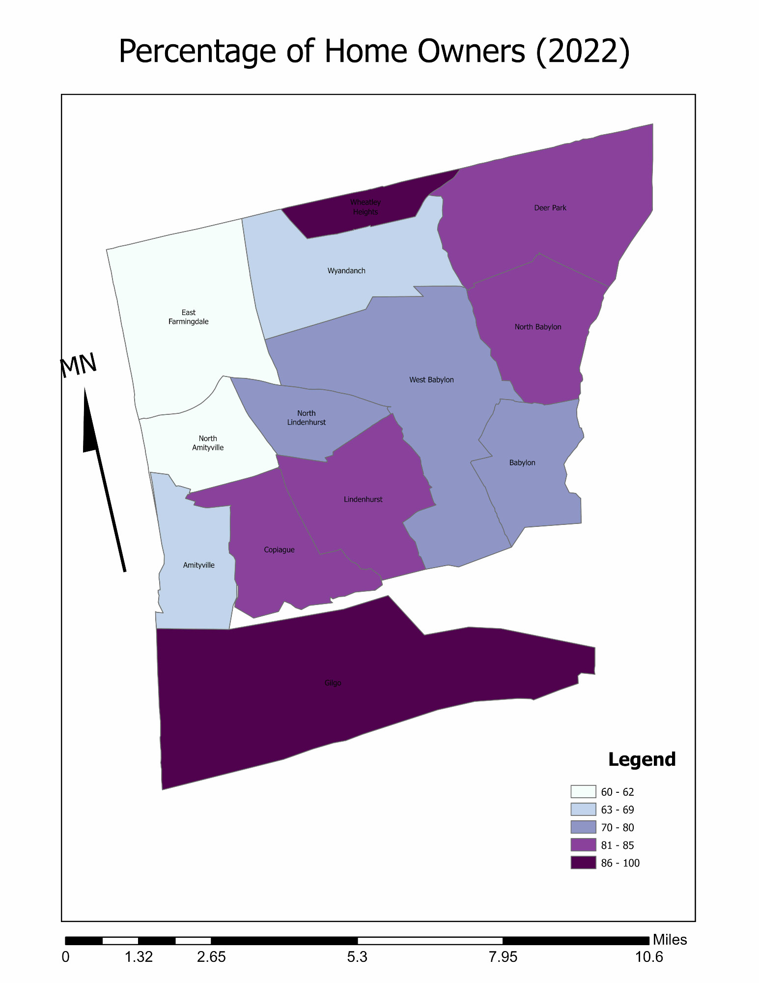
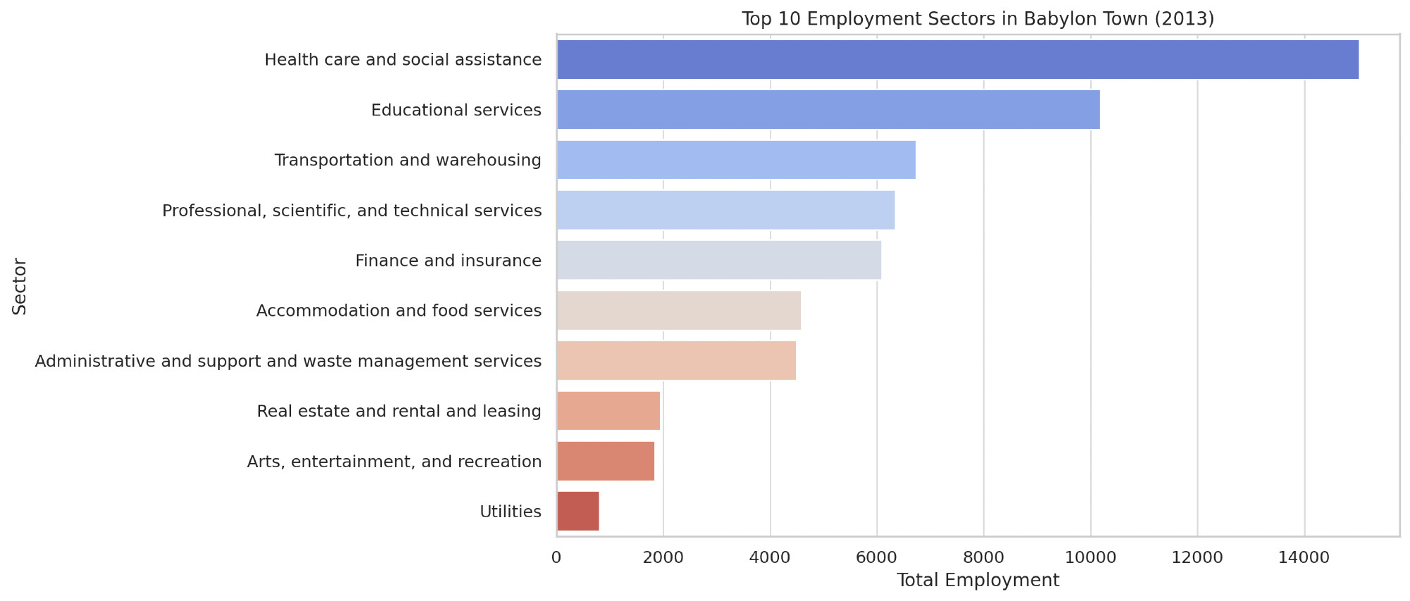
Some examples of maps I've made in the past few weeks. I'm looking at the difference between 2013 and 2019 in a focused area.
TM
the murderHobos! (the band)
@the-murderhobos.bsky.social
Nerd Rock.
website: the-murderhobos.com
favorite local band: open.spotify.com/artist/4e2QS0OUVn8CEgy1MvPa8N?si=DwAUtR5CQ3enn8PbfH4VTQ
stickers & cases: www.redbubble.com/people/cafeTechne
1.7k followers13.5k following2.8k posts