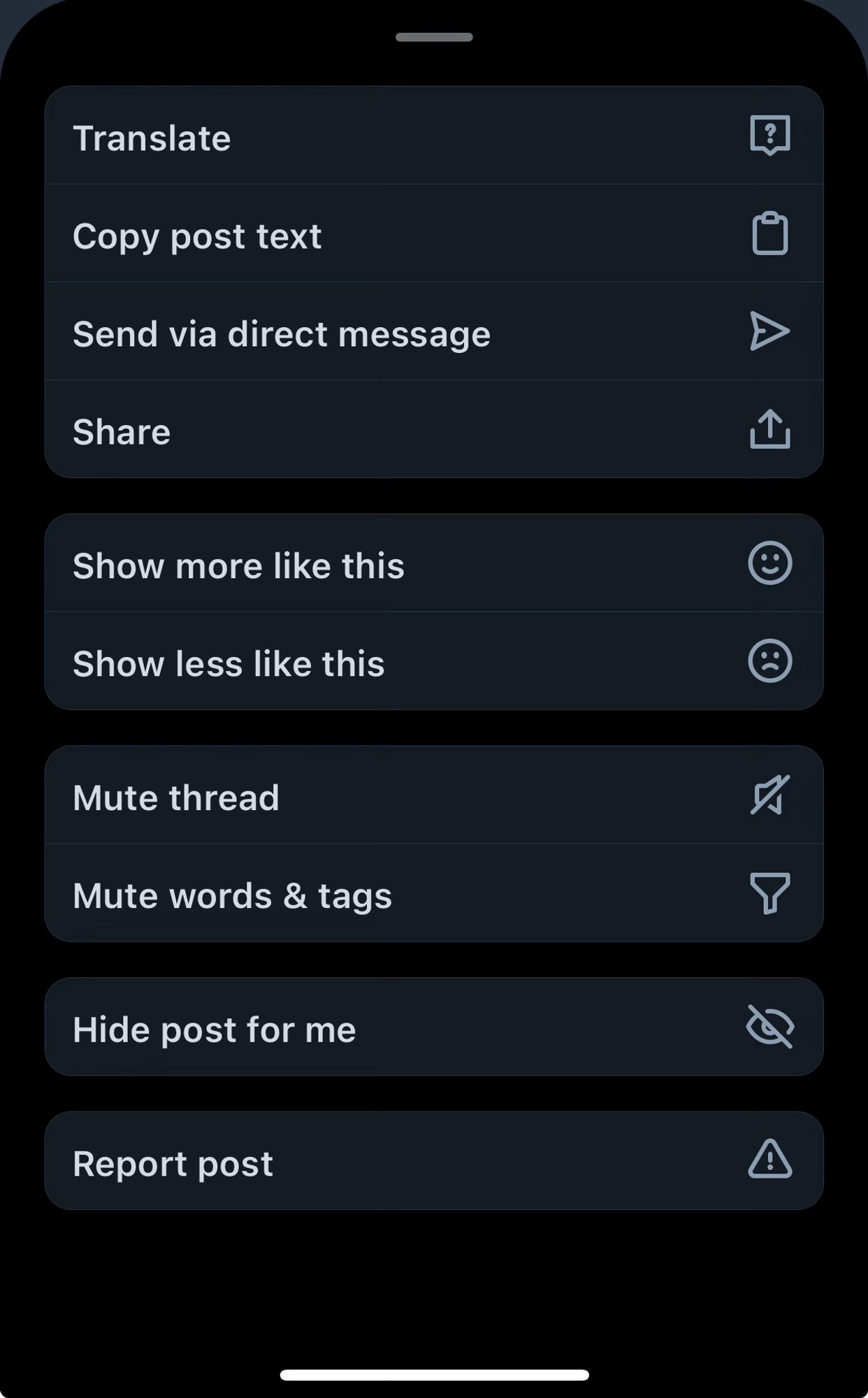
This sheet looks fine, don’t get me wrong but it is looks very custom compared to native components.
One thing that would greatly improve the “native look” of the app is utilizing more blur. If you compare the Bluesky app to the Twitter app, you’ll notice that Bluesky relatively dull by comparison. The use of blur in the twitter app adds visual appeal and depth

Bluesky really needs an app that feels more native. The official one feels very meh, too much custom ui.
Sorry, the printer decides if it wants to be removed or not, and it decided that it didn't want to be removed
Please try reusing coffee grounds and report back
The Photos app in iOS 18 is… something else. I’ve never seen such a poorly designed app
They are really trying to get people to use that thing
I explained it pretty badly so here’s a video about it. You either hold ALT or the Windows key depening on what de you use youtu.be/hPpp_xWZN5A?...

YouTube video by RWX Rob Archives
The thing I miss the most when using Windows is being able to move windows from anywhere by holding the windows key