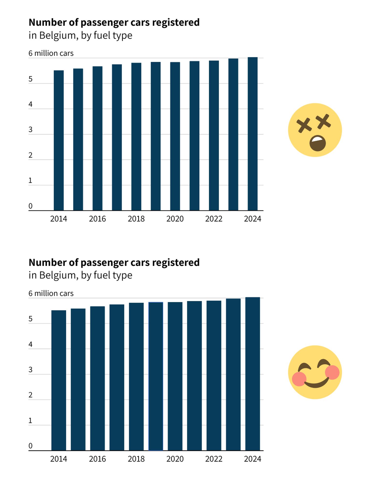
BLUE
Profile banner
KV
Koen Van den Eeckhout
@vandeneeckhoutkoen.bsky.social
šŸ“Š Turning complex data into powerful visual stories! Author of 'Powerful Charts'. Ex-physicist. He/him šŸ³ļøā€šŸŒˆ
462 followers34 following76 posts

āš ļø Watch out for MoirĆ© effects! Make sure that the gap between the bars is significantly smaller than the bars themselves. Otherwise, it creates a distracting zebra-stripey pattern. For Edward Tufte, these unintentional patterns are one of the major sources of chartjunk. (3/4)

Two similar bar charts, the only difference is the width of the gap between the bars. If the gap width is equal to the bar width, it creates a striped pattern that is hard to look at. If the gap width is significantly smaller than the bar width, the chart is much clearer and more pleasant to look at.
1

āš” For #dataviz purists, a bar chart is not the ideal way of showing evolution - they would prefer a line chart - but I can appreciate it when the data is countable. You wouldn't use a bar chart for something that evolves continuously, e.g. weight, but for cars it works. (2/4)

A comparison between a bar chart and a line chart for exactly the same data, the number of passengers in Brussel Airport between 2010 and 2021. In this case, because the number of passengers is a countable number, both are valid options, although the line chart is a lot cleaner because it uses much less ink.
1

Day 3 of exploring alternative chart types for the same dataset: a good old stacked bar chart! āœ… Enables us to see not only the evolution of the total, but also the breakdown by category, Ć”nd the evolution for each category. Check, check and check. (1/4)

A comparison between 2 charts showing the same data. The top one is a line chart, the bottom one a stacked bar chart. Both charts show the evolution of the number of cars in Belgium for four categories: petrol, diesel, hybrid, and electric. Gasoline is the largest category, diesel is shrinking.
A comparison between a bar chart and a line chart for exactly the same data, the number of passengers in Brussel Airport between 2010 and 2021. In this case, because the number of passengers is a countable number, both are valid options, although the line chart is a lot cleaner because it uses much less ink.
Two similar bar charts, the only difference is the width of the gap between the bars. If the gap width is equal to the bar width, it creates a striped pattern that is hard to look at. If the gap width is significantly smaller than the bar width, the chart is much clearer and more pleasant to look at.
The same stacked bar chart as in the previous posts, but with a transparent shaded area connecting the bars to better show the evolution of the individual categories.
1

Pro #dataviz tip for stacked area charts: it's usually a safer bet to place your smallest categories at the bottom of the chart. (3/3)

0

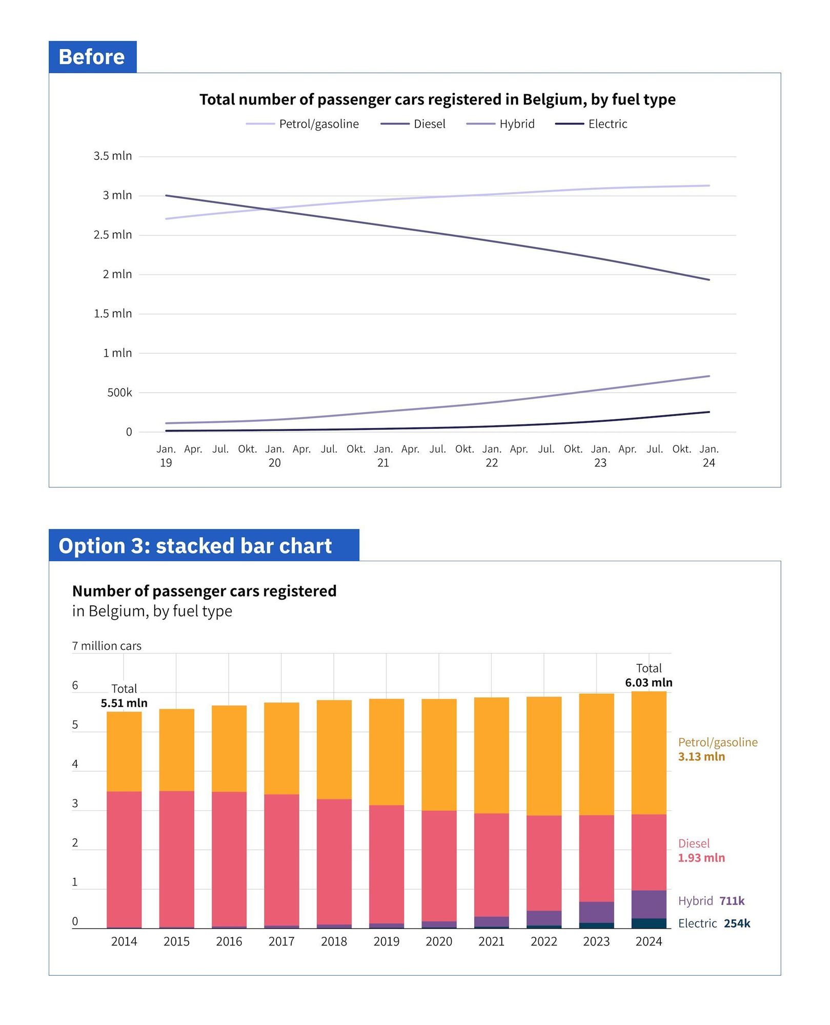
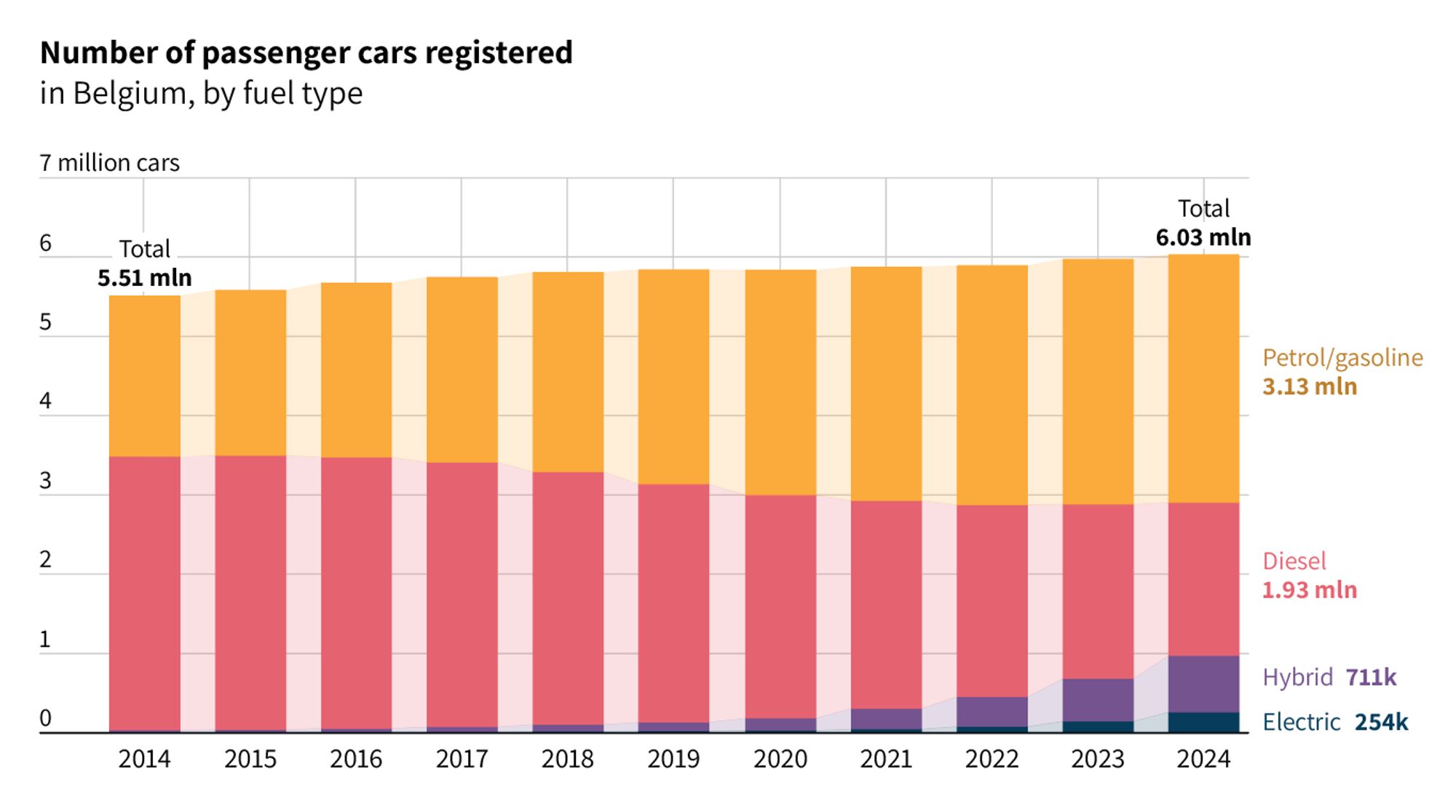
This type of chart works best if you want focus on the breakdown of the total into different categories. For example, if you want to show that electric cars are still only a tiny fraction (<5%) of all registered cars. That's what's called a 'part-to-whole comparison'. (2/3)

1

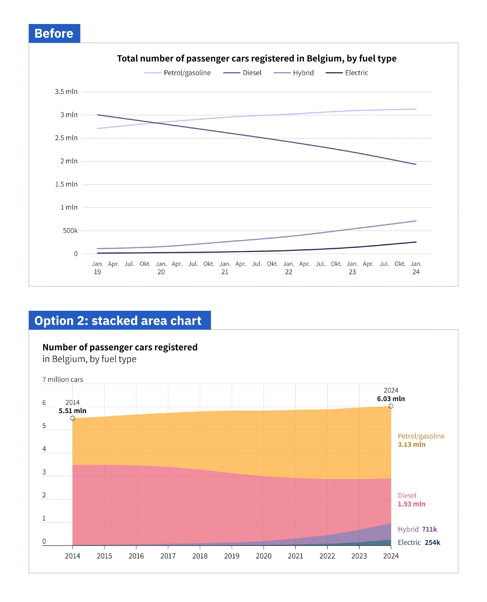
Day 2 of exploring alternatives for this line chart: how about a stacked bar chart? āœ… Also shows the total number of cars, which might be interesting. āŒ I find it a bit harder to read values for intermediate years. (1/3)

1

Or we can make Edward Tufte proud and build a really clean and minimal slopegraph: (3/3)

0

Even if for some reason you need to add *all* data labels, the tool handles it graciously: (2/3)

1

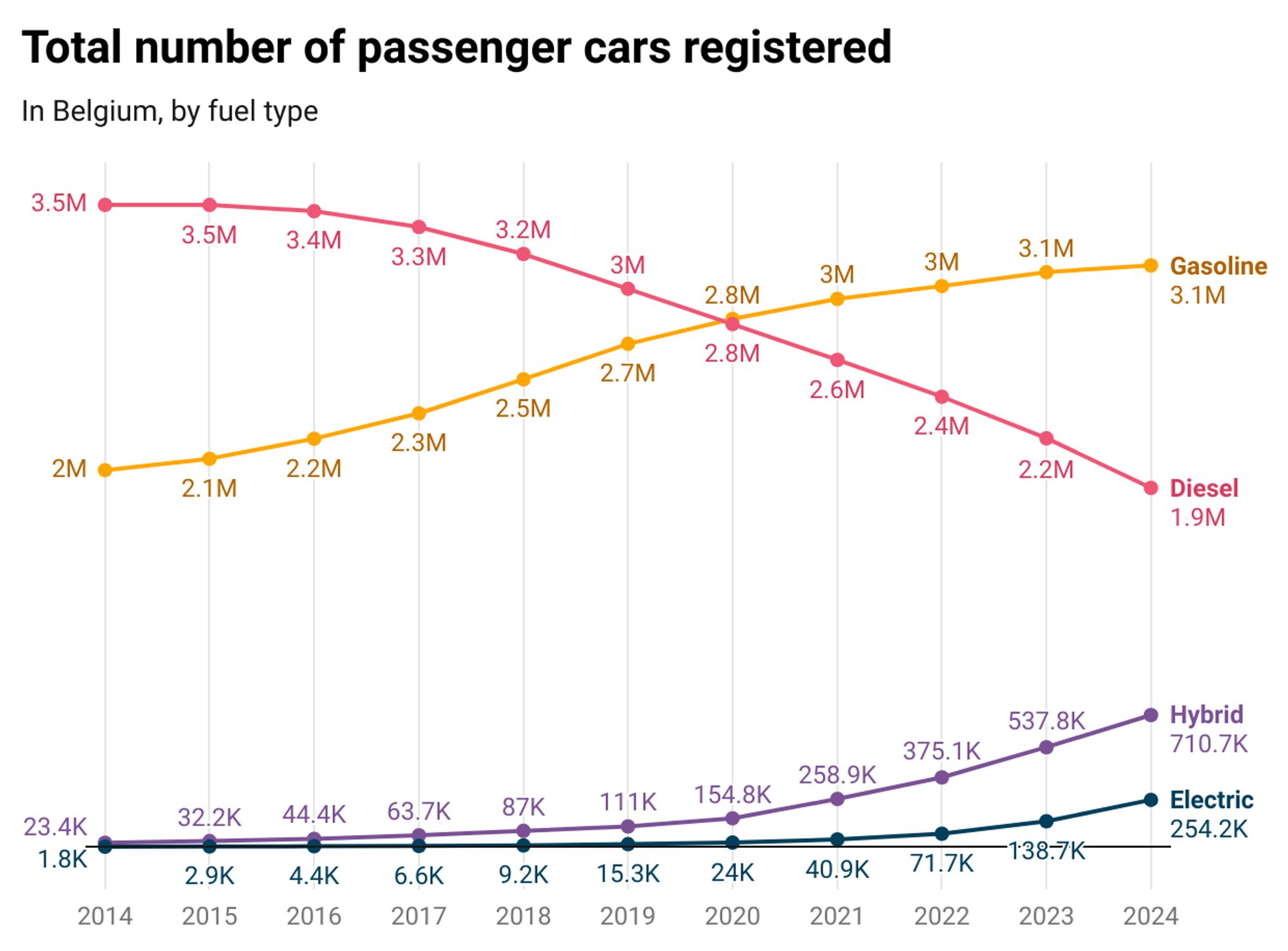
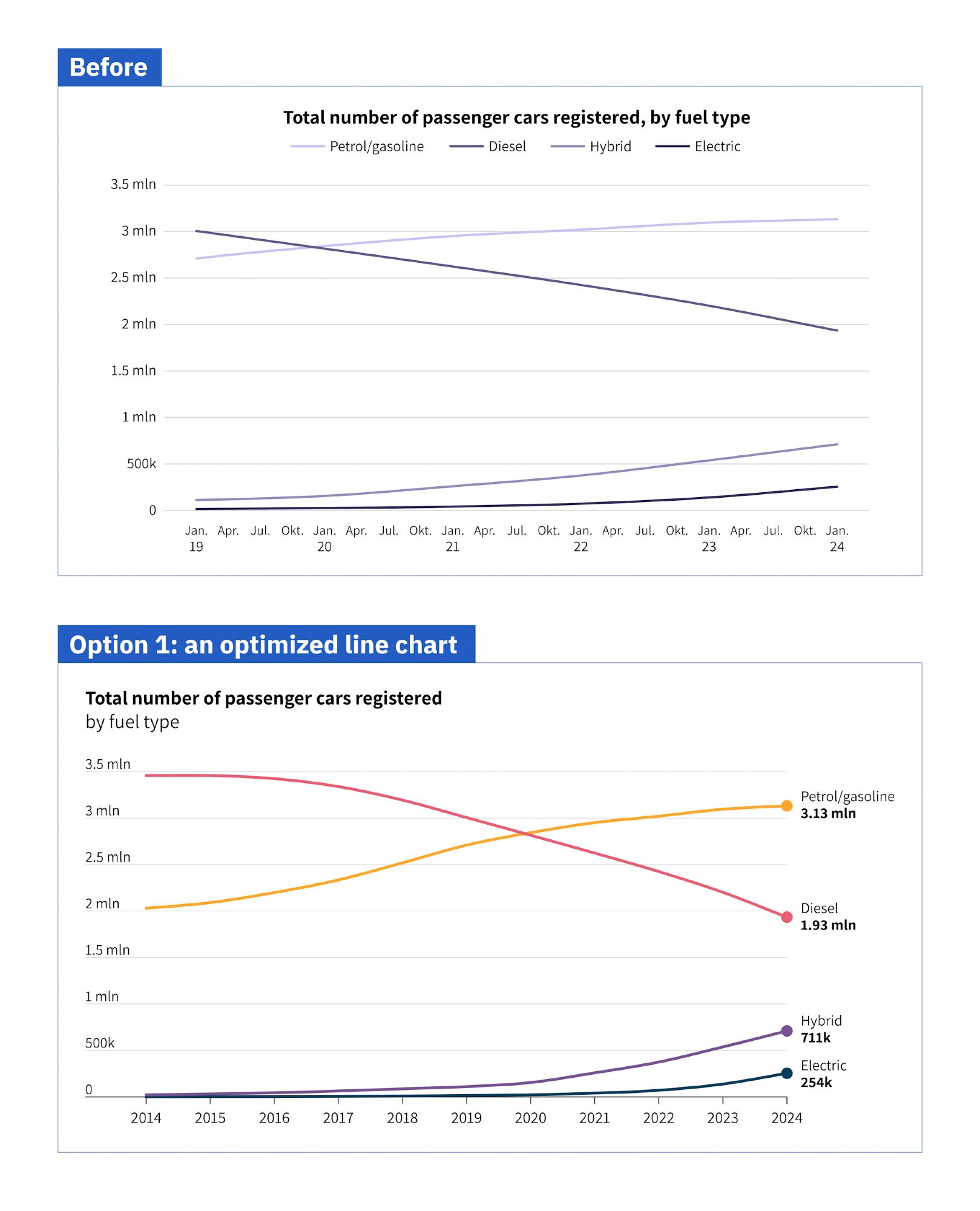
In #dataviz@datawrapper.bsky.social, you now have more options to play with labels in line charts. For example, we could have this lightweight approach where only the first and last values are labeled: (1/3)

1

Day 1 of exploring alternative charts for this dataset! Let's start by simply optimizing the line chart. āœ… Categories are more easily distinguishable āœ… Extended data range gives more context, better ticks āœ… Direct labeling avoids legend, shows final values āŒ Total values are not visible #dataviz

0
Profile banner
KV
Koen Van den Eeckhout
@vandeneeckhoutkoen.bsky.social
šŸ“Š Turning complex data into powerful visual stories! Author of 'Powerful Charts'. Ex-physicist. He/him šŸ³ļøā€šŸŒˆ
462 followers34 following76 posts