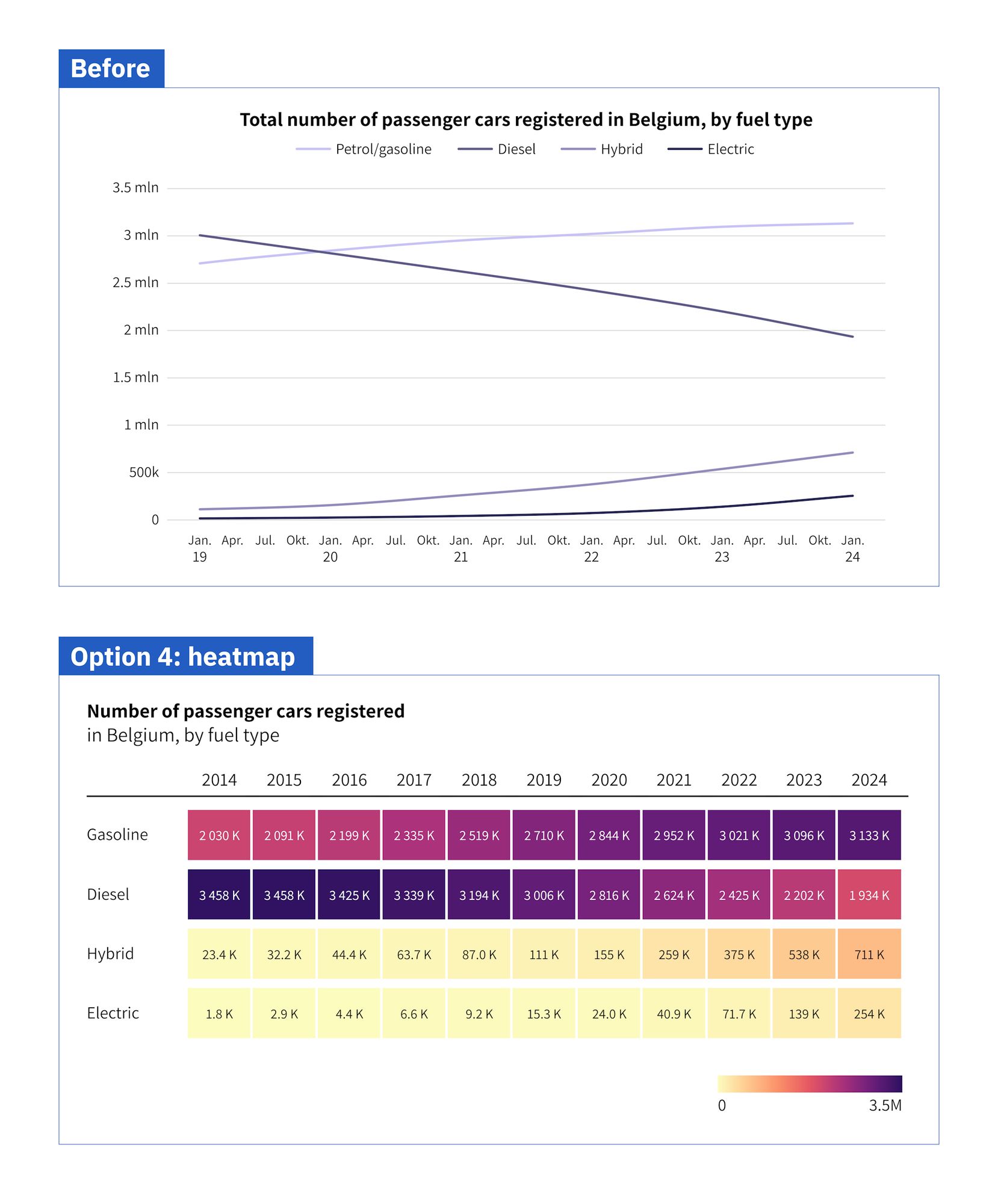
⚠️ Apply the color scale logically: light colors for low, dark colors for high values. That's because our brain is secretly comparing the cell colors with the background color. Darker colors = more contrast with background = more visually prominent = bigger numbers! (4/4)
⚠️ Make sure to use an optimized sequential color scale - nicely going from light to dark, because the we use the color brightness as visual variable to show the data. Some rainbow scales have brightnesses that go all over the place - a nightmare for colorblind people! (3/4)
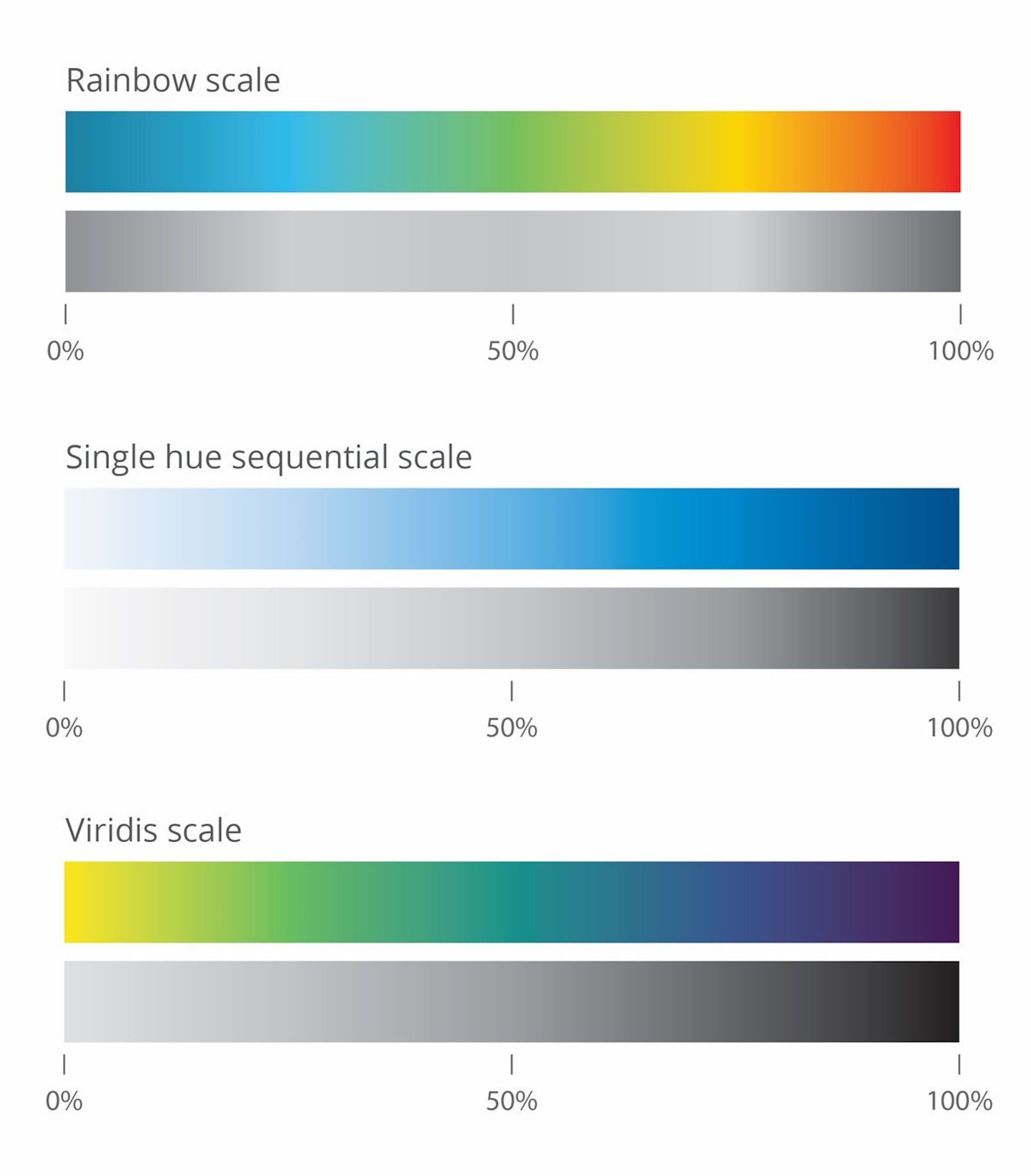
⚡ Want to be even more compact? Just leave out the data values, and rely purely on the colors! If accuracy is less important, this is the most space-efficient way to show a pattern. (2/4)

Thanks a lot, Andy! 🍻
🥳 My company Baryon is celebrating! EXACTLY 10 years ago I became a real information designer. Back then it was still a side hustle, a hobby that got out of hand. To celebrate, here's a snippet from some of my very first paid work. (I have older stuff, but that's too embarrassing to share! 🫣)
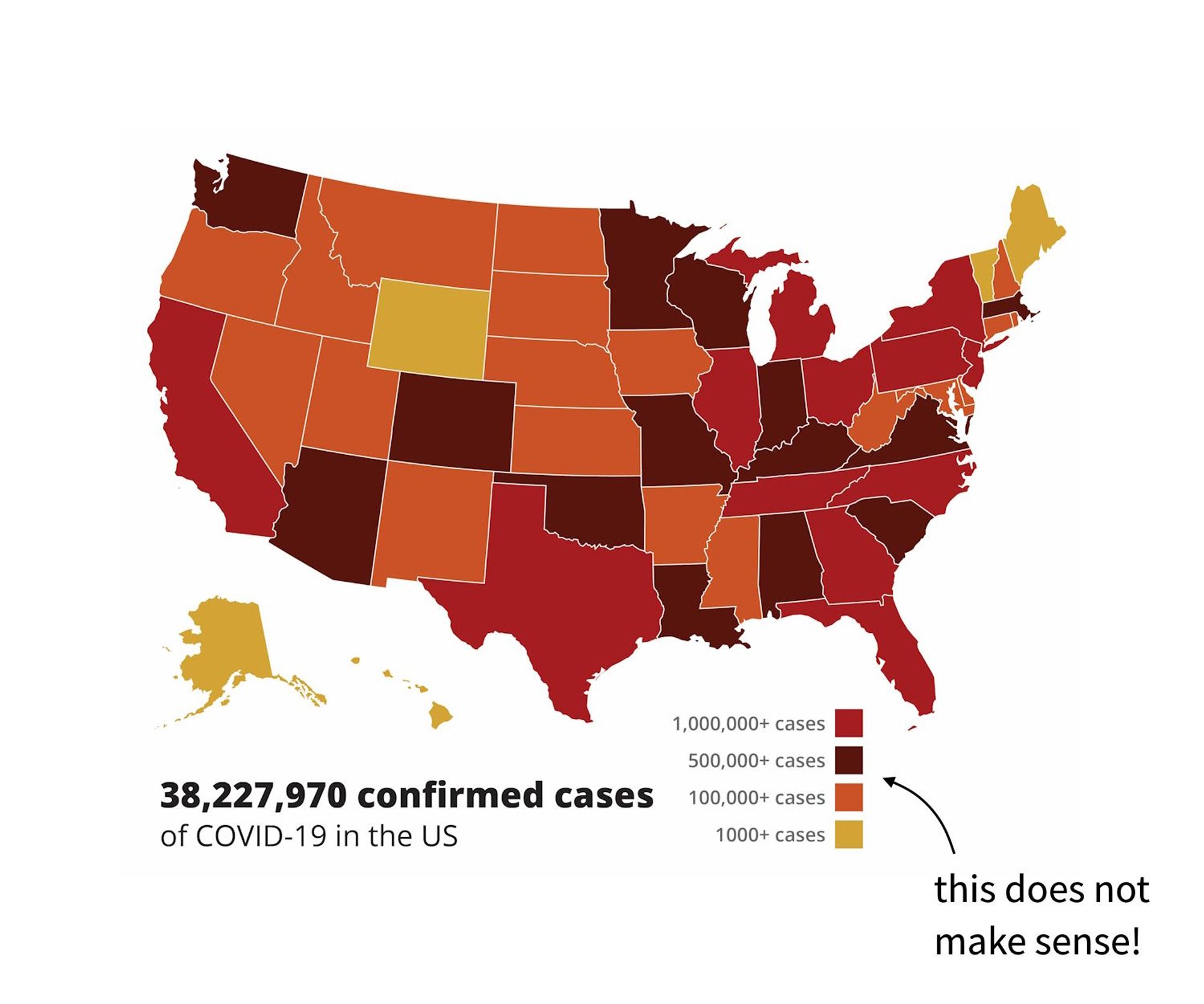
These charts may look pretty at first sight, but they're useless because they are impossible to interpret. UX and UI designers, please don't make charts an afterthought! PS: on a totally unrelated note, you can hire me for #datavizhttps://buff.ly/4edCUQt (3/3)
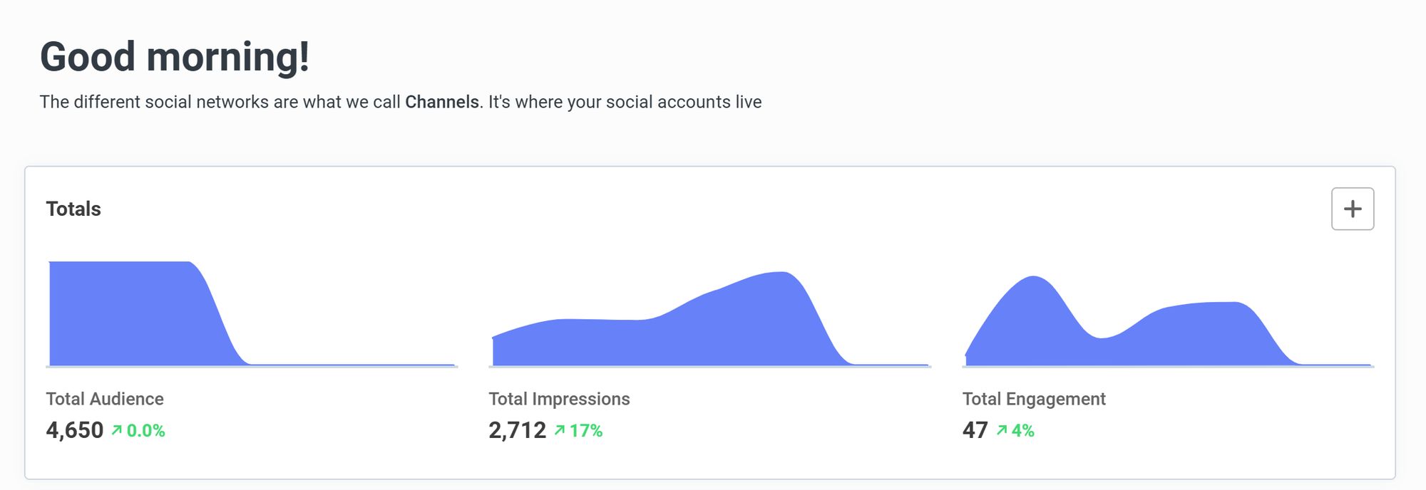
⚡ No labels on the horizontal or vertical axes (only when you hover over the chart) ⚡ Shaded area chart doesn't start at zero (just make it a line chart and it would be solved) ⚡ Unnecessary smoothing of the charts (we have no idea how many data points we're looking at) (2/3)
🥲 I'm often quite surprised by the low quality of charts even in well-known, well-developed tools such as Buffer (the social media scheduling tool I use). (1/3)
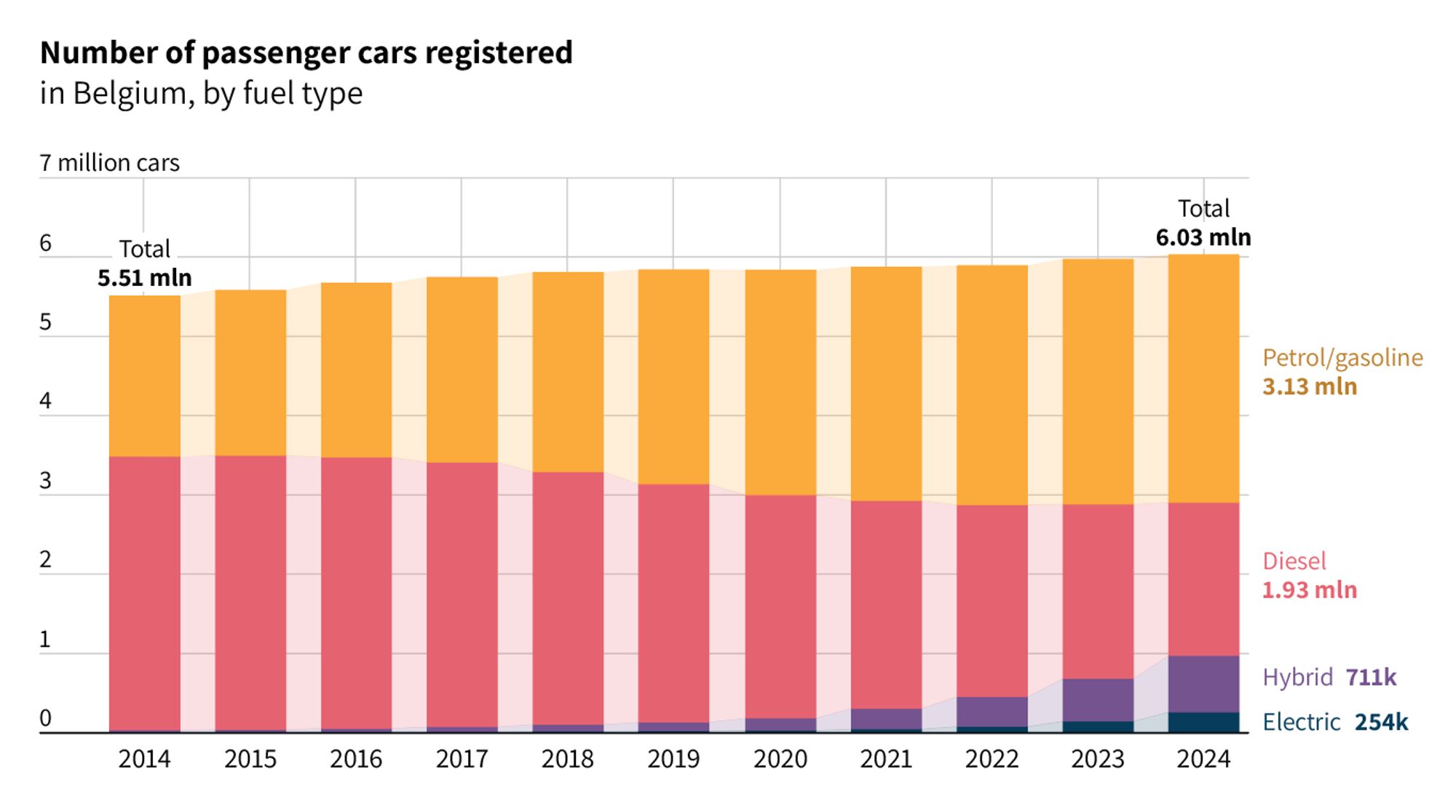
💡Additional note: we're lucky here, the evolution is steady and gradual. With more volatile data the bars jump up and down much more, and the chart can be harder to read. Some tools enable you to connect the bars with a transparent shade, to counter this effect somewhat. (4/4)