Please read the book—it's serious scholarship, and is very far from painting the IR as simply bad. They book does argue that the IR was not all good—Your own first plot (from OWID) shows inequality going up during the IR, for instance.
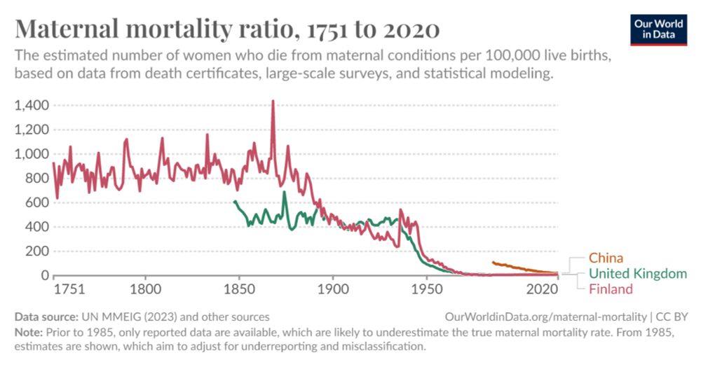
It's a sobering statistical chart, but might not be that bad. Risk up around 0.5% before dropping right down. Worth looking through the OWiD original, I've added Finland and China as comparators, Finland up around 1% @1850, then drops to match UK: ourworldindata.org/grapher/mate...
An interactive visualization from Our World in Data.
I thought the OWID piece focused too much on the meat/veg dichotomy. People also want to know “should I buy Spanish grapes or Peruvian grapes” and there transport might be significant. Or: European beet sugar v cane sugar, which seems to have a high transport GHG component
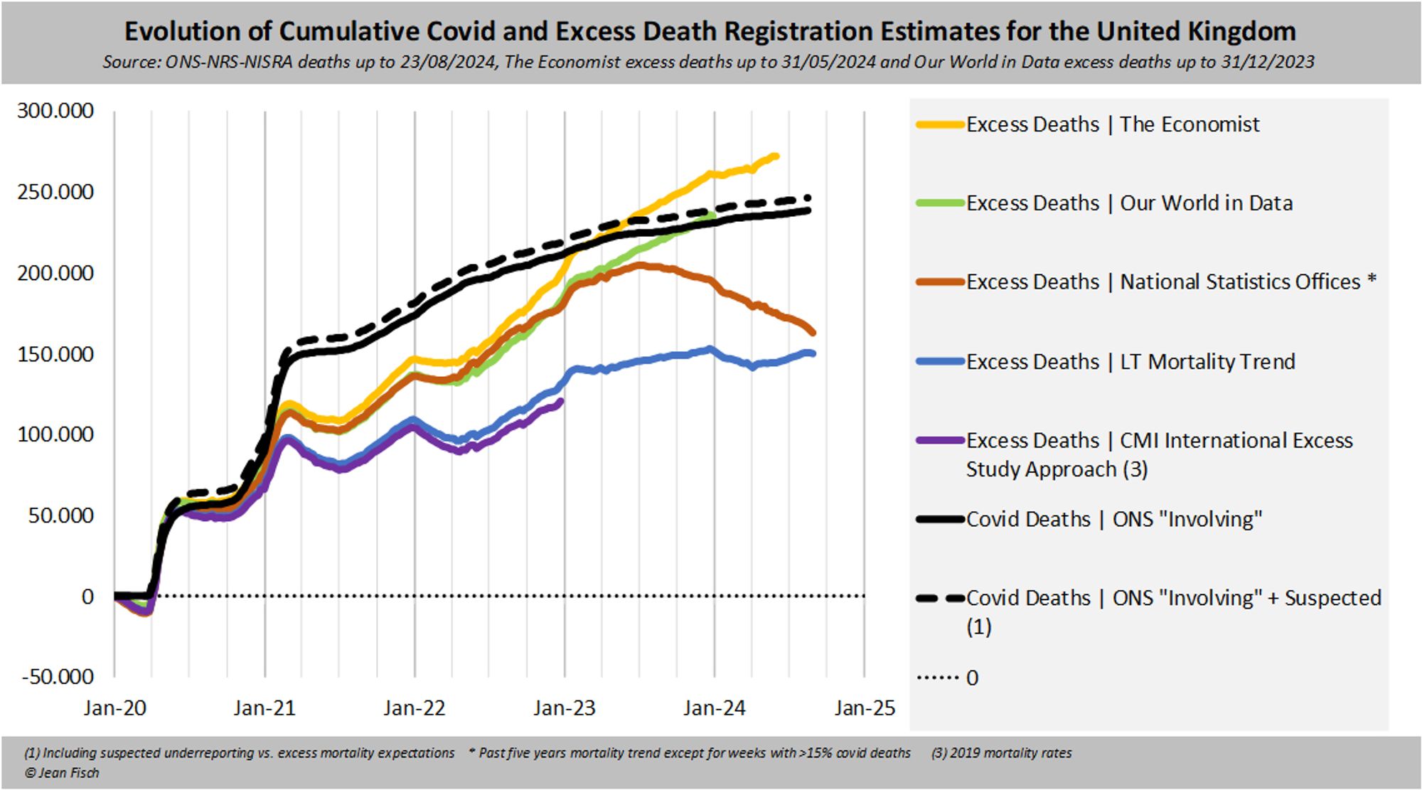
Just for coherence, I stick here to data by registration date in order to match the analysis done by Swiss Re Here the different estimates for cumulative excess for the UK There is a reason why OWID and The Economist are much higher than say CMI or 13-19 Mortality Trends 2/
Telling how often he cites OWID
2021 not really a good year since affected by exactly where in the Covid pandemic countries were. Sweden probably high since it took almost the entire hit 2020. But unfortunately OWID doesn't have newer numbers and I'm too lazy to dig out other source
Some striking exceptions. 2011-2021 acc to OWID life exp World +0.5 Mexico -4.2 Venezuela -2.4 Peru -1.8 US -1.6 Philippines -1.5 Indonesia -1.3 Russia -1.0 Brazil -0.6 UK -0.1 India -0.1 Germany+0.3 France +0.7 Sweden+1.2 Japan +2.1 Somalia +4.0 Ethiopia+4.3
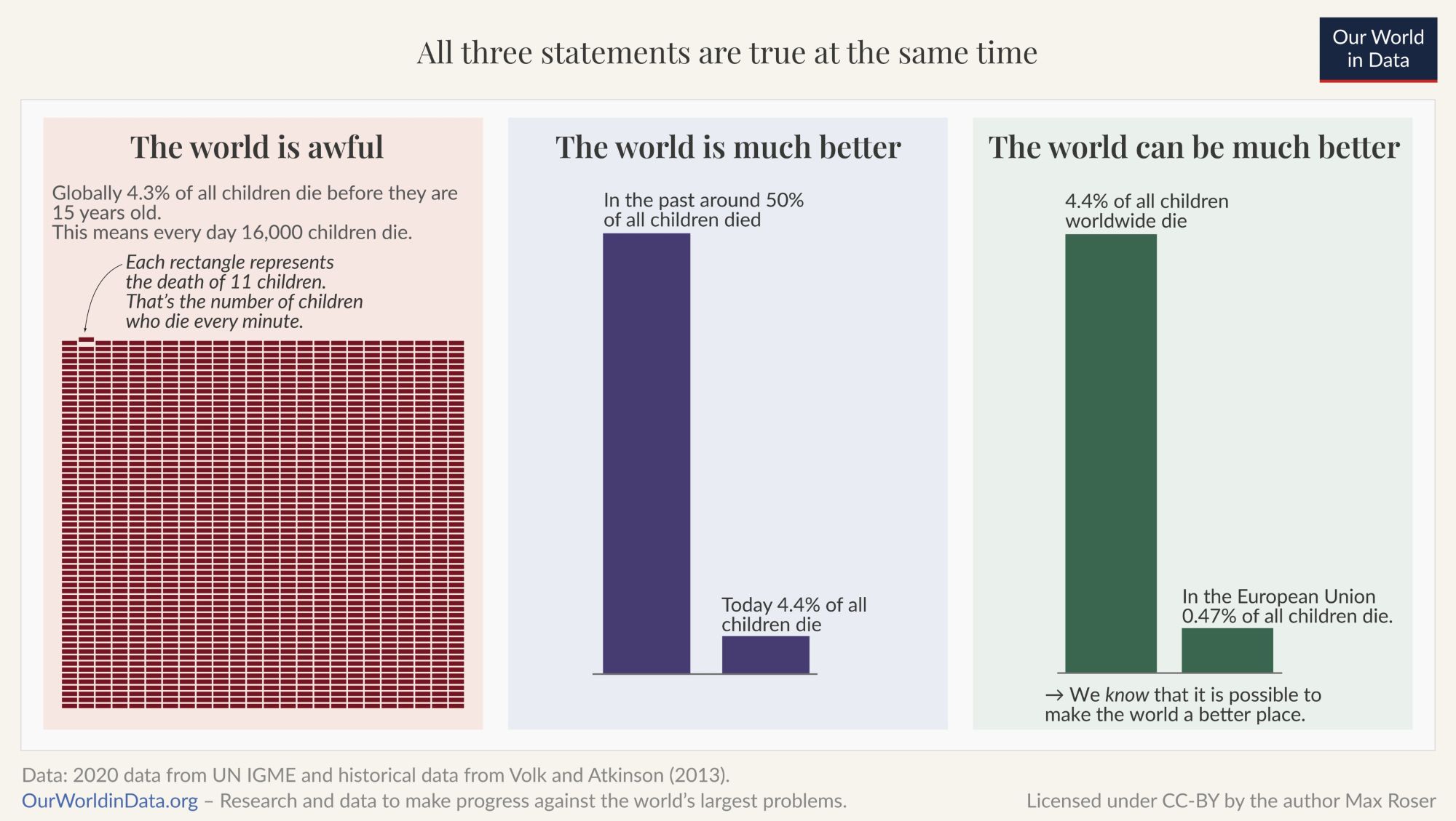
good and succinct - and told in video too www.youtube.com/watch?v=CGmd...ourworldindata.org/much-better-...@maxroser.bsky.social )