BLUE
Profile banner
A
Antonio
@aasmith.bsky.social
Making maps about the United States
43 followers49 following42 posts
Aaasmith.bsky.social

I just tested this out. It looks like you have to create the geopackage first using the Create SQLite Database tool. You should be able to use the Export Features tool to add a layer to the gpkg.

0
Aaasmith.bsky.social

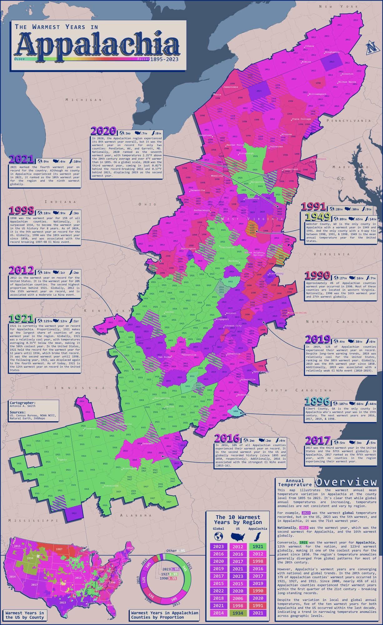
The Warmest Years in Appalachia (1985-2023) 1921 was a very warm year for App. It is still the warmest year for 34% of counties in the region. Globally, 1921 was a cool year. However, regional variation from global trends seems to be a thing of the past. #gis#gischat#cartography#maps

A map showing a very colorful map of the Appalachian region in the United States.
0
Aaasmith.bsky.social

Agreed!

0
Aaasmith.bsky.social

The final map is the first one I printed. It is a map from my capstone project for my associate's degree and shows the alternative banking locations and household income in Knox County, TN. I don't really like looking at this one anymore. lol #gischat

1
Aaasmith.bsky.social

I made three maps for TNGIC conferences. One compares population distribution and elevation in TN. The other is essentially a very tall reference map of a road known as the "Tail of the Dragon". The last one (most recent) shows the warmest years in Appalachia. I will post it here shortly. #gischat

1
Aaasmith.bsky.social

Yep! I work from home tho. I have three, soon to be four, of my own maps hanging up. 😅 #gischat

1
Aaasmith.bsky.social

Hi #gischat I got pulled off of a field job because the company forgot to submit my paperwork for a new security clearance. They had this stereoimagery mapping project that I could work on in the meantime. I assumed this trip into the GIS world was going to be temporary. That was 20 yrs ago!

0
Reposted by Antonio
IIinfobeautiful.bsky.social

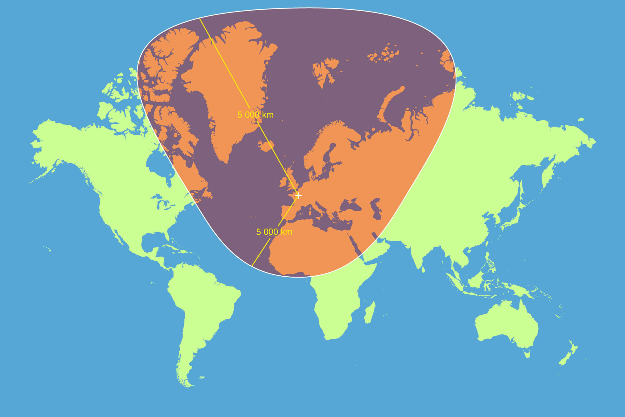
Another reasons to tut at the Mercator Map projection - how a circle with a radius of 5,000km, centred on Paris, looks according the the Mercator projection

A circle placed on a world map using the Mercator projection shows how distorting this way of depicting the world has become. The circle is highly distended forming a large tear-shaped with undue size and prominence given to the northern portion.
0
Reposted by Antonio
MHmichaelhobbes.bsky.social

Finally, when a friend shows me something they've painted or written I can shout "A COMPUTER CAN DO THAT" right into their face.

AHkh0rish.bsky.social

Clownshit

James Marriott article “AI spells trouble for creatives—about time too. Machines that can write and paint are a welcome rebuff to the prestige enjoyed by artistic types”
21
Aaasmith.bsky.social

It's been awhile, but I believe you have to use the KML to Layer tool. pro.arcgis.com/en/pro-app/l...

1
Profile banner
A
Antonio
@aasmith.bsky.social
Making maps about the United States
43 followers49 following42 posts