With the influx of dataviz people, let's do some re-intros. 📊 — What's your claim to fame? ✨ — How might we know you already? What have you done that we might have seen or read before? What would help us remember how we came across you? Don't be shy: it's helping us reconnect and remember you 💡
Well, I'm a data visualization consultant in Italy and I started collecting bad charts on Twitter with the #horrorchart@ondatait.bsky.social association.
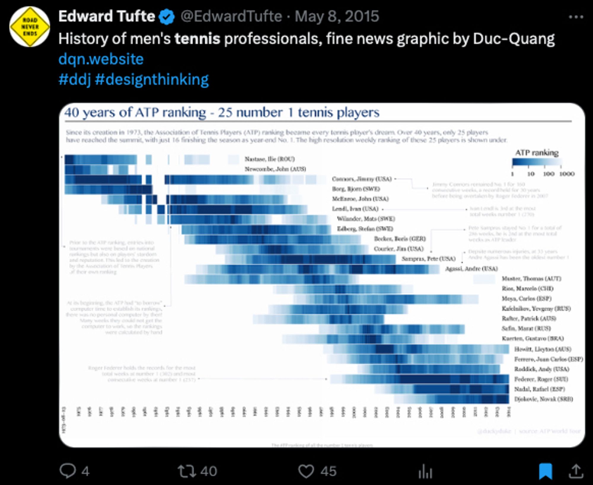
As a Swiss data/visual journalist writing in French, I have 0 claim to fame. However, ages ago, my very first dataviz got tweeted by Ed Tufte. I guess it all went downhill from there. Since then, plenty of data-driven stories, dashboards and dataviz. Mainly with R & datawrapper. I also teach ddj
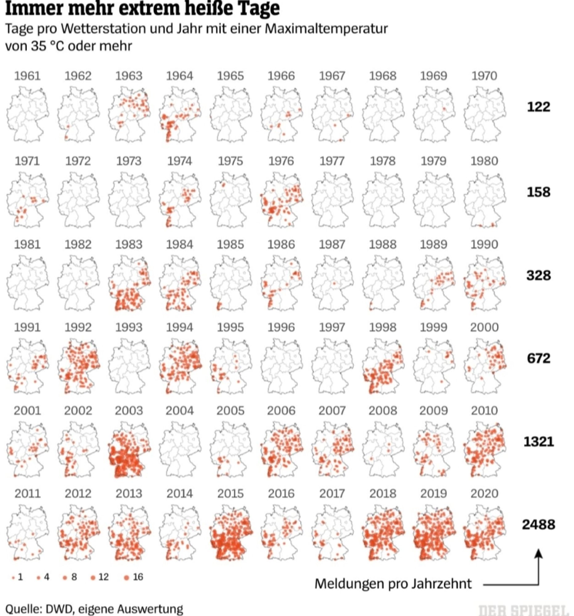
Great idea! By day I'm the co-lead of the SPIEGEL data & visualization team: www.spiegel.de/thema/daten-...www.letsmakeamap.com I once published this small multiple of heat days in Germany that went viral on Twitter (750k impressions)
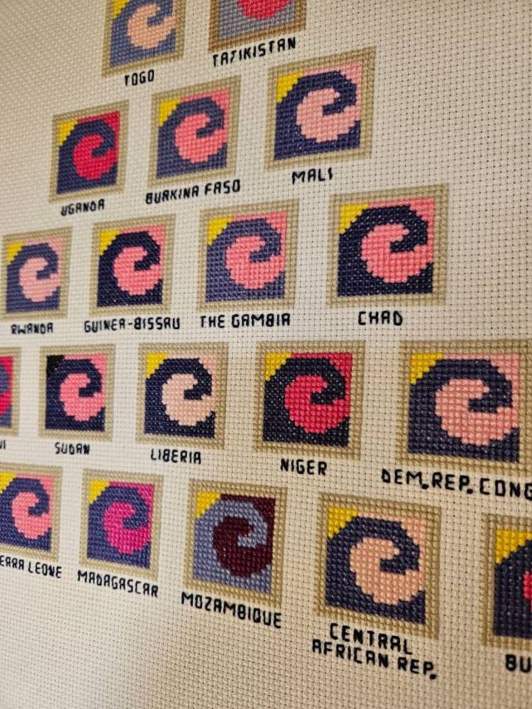
I don't expect many people have come across me, but I create data art in cross stitch. My latest piece (datayarns.wordpress.com/2024/08/04/t...) was a community showcase project in the DVS September update email ♥️ Day job is publications editor for a non profit, which includes data- and infoviz.
Trickle down is about climate and injustice. It visualises differences, and also some similarities, between the carbon emissions, climate risk and climate vulnerability of high-GDP and low-GDP nations...
Great to see you here Francis and thanks for the reconnecting initiative 🤗 I also added my re-intro bsky.app/profile/ikas...
Introducing myself again: I'm a developer of data visualization methods, mainly in R, and an historian of data visualization. In #datavisgithub.com/friendly

friendly has 53 repositories available. Follow their code on GitHub.
My social media following came from 4 things: - The Data Design Manifesto: datarocks.co.nz/the-data-des...nightingaledvs.com/data-art-sel...www.datarocks.co.nz/blog/categor...buttondown.com/datarocksnz
A monthly(ish) newsletter all about the design of data displays. Here you'll learn more about how a little bit of design can go a long way in helping you explore and present your data more effectivel...
Great idea. I'll go first so I can follow the loop: 👋 I do maps, interactives, hand-drawn doodles and visual stuff for the New York Times. I've done a few things on the war in Ukraine and Gaza, but as a visual journalist I do stories on a wide range of topics. Some stuff here mhinfographics.com
Infographics-dataviz