The green outlines on the hovered interactive objects are looking really good btw, had seen the earlier post where they were completely highlighted and thought that was perhaps too much, but these look just right 🔥
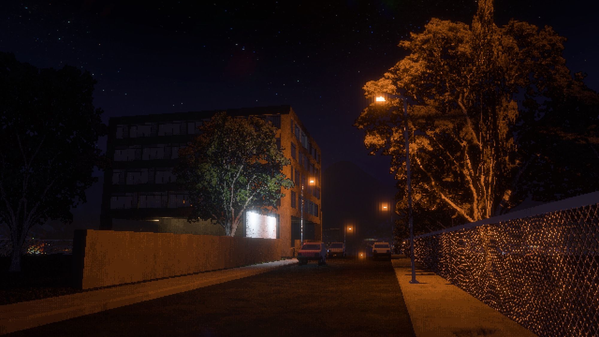
I guess the JPEG artifacts here make it less pixelated too, which strangely adds to the "realism". 😂
The Pokémon designs themselves were also modulated by the limited (or no) palette. Gen 1 is very monochromatic, while Gen 2 which was already developed straight to the Game Boy Color had more bichromatic designs. IMO most of the later designs people don't like are violating these limitations
😱 Oh wow it really is a similar feeling scene, as it loaded I did a double take And the night mode camera probably helped there, it was likely darker/scarier
Beleza! Não demora muito não, tô só esperando ter mais conteúdo pra mostrar e lanço a página em breve. Quando tiver no ar eu cadastro. Vai ser em 2025 né?
Thanks!! Didn't play Type 4 specifically, but late PSX-era games had a moody vertex lighting look that partially inspired this
Thanks! 🥳
Ainda não tou com página na Steam, posso botar um N/D no campo?
The algorithm isn't actively throttling your reach to sell you promoted tweets/ads