BLUE
Profile banner
DM
Daniel Mote
@danielmote.bsky.social
Caver, backpacker, photographer | He/Him
88 followers452 following109 posts
DMdanielmote.bsky.social

Kent Bazemore!

1
DMdanielmote.bsky.social

Iā€™m biased, but I think their throwbacks are the best uniforms in the NFL.

1
DMdanielmote.bsky.social

Thanks for pointing out that white might be better for him! I think heā€™ll be best off if he tries a bunch of things and keep what work best. The myopia/astigmatism combo is no joke. Every time I get a new prescription itā€™s like seeing the world for the first time again.

0
DMdanielmote.bsky.social

And yeah, thereā€™s no excuse for that sort of attitude from either direction. Gotta respect that what works for other people doesnā€™t necessarily work for you, and vice versa.

0
DMdanielmote.bsky.social

ā€¦this puts a different spin on what cavers mean when discussing the skillset needed for vertical caving.

0
DMdanielmote.bsky.social

Quite welcome! We really hope it helps!

0
DMdanielmote.bsky.social

Iā€™ve heard of other people liking Cascadia Code, Arial, Verdana, and Open Sans. Generally sans serif fonts work better.

0
DMdanielmote.bsky.social

Youā€™ve already got some good answers. I think the biggest thing is to find the best font and color code combo for him. That is probably not going to be the same as what other people need. My partner does well with Comic Sans and OpenDyslexic, but others need something different.

1
DMdanielmote.bsky.social

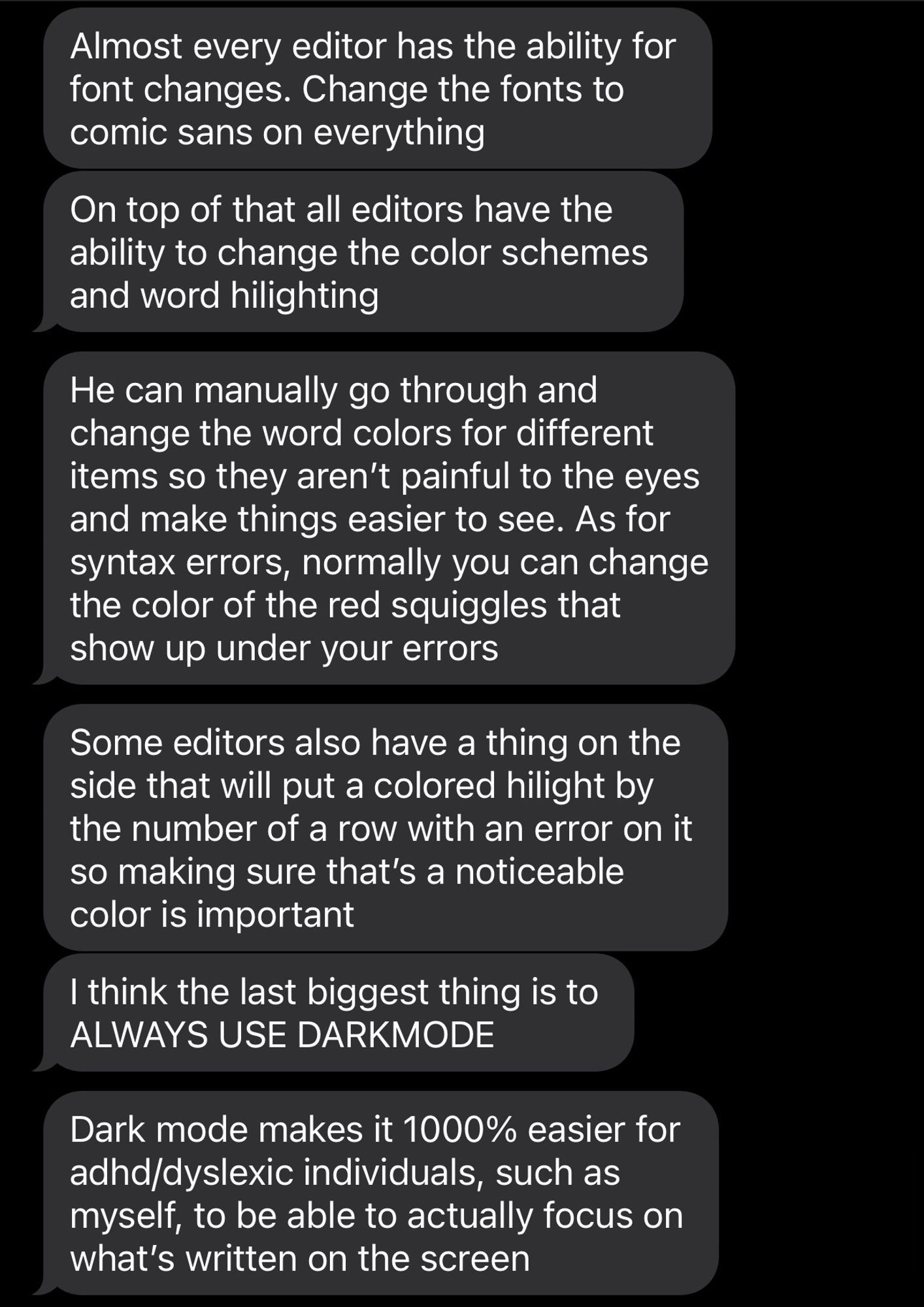
I asked my partner who has dyslexia, dyscalculia, and a computer science degree. Hereā€™s what my they suggested:

Almost every editor has the ability for font changes. Change the fonts to comic sans on everything. On top of that all editors have the ability to change the color schemes and word hilighting. He can manually go through and change the word colors for different items so they arenā€™t painful to the eyes and make things easier to see. As for syntax errors, normally you can change the color of the red squiggles that show up under your errors. Some editors also have a thing on the side that will put a colored hilight by the number of a row with an error on it so making sure thatā€™s a noticeable color is important. I think the last biggest thing is to ALWAYS USE DARKMODE. Dark mode makes it 1000% easier for adhd/dyslexic individuals, such as myself, to be able to actually focus on whatā€™s written on the screen.
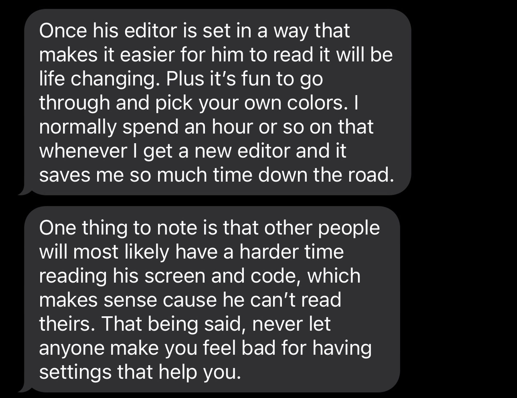
Once his editor is set in a way that makes it easier for him to read it will be life changing. Plus itā€™s fun to go through and pick your own colors. I normally spend an hour or so on that whenever I get a new editor and it saves me so much time down the road. One thing to note is that other people will most likely have a harder time reading his screen and code, which makes sense cause he canā€™t read theirs. That being said, never let anyone make you feel bad for having settings that help you.
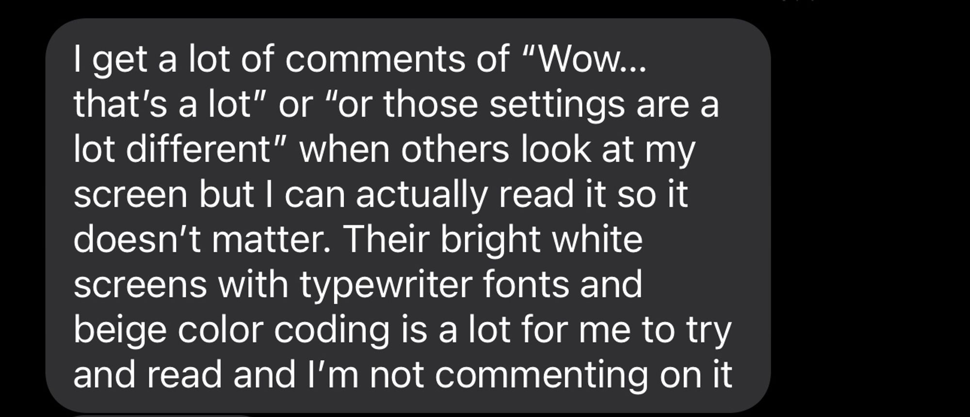
I get a lot of comments of ā€œWowā€¦ thatā€™s a lotā€ or ā€œor those settings are a lot differentā€ when others look at my screen but I can actually read it so it doesnā€™t matter. Their bright white screens with typewriter fonts and beige color coding is a lot for me to try and read and Iā€™m not commenting on it
3
Profile banner
DM
Daniel Mote
@danielmote.bsky.social
Caver, backpacker, photographer | He/Him
88 followers452 following109 posts