Lol, maybe I'm in too deep, but that reads pretty clearly to me?! If I were asking my 4yo, I might have said "is the line GOING UP UP UP?! or STAYING FLAT FLAT FLAT?!" 🫠
Here's a million-gif writeup on HOPs (Hypothetical Outcome Plots 📊), which use animation to simulate how values might vary (e.g. around an average) instead of just showing the distribution directly, so it's a way to "experience" uncertainty. via @kalealex.bsky.social@jessicahullman.bsky.social.
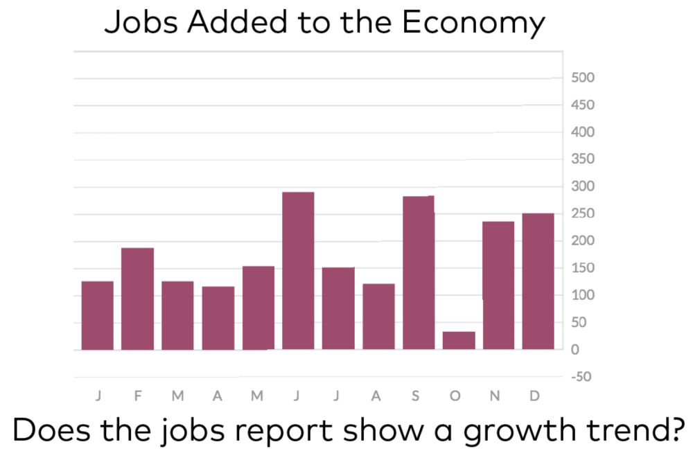
In daily life, we often find ourselves trying to separate signal from noise. For example, do the monthly job numbers to the left suggest a…
I think there's some hope though? Pew and Gallup somehow worked up the courage to get out of the prediction game... And the amount of skepticism you see on reddit toward _any_ poll suggests some critical mass of (online) people know to not take them seriously.
Yeahhh... hard to think of a topic that checks so many boxes for media incentives, while also being so useless and destructive for everyone else?! This writeup captures the problem pretty succinctly: theconversation.com/us-election-...
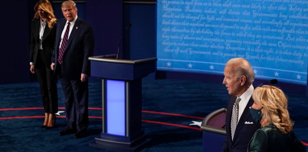
Voters are told little about policy issues as journalists focus on the ‘contest’.
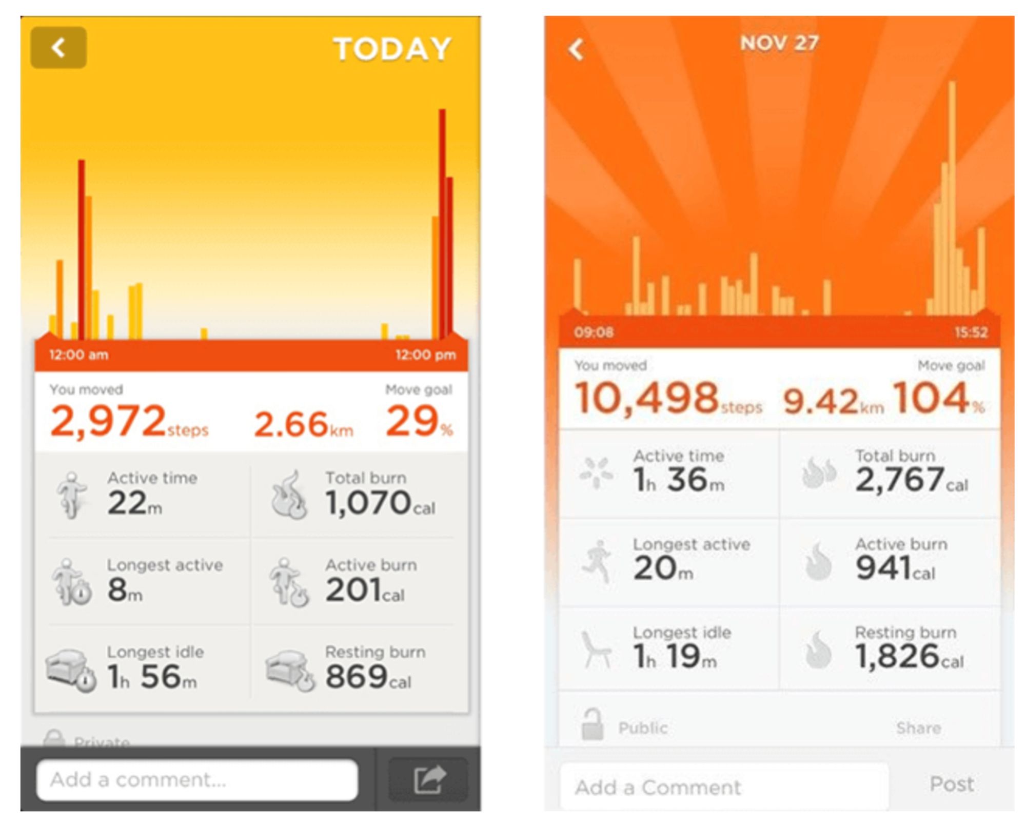
Ooo! Great prompt! Ancient history now, but Jawbone (RIP) had a step tracking app, and when you hit 10k steps it would change the whole screen to show these gratuitous and celebratory pinwheels. Still one of my favorite examples of quick, emotionally-charged visual treatments for dataviz.
Yes! Whatever other connotations aside, the jump to "deprived by" stood out as a way to invite more structurally focused questions about responsibility.
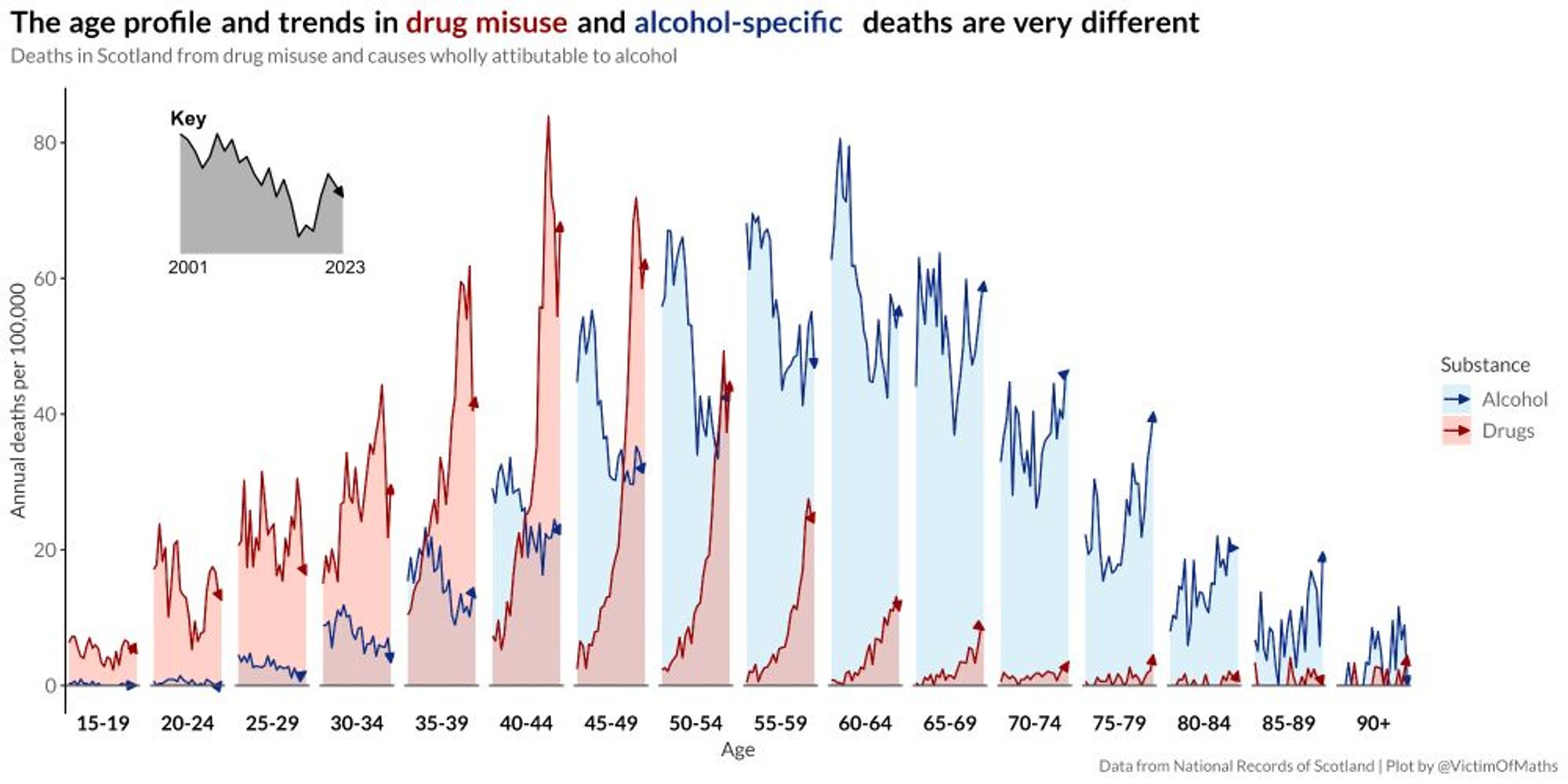
For sure! "Simpler and clearer" 🤷 maybe?! But agreed that the age × time × substance comparison is so striking it feels worth a bit of density.
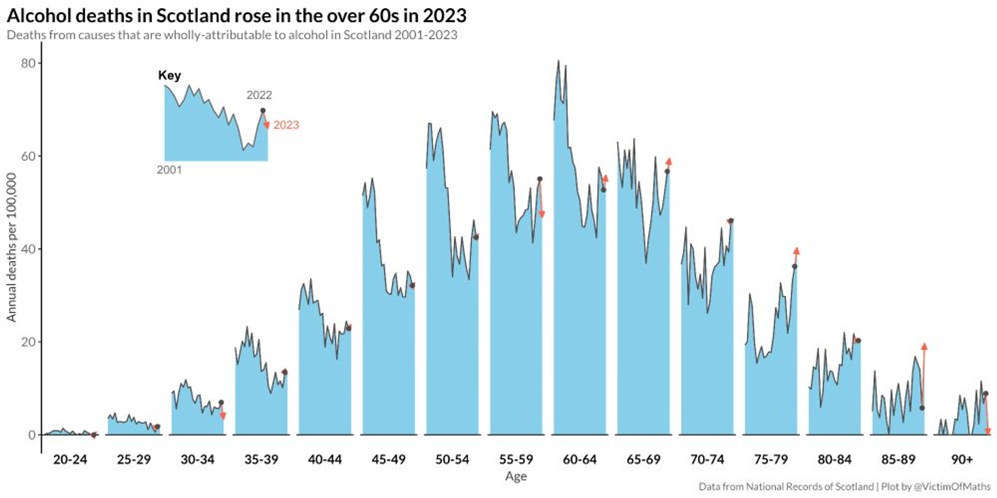
This is a interesting technique! In the first chart, it seemed like an odd way to show time trends since the age distribution jumps out as more salient(at first!), but the payoff with that last point feels powerful.
Sure! Might take a minute (can't easily share the data). Alas, not ggdist, was an abomination of matplotlib and pre-smoothing.
You're the best Francis! Thanks so much for making this happen. Btw, should this be a quote post or a reply? I'm not sure of the etiquette...