FC
Fabio Crameri
@fabiocrameri.ch
Geoscientist & Graphic Designer
www.fabiocrameri.ch
• Somewhere between Earth & Art & Science
• Founder of s-ink.org & SZIdatabase.org
Science communication and graphic design
❯ Undertone.design
248 followers179 following47 posts
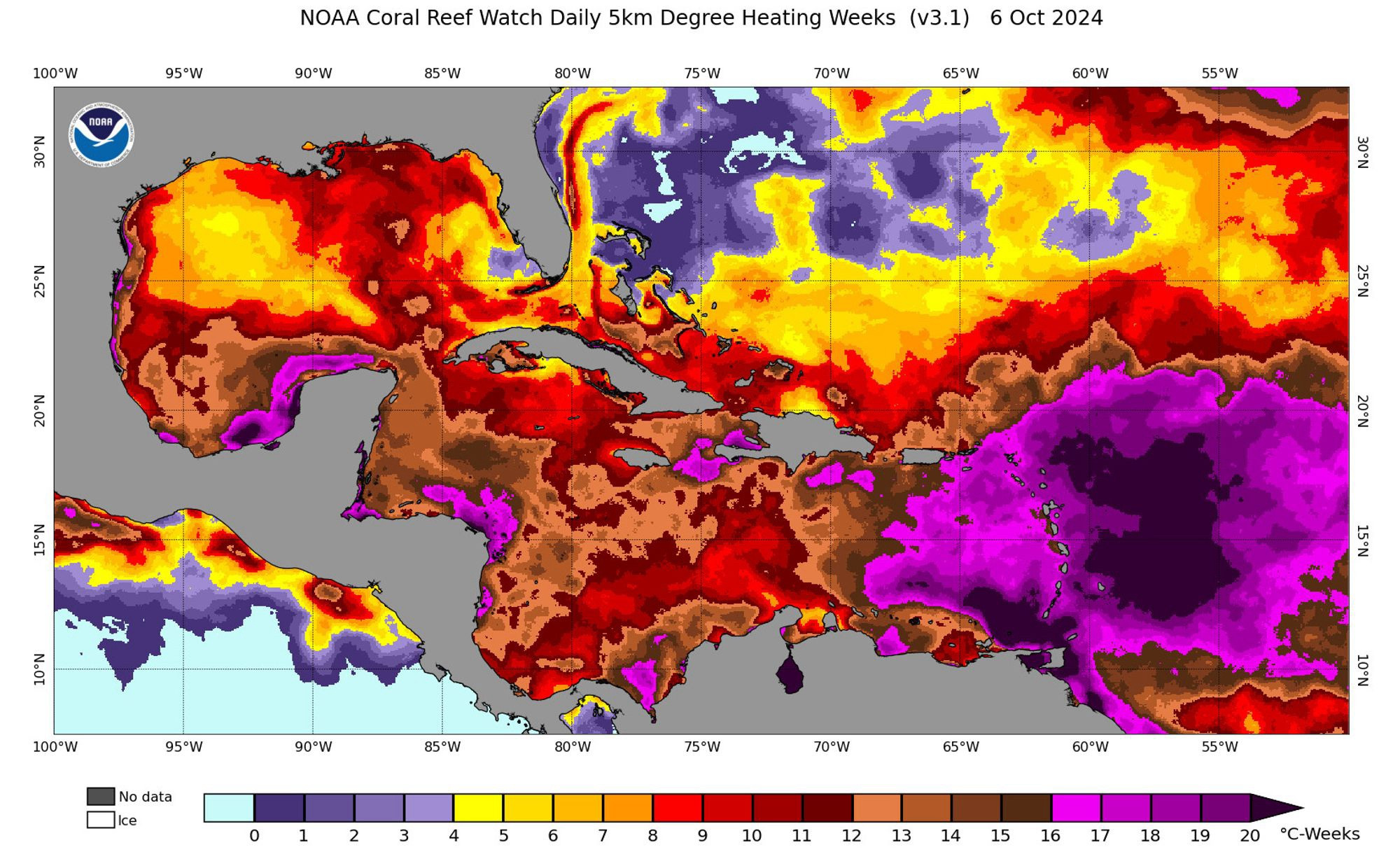
Nothing says ‚higher education‘ like ignoring the very science you’re supposed to educate about… 🙈🙉 🙃 Thanks, Nick! Let’s see… #UseBatlow 📊
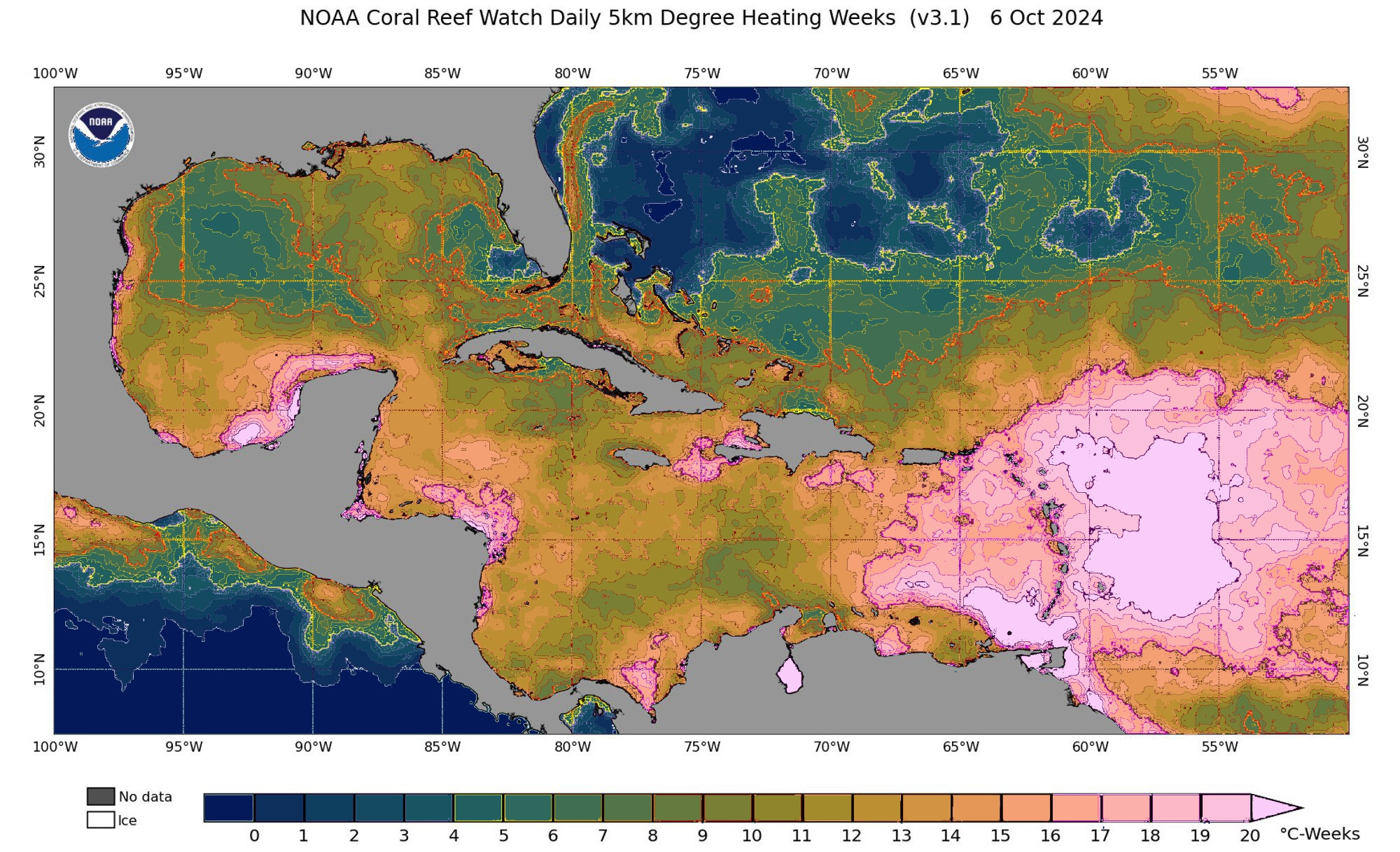
Scales (such as a colour bar) that are meant to represent one dimension of a data set can’t be used to highlight data ranges. Instead, use superposed contour lines instead if you must know the individual values clearly on a map. Here’s a crude example of how this map could be shown. 📊 #UseBatlow
FC
Fabio Crameri
@fabiocrameri.ch
Geoscientist & Graphic Designer
www.fabiocrameri.ch
• Somewhere between Earth & Art & Science
• Founder of s-ink.org & SZIdatabase.org
Science communication and graphic design
❯ Undertone.design
248 followers179 following47 posts