
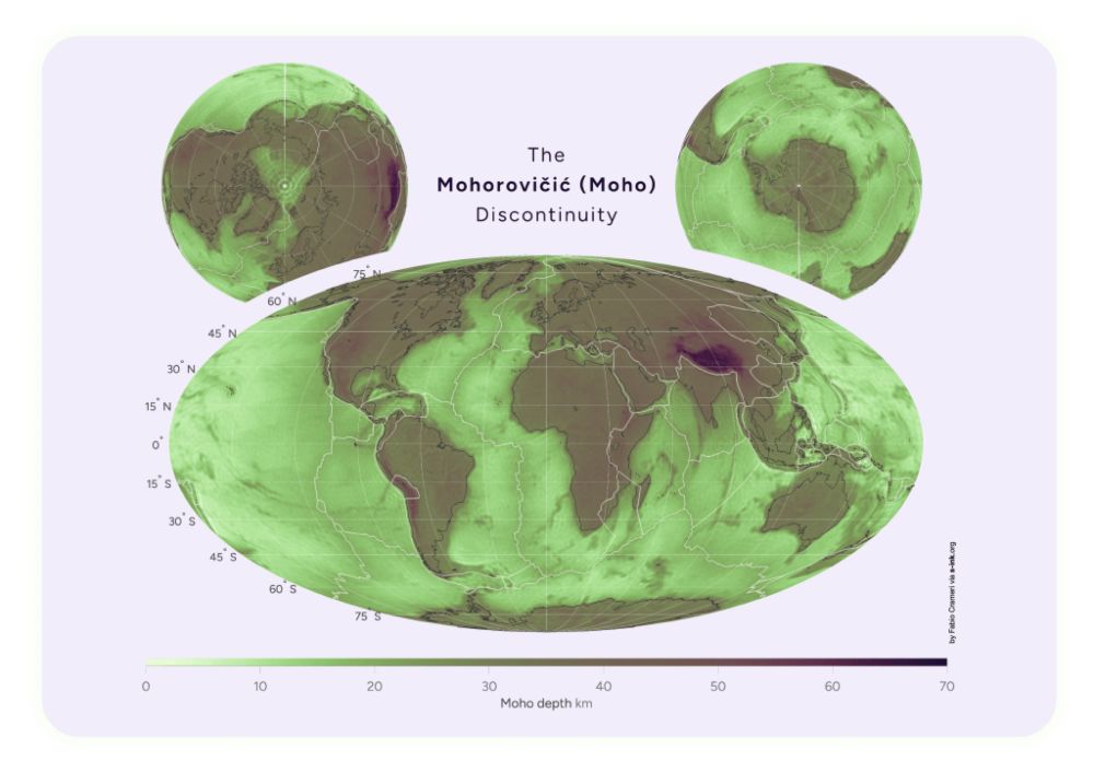
I think it should be all about the first impression of the map, certainly when posted to the public or on a social media platform. We, scientists, tend to forget (or ignore?) that most people don’t even know how to read a colour map. Wouldn’t superposed contour lines do the trick?
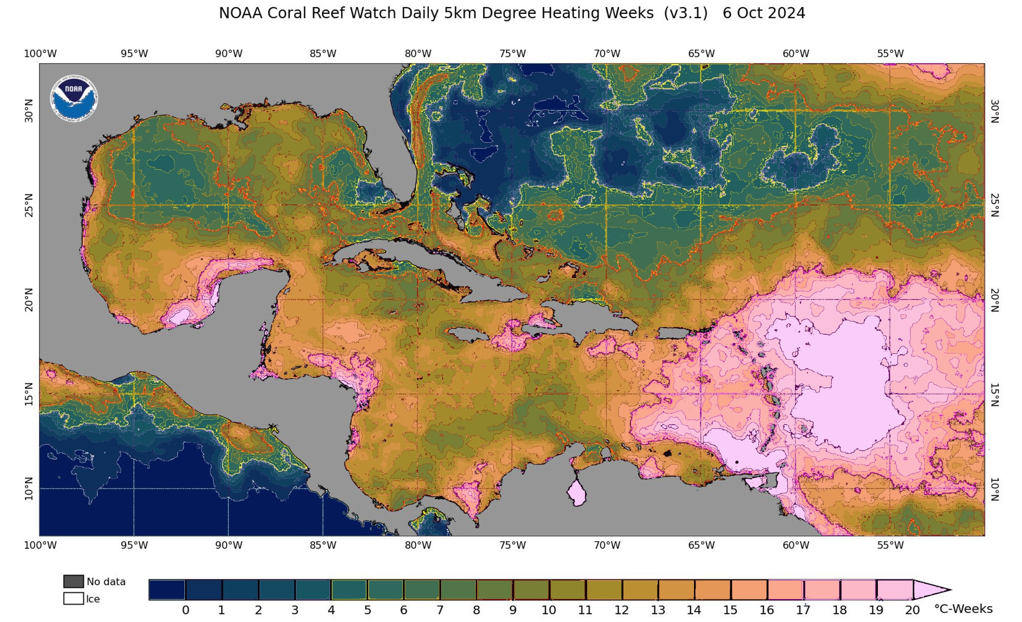
Scales (such as a colour bar) that are meant to represent one dimension of a data set can’t be used to highlight data ranges. Instead, use superposed contour lines instead if you must know the individual values clearly on a map. Here’s a crude example of how this map could be shown. 📊 #UseBatlow
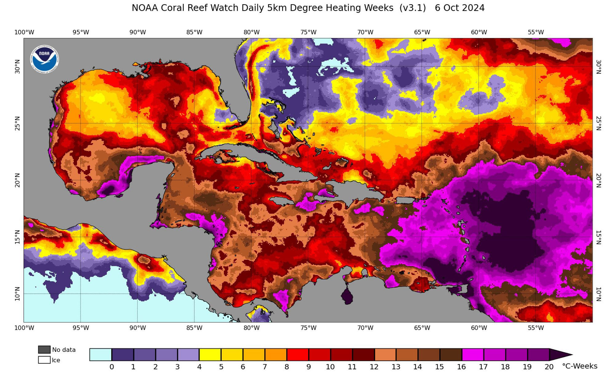
Nothing says ‚higher education‘ like ignoring the very science you’re supposed to educate about… 🙈🙉 🙃 Thanks, Nick! Let’s see… #UseBatlow 📊

I got the chance to present about accurate and accessible #scientific#colour use in a room full of physicists! Thanks, Santa Pile, Andreas Schell (see images), and @oepg_at for the invitation and organisation! 🫶📊
Maybe this is relevant: Coloring Chemistry–How Mindful Color Choices Improve Chemical Communication, Angew. Chem. Int. Ed., www.fabiocrameri.ch/ws/media-lib...doi.org/10.31223/X51...
😬 You know what that means, yeah? #UseBatlow