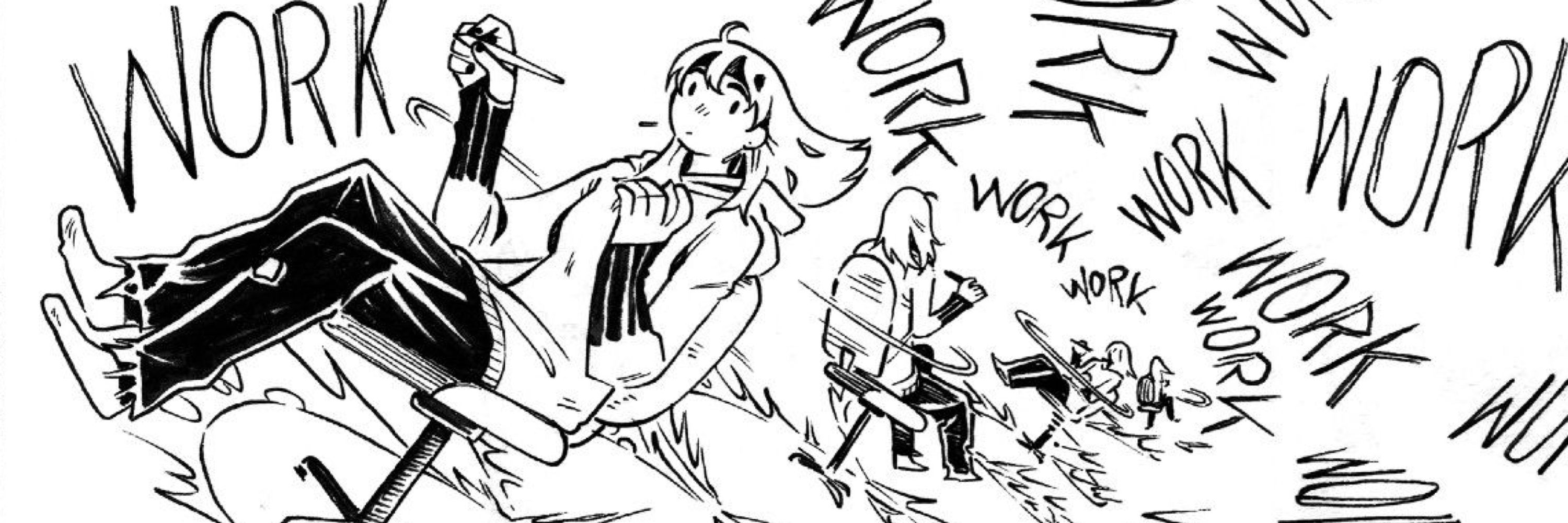
Im curious, what do ya’ll think of my lettering? Im still rusty after not doing any for a few years and i feel like i cant gauge it myself. Im trying to maintain some of the hand drawn vibe but i want to make sure it doesnt look amateurish if that makes sense. Thanks!
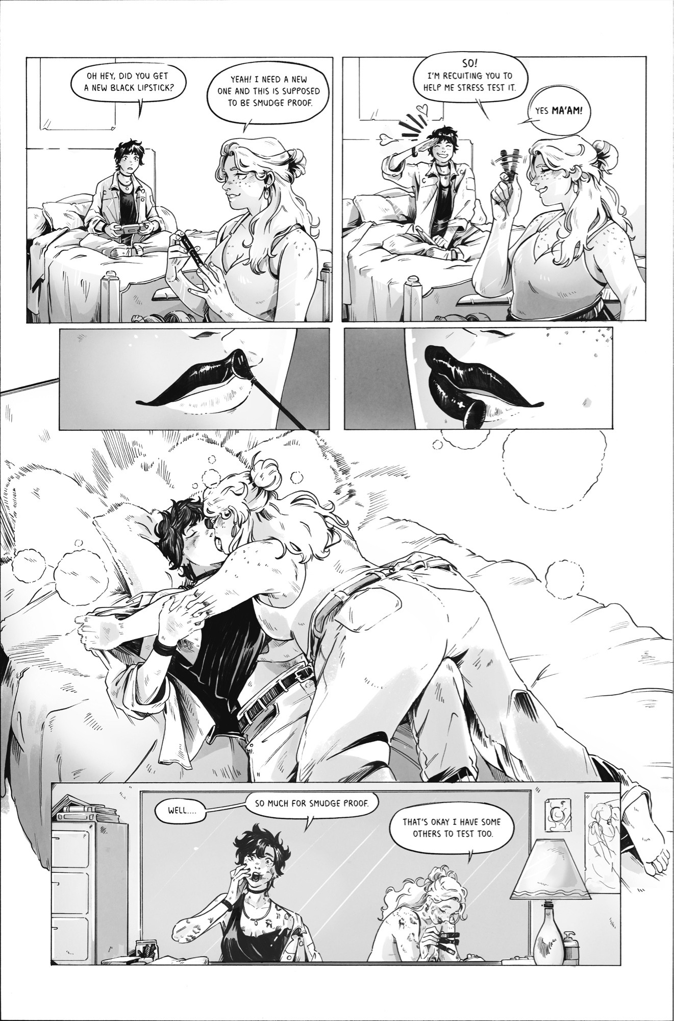
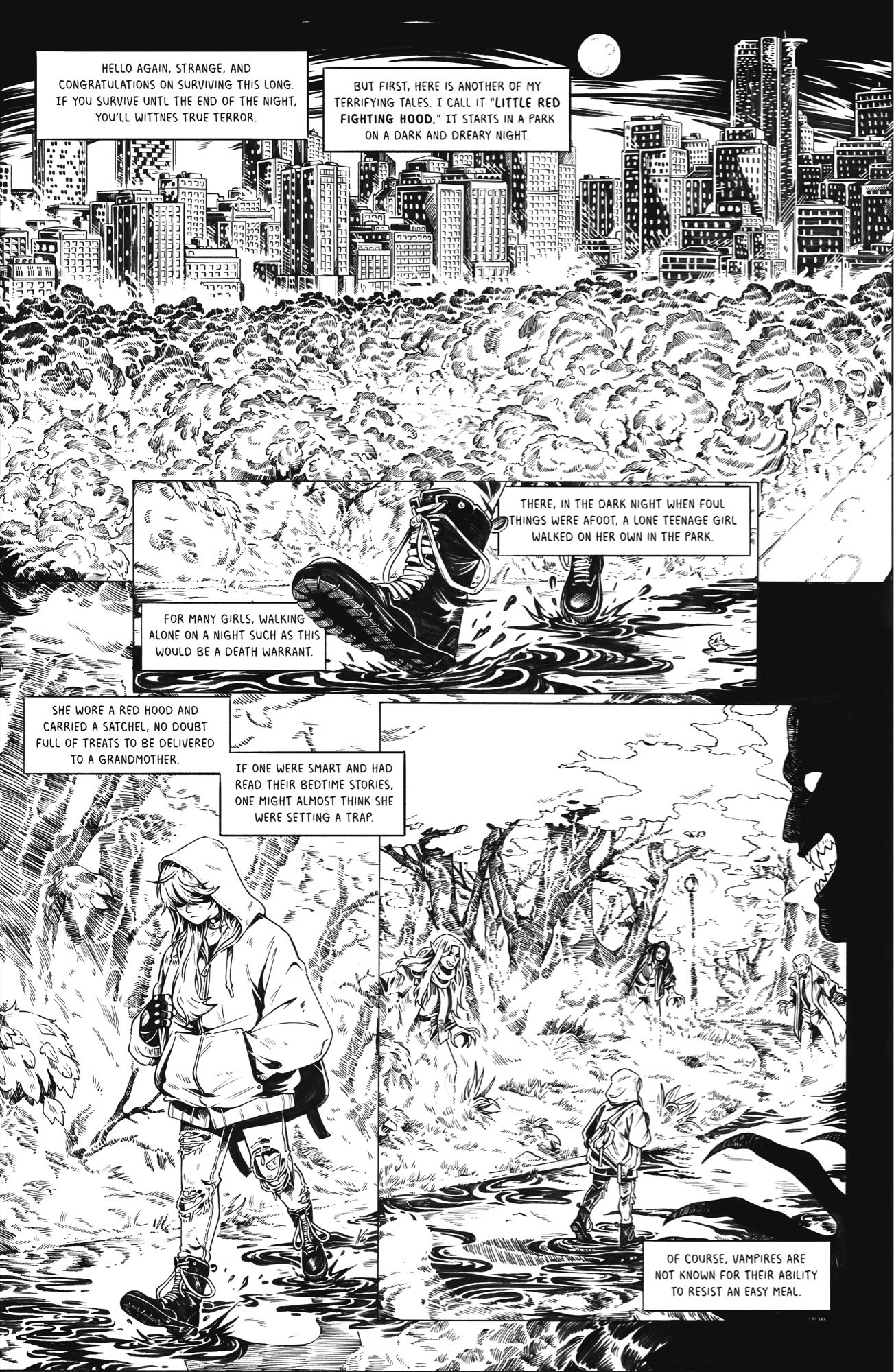
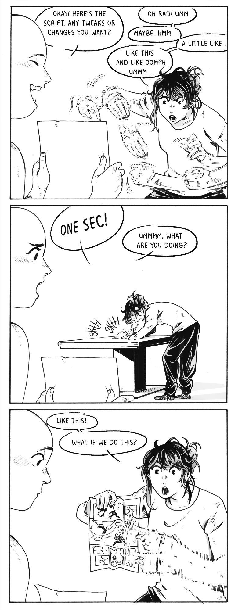
The lettering is fine! My only complaint is that sometimes the speech bubbles feel a bit empty at times since the text doesn't fill them up properly (like the more energetic bubbles in the third image) That said, the fourth image has the text perfectly done imo
Blambot has some good tips on lettering (even tho it’s digital, the tips still work as guides for hand lettering. blambot.com/pages/letter...
BETTER LETTERER: Comic Lettering Tips These infographics were originally posted on Nate Piekos's social media accounts,and are collected here for your reference!
The only issue I see is the center spacing on the description blocks (tho that was already addressed) for me personally the line spacing is a little wide, but I usually change even digital fonts to 85%~ on line spacing.
I like it! Only critique I'd offer is to watch out for tangents, and I don't know hoe I feel about center-aligned text in the rectangular captions, I'd try left-aligned, but that might just be a personal preference. I'm not a letterer so not sure if there's a standard for those.
Looks nice to me! Readable and lively. Also, your hatching is great, that’s hard to do!
I think it looks great
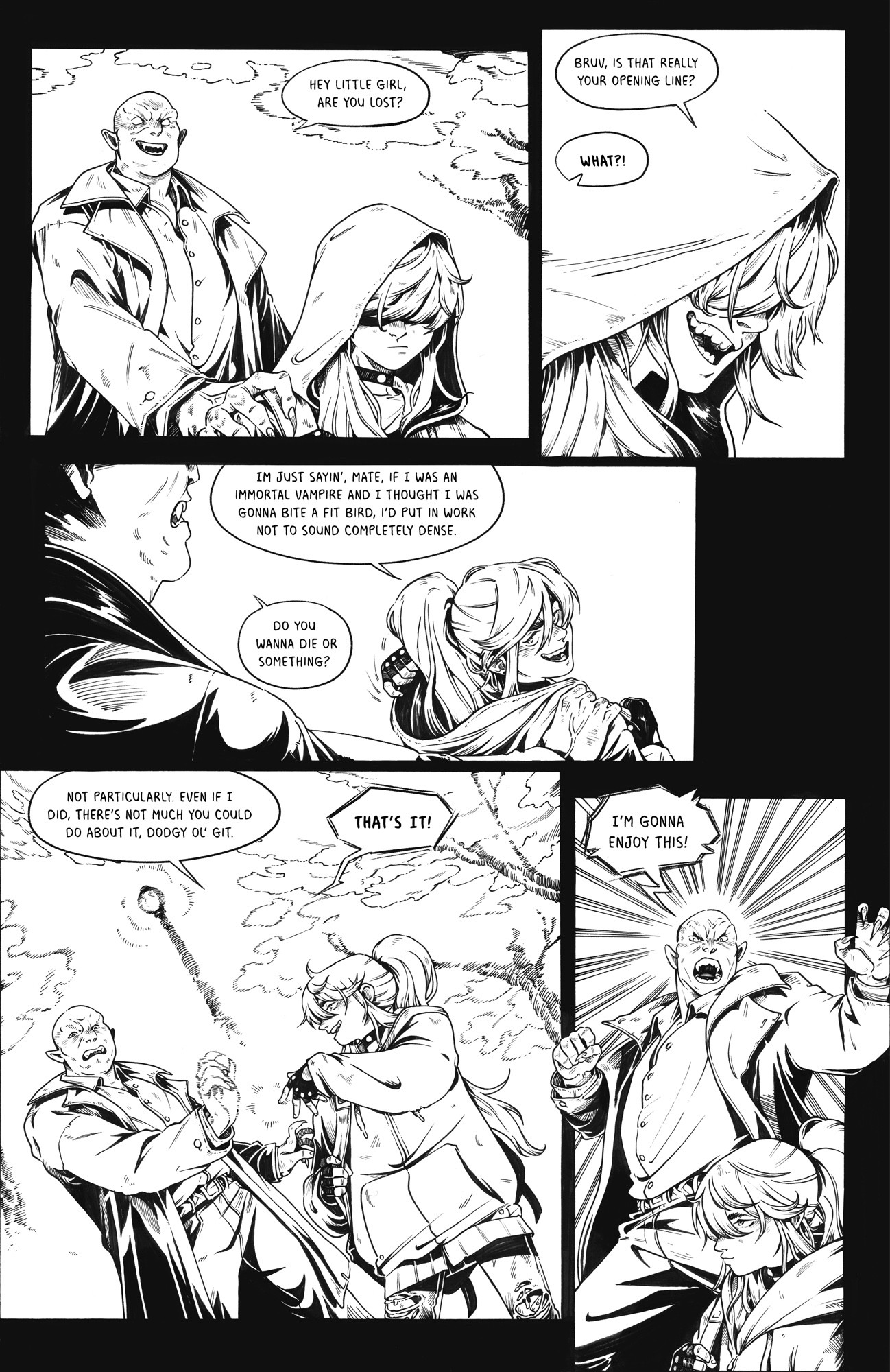
For what it’s worth, I saw that last frame in a different context first and didn’t think twice about how it had been lettered. I definitely understand perfectionism in one’s own art, but I guess I would say remember that you’re probably stressing about it way more than anybody else on the planet!
it looks rock solid imo! clear and readable, and yes, handwritten. The LOUD words could use some more oomph, but judging by the more recent work, you're getting the hang of that too :3
It's perfectly fine! The dialogue flows nicely, doesn't feel sluggish or awkward, the black and white inking is freaking amazing as usual. It's good 👍
I think the font itself is very clean and readable! I find it easier to read on the last picture where the text is bigger (I think), but I'm looking at your pages (gorgeous inks btw) from the small screen of my phone so that might be on me