
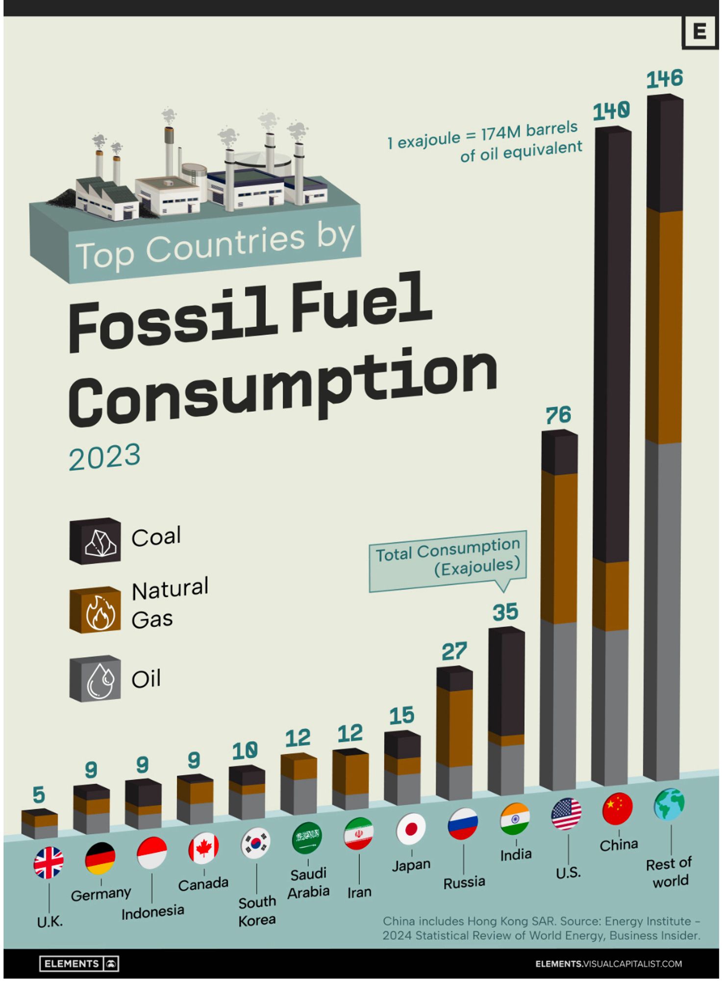
Fossil fuel consumption reached new record highs in 2023, driven by increased coal and oil use in China, despite the global boom in renewable energy. This graphic shows the top 12 countries by fossil fuel consumption in 2023. Data is from 2024 Statistical Review of World Energy.
Your graph doesn't show how fossil fuel consumption has reached new record highs in 2023. So, what's the real purpose of this post?
This graph on its own is equivalent to cherry picking bits to push forward a specific narrative Reality is far more complex to be washed out like that… As some have already noted, this graph should be next to at least another two: 1. Consumption same per capita 2. Renewable per country
Imagine how bad it would be if China hadn’t invested in so much renewables over the past ten years.
Per capita? Does this include airline emissions?
I wonder has anyone projected what European consumption would be if they started manufacturing more locally without lengthy supply chain to China and India?
If you made a chart of per capita emissions, what will it look like?
Fascinating chart. Would love to see the same chart but for renewables.