
You can slap any label on this chart and then get performatively mad that one specific thing didn't solve the entire problem of rising CO2 PPM. The launch of the degrowth movement, extinction rebellion, Just Stop Oil, renewable energy, EVs, net zero. Anything. Imagination is your only limit.
I've never seen anyone use the chart in that way, really. I'm using it as an invitation to discuss fossil capital and how to end it!
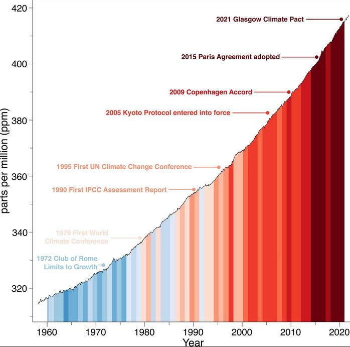
It's not about one specific thing. It's about the complete failure of the entire process and a refutation of the perpetual propaganda pretence that we're making progress. Sure you can attach any nonsense you like above an image but that isn't the image's fault.
Treating it like a profound revelation that we haven't bent the emissions curve by any material amount so far is as obnoxious and boring a pronouncement as "but the sun doesn't shine at night and the wind stops blowing", and both come from exactly the same demographic of white guys
Indeed, as @lucysmaxwell.bsky.social writes in this thread there are also significant opportunities for legal challenges to governments who are not doing enough on climate change