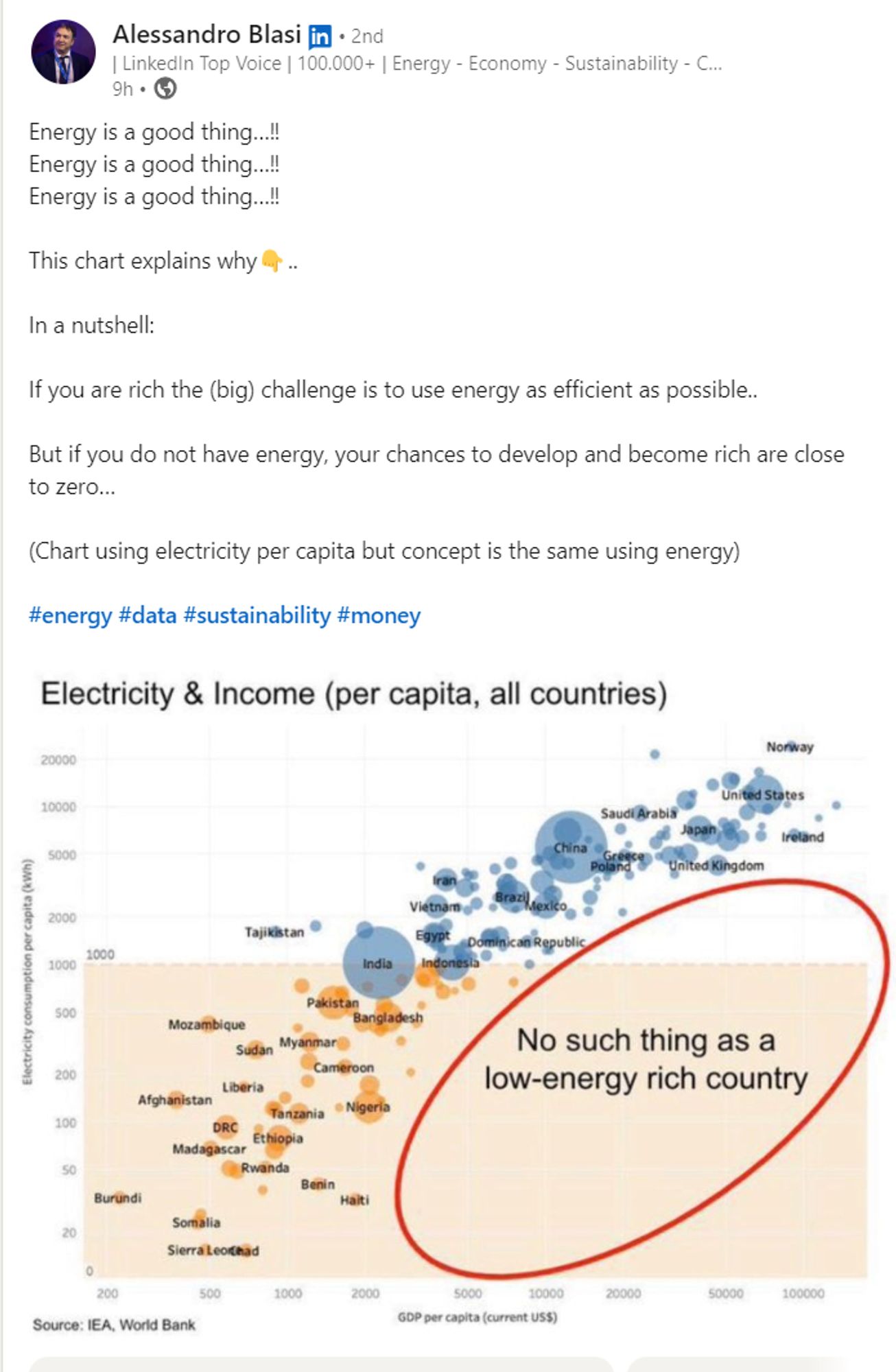
Putting aside the fact that even the broader point of this is misguided, I see this graphic shared regularly as if it's some sort of immutable law of the universe rather than an emergent property of a fucked up system that we can and should change
Why does your profile picture look like you're in jail?

Agree but maybe also good to link to the post explaining why this chart is misleading/plain wrong? industrydecarbonization.com/news/mislead...
A chart linking low energy consumption with poverty is widely shared on social media. The graphic uses a misleading visualization, and if we look at the data more objectively, it tells a very differen...
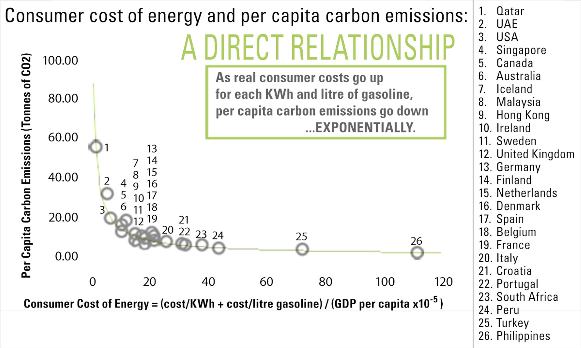
Perhaps more relevant is the fact that the consumer cost of energy correlates directly with per capita carbon emissions. This is an image I made 15 years ago, but I would be surprised if much has changed today. But as solar continues to become less expensive this paradigm may finally start to shift.
Partly to blame is the economic classification system: developed vs developing. Rather we should only classify nations as low-carbon and high-carbon. The high carbon nations need to aspire to be more low carbon rather than developing nations aspiring to become developed.
Presenting properties of fucked up systems we have now as if they're immutable laws of the universe is persistent, also very annoying.
That kind of mindset would be decrying our critical lack of vacuum tubes if we wanted to remain competitive with the Soviets.
I'm at a bit of a loss as to how you'd change this shape unless you had a cohort of small rich nations with little industry and a lot of high priced service workers, like if everyone in Lixembourg worked as a zoom therapist for the rest of Europe, and they also taxed electricity heavily.
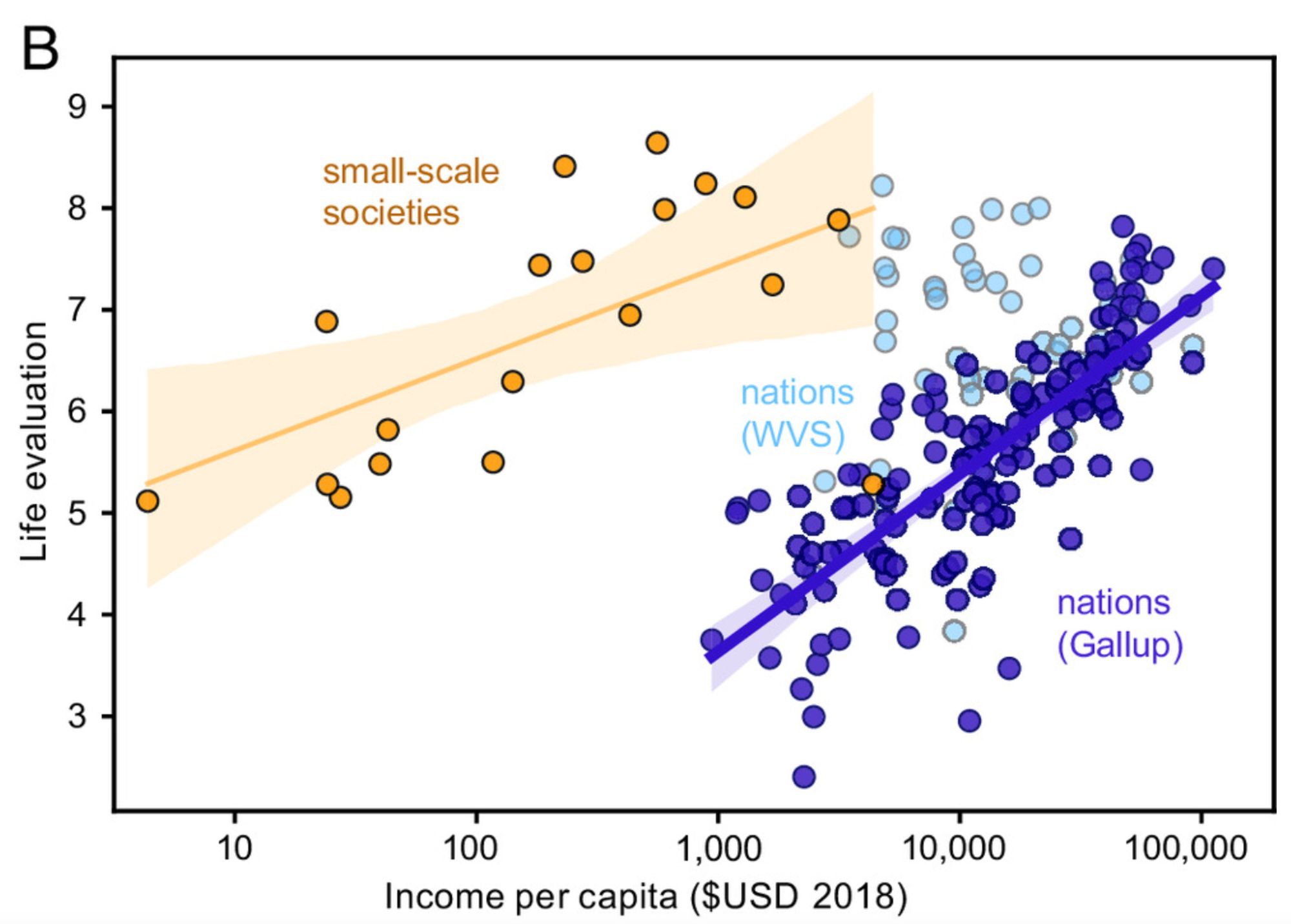
Looks like India could be the first, if you were only going by this graph.