Stay tuned for more editions of Insight Out featuring participatory data visualisations from this cubical installation! #datavisualization#dataviz#datavisualisation#informationdesign#data#design#charts
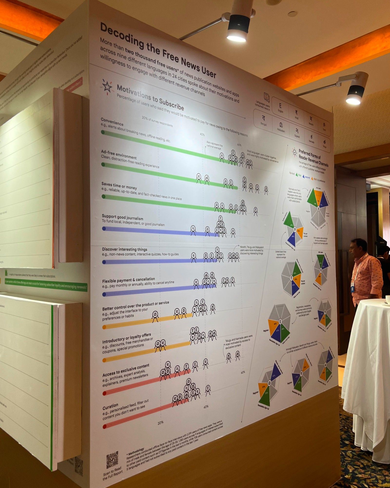
📝 Our Process: Conceptualised by our Founder @chartwaali.bsky.social, this chart was initially presented to the client featuring two colour scales - a sequential variant quantifying all spokes of the “umbrella chart”, while the other highlighted just the top three preferences.
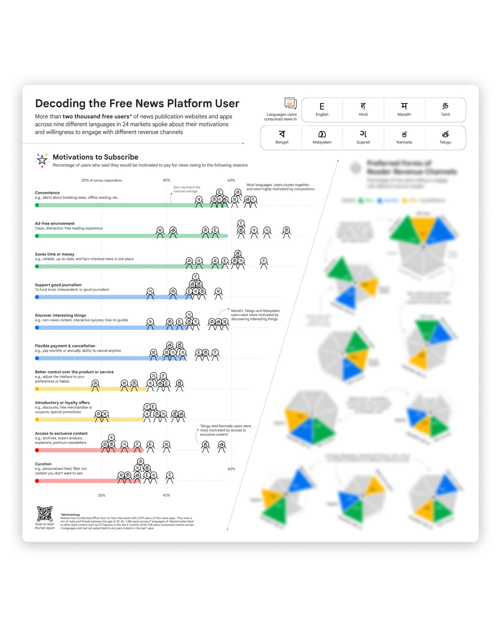
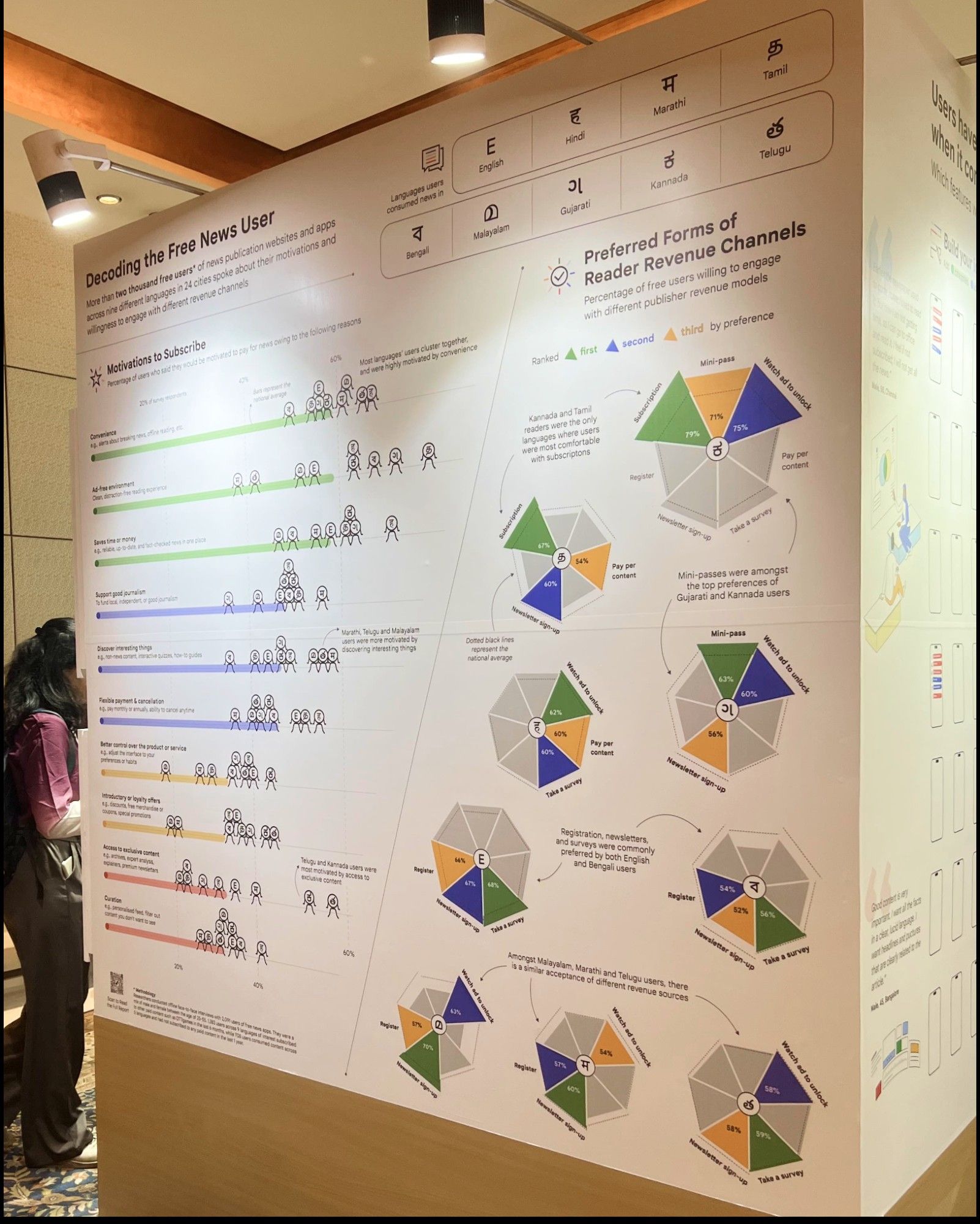
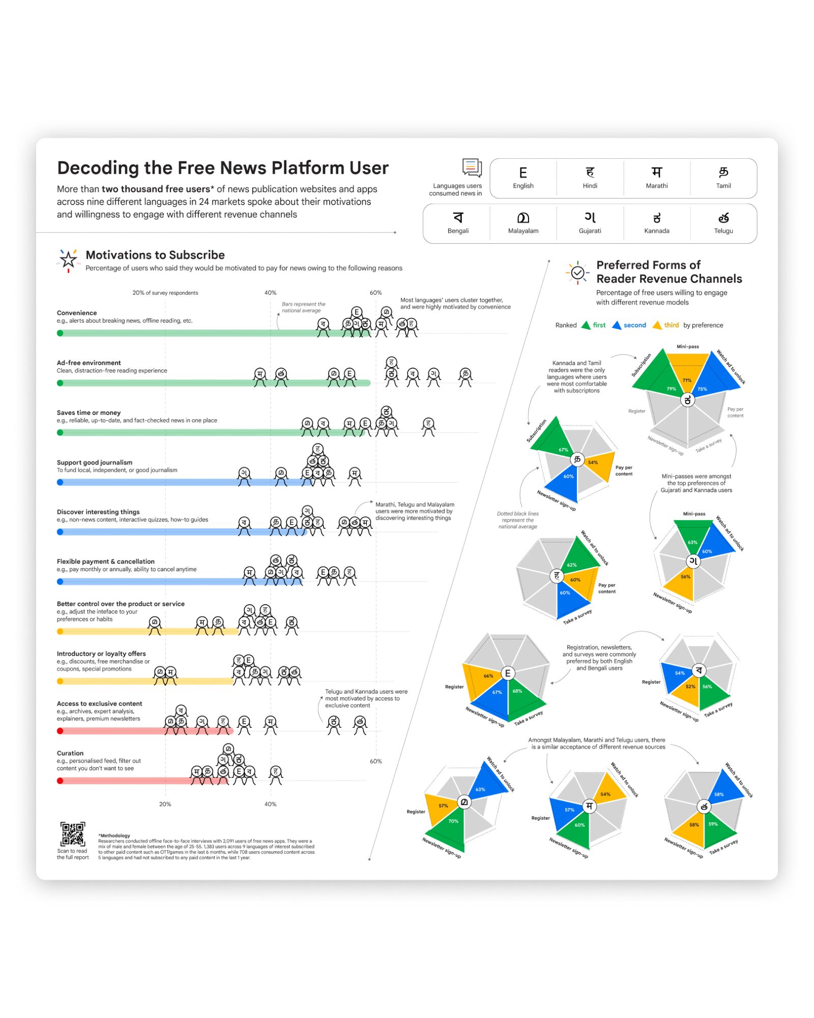
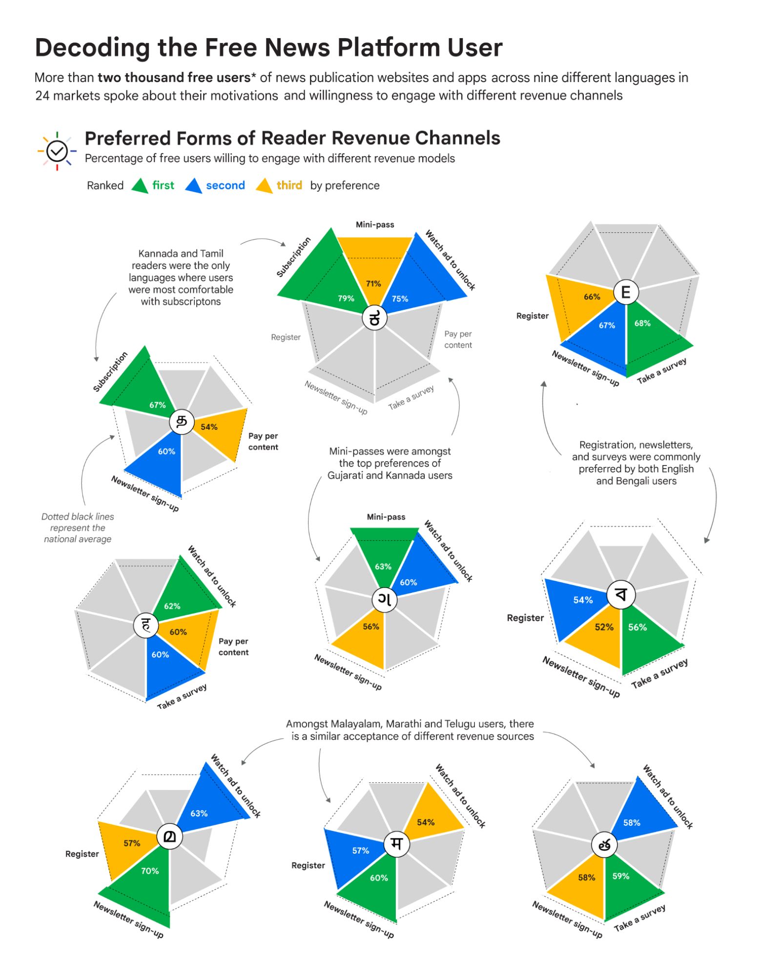
🔍 A few notable findings? • Kannada and Tamil users were most comfortable with subscriptions • Gujarati and Kannada users preferred mini-passes • English and Bengali users favoured registration, newsletters, and surveys.
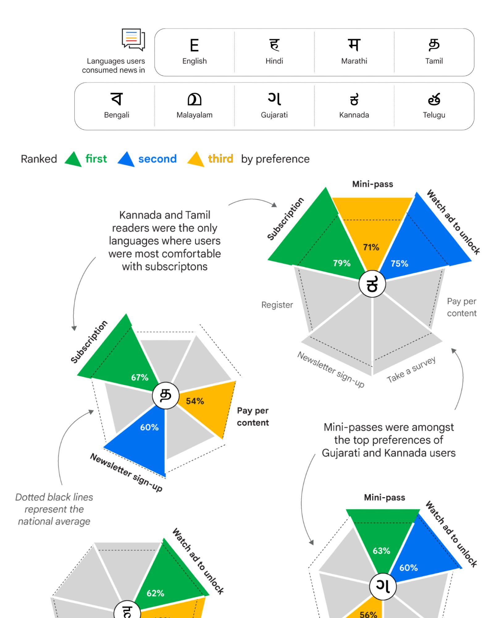
We also added annotations to guide the viewer, indicating how in some languages, users clearly favoured particular revenue models, while in other languages, openness to most models was observed.
Ultimately, colour was used to highlight the top three preferences per language. Dotted black lines represent the national average, providing a baseline for comparison.
📈 The Visualisation: With one “umbrella chart” dedicated to each of the nine language groups’ users, their willingness to engage with revenue models such as subscriptions, mini-passes, pay-per-content, newsletter sign-ups, and surveys is visualised in order of preference.
This chart visualises free news users’ (people who consume news through free platforms without a subscription) preferences for different revenue channels across nine regional language groups.
See a picture of the final installation at Google News Initiative India Summit, and stay tuned for more visualisations from the event in future editions of Insight Out!