BLUE
Profile banner
KV
Koen Van den Eeckhout
@vandeneeckhoutkoen.bsky.social
📊 Turning complex data into powerful visual stories! Author of 'Powerful Charts'. Ex-physicist. He/him 🏳️‍🌈
462 followers34 following76 posts

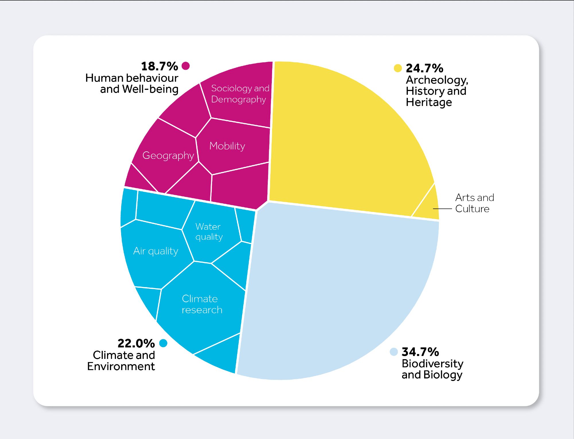
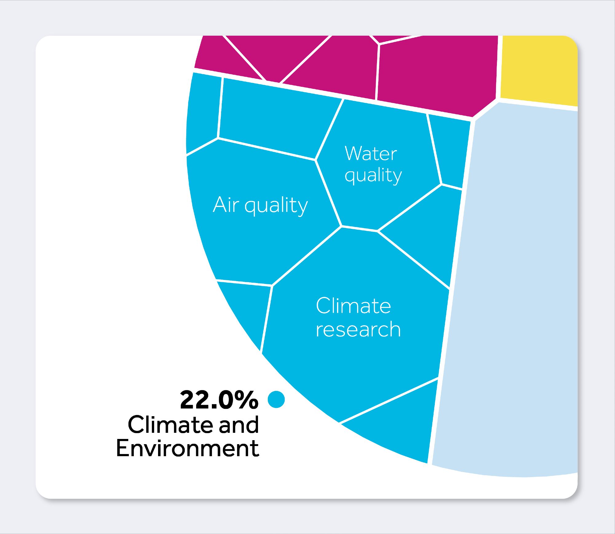
This Voronoi chart shows to which topics the different Citizen Science projects belong. It’s a great alternative for a more simple treemap, and its circular shape makes it stand out! (3/13)

Circular Voronoi chart showing the four big topics of citizen science projects: 24.7% of projects are in Archeology, History and Heritage, shown in yellow, 34.7% in Biodiversity and Biology, shown in light blue, 22% in Climate and Environment, shown in dark blue, and 18.7% of projects are in the field of Human behaviour and Well-being, shown in pink.
1

We could even show some subdivisions and major subtopics, without overwhelming the visual: (4/13)

Detail of the Voronoi chart, showing some of the major subdivisions in the Climate and Environment group. The three major ones are labeled: Climate research, Air quality, and Water quality. There are six smaller subdivisions, but they are not labeled.
1
Profile banner
KV
Koen Van den Eeckhout
@vandeneeckhoutkoen.bsky.social
📊 Turning complex data into powerful visual stories! Author of 'Powerful Charts'. Ex-physicist. He/him 🏳️‍🌈
462 followers34 following76 posts