JF
Jason Furtado
@wxjay.bsky.social
Associate Professor of Meteorology at the University of Oklahoma. Study large-scale climate dynamics, subseasonal-to-seasonal forecasting, and climate change. Proud RI native and New England sports fan. Opinions & thoughts are my own. 🇺🇸 🇵🇹
210 followers87 following30 posts
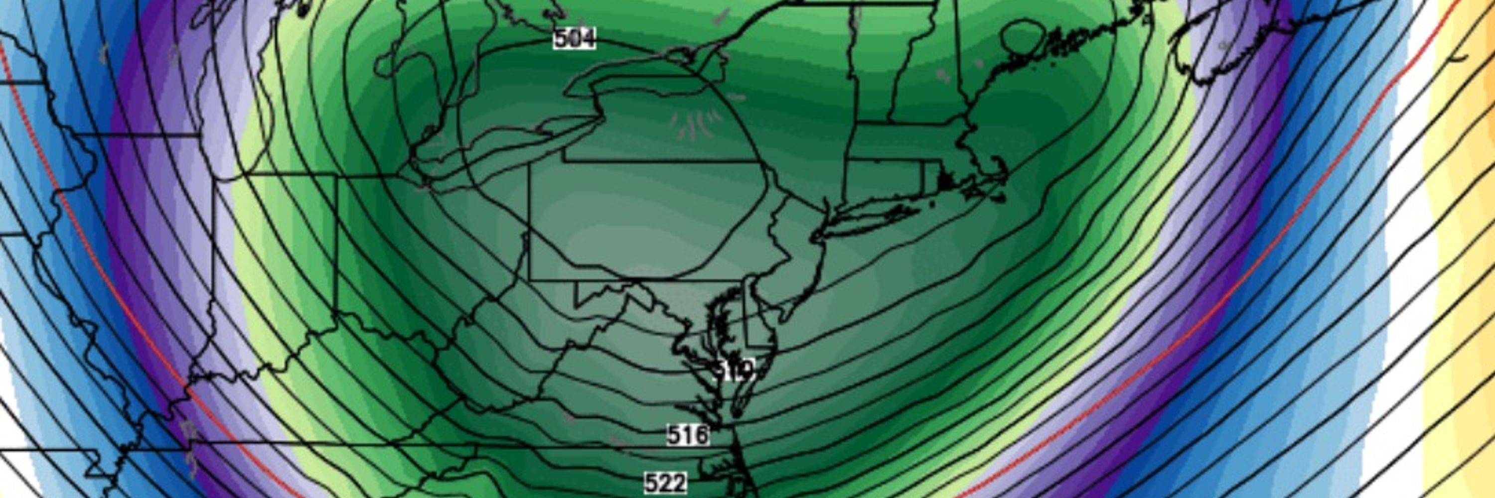
Stats/Met folks: Say I produce a box-and-whiskers plot from GEFS 00Z run showing max T for PVD for Day +10 from the model. What is the best way to show the change in the distribution (not just a new box-and-whiskers plot) of max T forecasts for PVD for the same verif day from subsequent GEFS runs?
I felt split violin plots were informative, especially if the mean-or-median is shown. But for a box & whisker? Maybe there’s some way to do shading with the box and arrow with the whisker endpoints, but would have to assure the box is what stands out most.
JF
Jason Furtado
@wxjay.bsky.social
Associate Professor of Meteorology at the University of Oklahoma. Study large-scale climate dynamics, subseasonal-to-seasonal forecasting, and climate change. Proud RI native and New England sports fan. Opinions & thoughts are my own. 🇺🇸 🇵🇹
210 followers87 following30 posts